More than just Liquid Glass
Spotlighting the most helpful new features of iOS 26.
The new Clear icons look in iOS 26 can make it hard to identify apps, since they’re all the same color. Credit: Scharon Harding
iOS 26 became publicly available this week, ushering in a new OS naming system and the software’s most overhauled look since 2013. It may take time to get used to the new “Liquid Glass” look, but it’s easier to appreciate the pared-down controls.
Beyond a glassy, bubbly new design, the update’s flashiest new features also include new Apple Intelligence AI integration that varies in usefulness, from fluffy new Genmoji abilities to a nifty live translation feature for Phones, Messages, and FaceTime.
New tech is often bogged down with AI-based features that prove to be overhyped, unreliable, or just not that useful. iOS 26 brings a little of each, so in this review, we’ll home in on the iOS updates that will benefit both mainstream and power users the most.
Table of Contents
Let’s start with Liquid Glass
If we’re talking about changes that you’re going to use a lot, we should start with the new Liquid Glass software design that Apple is applying across all of its operating systems. iOS hasn’t had this much of a makeover since iOS 7. However, where iOS 7 applied a flatter, minimalist effect to windows and icons and their edges, iOS 26 adds a (sometimes frosted) glassy look and a mildly fluid movement to actions such as pulling down menus or long-pressing controls. All the while, windows look like they’re reflecting the content underneath them. When you pull Safari’s menu atop a webpage, for example, blurred colors from the webpage’s images and text are visible on empty parts of the menu.
Liquid Glass is now part of most of Apple’s consumer devices, including Macs and Apple TVs, but the dynamic visuals and motion are especially pronounced as you use your fingers to poke, slide, and swipe across your iPhone’s screen.
For instance, when you use a tinted color theme or the new clear theme for Home Screen icons, colors from the Home Screen’s background look like they’re refracting from under the translucent icons. It’s especially noticeable when you slide to different Home Screen pages. And in Safari, the address bar shrinks down and becomes more translucent as you scroll to read an article.
Because the theme is incorporated throughout the entire OS, the Liquid Glass effect can be cheesy at times. It feels forced in areas such as Settings, where text that just scrolled past looks slightly blurred at the top of the screen.
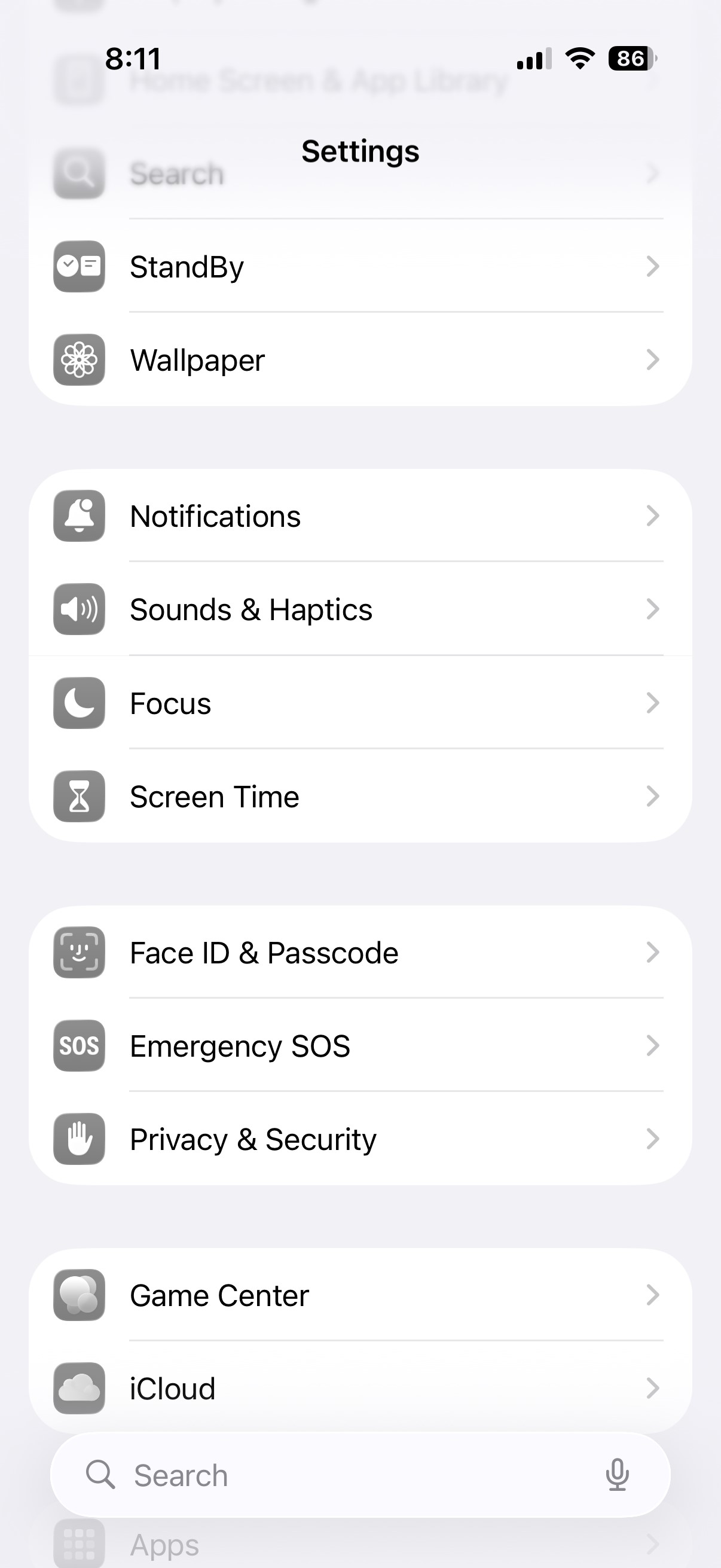
Liquid Glass makes the top of the Settings menu look blurred.
Credit: Scharon Harding
Liquid Glass makes the top of the Settings menu look blurred. Credit: Scharon Harding
Other times, the effect feels fitting, like when pulling the Control Center down and its icons appear to stretch down to the bottom of the screen and then quickly bounce into their standard size as you release your finger. Another place Liquid Glass flows nicely is in Photos. As you browse your pictures, colors subtly pop through the translucent controls at the bottom of the screen.
This is a matter of appearance, so you may have your own take on whether Liquid Glass looks tasteful or not. But overall, it’s the type of redesign that’s distinct enough to be a fun change, yet mild enough that you can grow accustomed to it if you’re not immediately impressed.
Liquid Glass simplifies navigation (mostly)
There’s more to Liquid Glass than translucency. Part of the redesign is simplifying navigation in some apps by displaying fewer controls.
Opening Photos is now cleaner at launch, bringing you to all of your photos instead of the Collections section, like iOS 18 does. At the bottom are translucent tabs for Library and Collections, plus a Search icon. Once you start browsing, the Library and Collections tabs condense into a single icon, and Years, Months, and All tabs appear, maintaining a translucence that helps keep your focus on your pictures.
You can still bring up more advanced options (such as Flash, Live, Timer) with one tap. And at the top of the camera’s field of view are smaller toggles for night mode and flash. But for when you want to take a quick photo, iOS 26 makes it easier to focus on the necessities while keeping the extraneous within short reach.
Similarly, the initial controls displayed at the bottom of the screen when you open Camera are pared down from six different photo- and video-shooting modes to the two that really matter: Photo and Video.
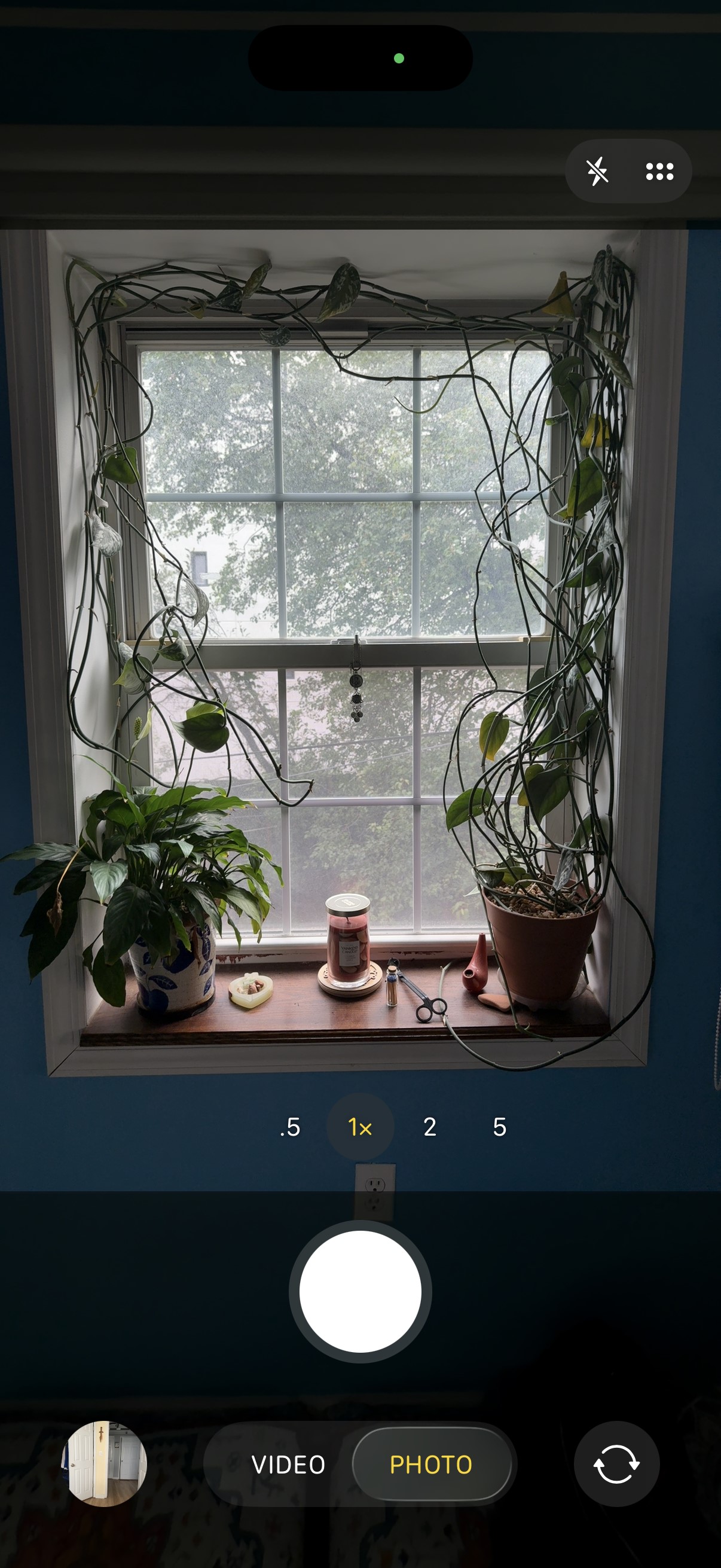
If you long-press Photo, options for the Time-Lapse, Slow-Mo, Cinematic, Portrait, Spatial, and Pano modes appear.
Credit: Scharon Harding
If you long-press Photo, options for the Time-Lapse, Slow-Mo, Cinematic, Portrait, Spatial, and Pano modes appear. Credit: Scharon Harding
iOS 26 takes the same approach with Video mode by focusing on the essentials (zoom, resolution, frame rate, and flash) at launch.New layout options for navigating Safari, however, slowed me down. In a new Compact view, the address bar lives at the bottom of the screen without a dedicated toolbar, giving the web page more screen space. But this setup makes accessing common tasks, like opening a new or old tab, viewing bookmarks, or sharing a link, tedious because they’re hidden behind a menu button.
If you tend to have multiple browser tabs open, you’ll want to stick with the classic layout, now called Top (where the address bar is at the top of the screen and the toolbar is at the bottom) or the Bottom layout (where the address bar and toolbar are at the bottom of the screen).
On the more practical side of Safari updates is a new ability to turn any webpage into a web app, making favorite and important URLs accessible quickly and via a dedicated Home Screen icon. This has been an iOS feature for a long time, but until now the pages always opened in Safari. Users can still do this if they like, but by default these sites now open as their own distinct apps, with dedicated icons in the app switcher. Web apps open full-screen, but in my experience, back and forward buttons only come up if you go to a new website. Sliding left and right replaces dedicated back and forward controls, but sliding isn’t as reliable as just tapping a button.
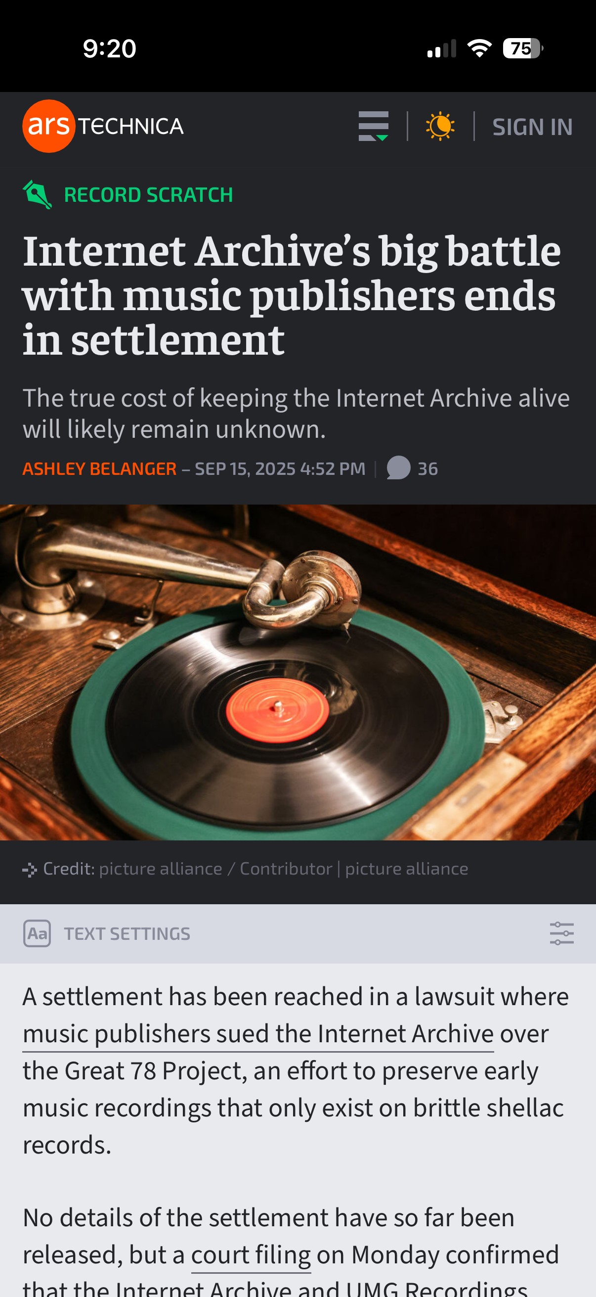
Viewing Ars Technica as a web app.
Credit: Scharon Harding
Viewing Ars Technica as a web app. Credit: Scharon Harding
iOS 26 remembers that iPhones are telephones
With so much focus on smartphone chips, screens, software, and AI lately, it can be easy to forget that these devices are telephones. iOS 26 doesn’t overlook the core purpose of iPhones, though. Instead, the new operating system adds a lot to the process of making and receiving phone calls, video calls, and text messages, starting with the look of the Phone app.
Continuing the streamlined Liquid Glass redesign, the Phone app on iOS 26 consolidates the bottom controls from Favorites, Recents, Contacts, Keypad, and Voicemail, to Calls (where voicemails also live), Contacts, and Keypad, plus Search.
I’d rather have a Voicemails section at the bottom of the screen than Search, though. The Voicemails section is still accessible by opening a menu at the top-right of the screen, but it’s less prominent, and getting to it requires more screen taps than before.
On Phone’s opening screen, you’ll see the names or numbers of missed calls and voicemails in red. But voicemails also have a blue dot next to the red phone number or name (along with text summarizing or transcribing the voicemail underneath if those settings are active). This setup caused me to overlook missed calls initially. Missed calls with voicemails looked more urgent because of the blue dot. For me, at first glance, it appeared as if the blue dots represented unviewed missed calls and that red numbers/names without a blue dot were missed calls that I had already viewed. It’s taking me time to adjust, but there’s logic behind having all missed phone activity in one place.
Fighting spam calls and messages
For someone like me, whose phone number seems to have made it to every marketer and scammers’ contact lists, it’s empowering to have iOS 26’s screening features help reduce time spent dealing with spam.
The phone can be set to automatically ask callers with unsaved numbers to state their name. As this happens, iOS displays the caller’s response on-screen, so you can decide if you want to answer or not. If you’re not around when the phone rings, you can view the transcript later and then mark the caller as known, if desired. This has been my preferred method of screening calls and reduces the likelihood of missing a call I want to answer.
There are also options for silencing calls and voicemails from unknown numbers and having them only show in a section of the app that’s separate from the Calls tab (and accessible via the aforementioned Phone menu).
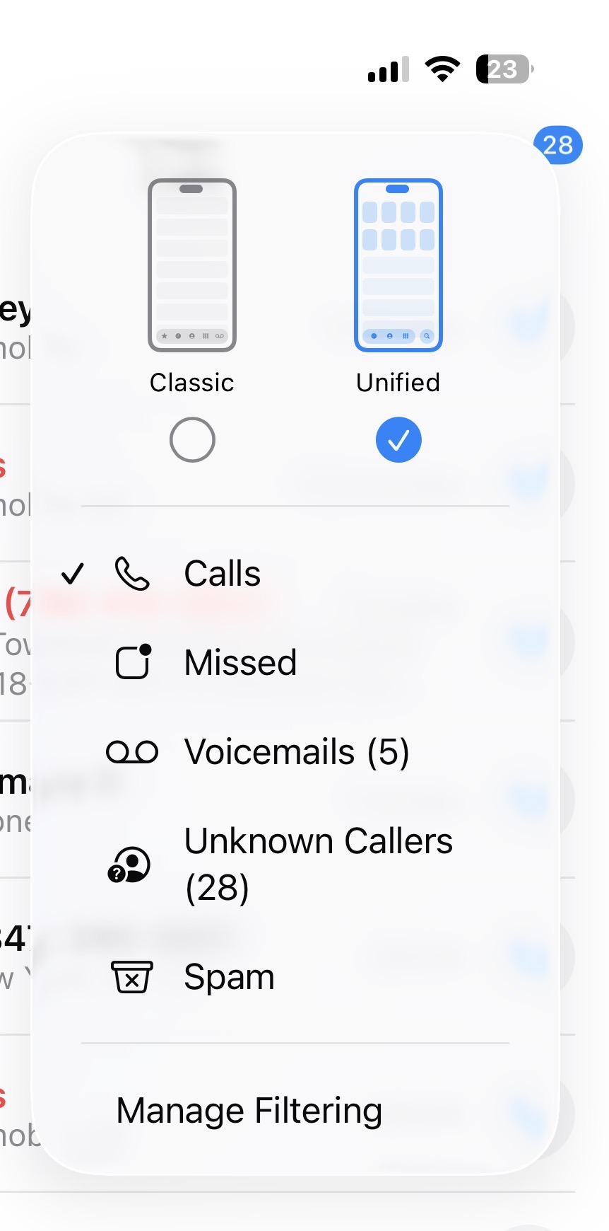
A new Phone menu helps sort important calls from calls that are likely spam.
Credit: Scharon Harding
A new Phone menu helps sort important calls from calls that are likely spam. Credit: Scharon Harding
You could also have iOS direct calls that your cell phone carrier identifies as spam to voicemail and only show the missed calls in the Phone menu’s dedicated Spam list. I found that, while the spam blocker is fairly reliable, silencing calls from unsaved numbers resulted in me missing unexpected calls from, say, an interview source or my bank. And looking through my spam and unknown callers lists sounds like extra work that I’m unlikely to do regularly.
Messages
iOS 26 applies the same approach to Messages. You can now have texts from unknown senders and spam messages automatically placed into folders that are separate from your other texts. It’s helpful for avoiding junk messages, but it can be confusing if you’re waiting for something like a two-factor authentication text, for example.
Elsewhere in Messages is a small but effective change to browsing photos, links, and documents previously exchanged via text. Upon tapping the name of a person in a conversation in Messages, you’ll now see tabs for viewing that conversation’s settings (such as the recipient’s number and a toggle for sending read receipts), as well as separate tabs for photos and links. Previously, this was all under one tab, so if you wanted to find a previously sent link, you had to scroll through the conversation’s settings and photos. Now, you can get to links with a couple of quick taps. Additionally, with iOS 26 you can finally set up custom iMessage backgrounds, including premade ones and ones that you can make from your own photos or by using generative AI. It’s not an essential update but is an easy way to personalize your iPhone by brightening up texts.
Hold Assist
Another time saver is Hold Assist. It makes calling customer service slightly more tolerable by allowing you to hang up during long wait times and have your iPhone ring when someone’s ready to talk to you. It’s a feature that some customer service departments have offered for years already, but it’s handy to always have it available.
You have to be quick to respond, though. One time I answered the phone after using Hold Assist, and the caller informed me that they had said “hello” a few times already. This is despite the fact that iOS is supposed to let the agent know that you’ll be on the phone shortly. If I had waited a couple more seconds to pick up the phone, it’s likely that the customer service rep would have hung up.
Live translations
One of the most novel features that iOS 26 brings to iPhone communication is real-time translations for Spanish, Mandarin, French, German, Italian, Japanese, Korean, and Portuguese. After downloading the necessary language libraries, iOS can translate one of those languages to another in real time when you’re talking on the phone or FaceTime or texting.
The feature worked best in texts, where the software doesn’t have to deal with varying accents, people speaking fast or over one another, stuttering, or background noise. Translated texts and phone calls always show the original text written in the sender’s native language, so you can double-check translations or see things that translations can miss, like acronyms, abbreviations, and slang.
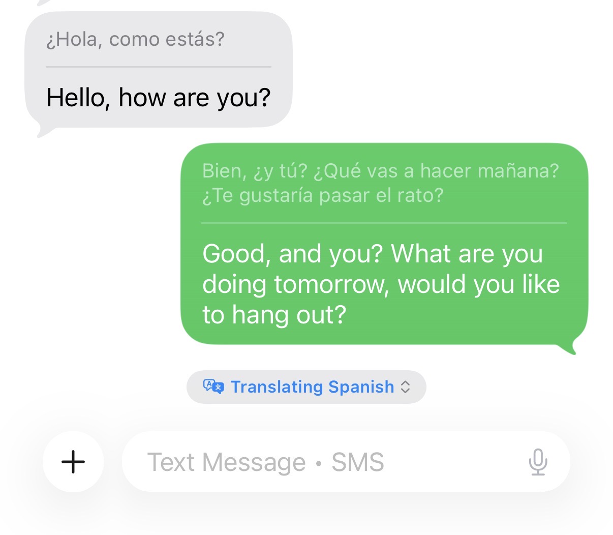
Translating some basic Spanish.
Credit: Scharon Harding
Translating some basic Spanish. Credit: Scharon Harding
During calls or FaceTime, Live Translation sometimes struggled to keep up while it tried to manage the nuances and varying speeds of how different people speak, as well as laughs and other interjections.
However, it’s still remarkable that the iPhone can help remove language barriers without any additional hardware, apps, or fees. It will be even better if Apple can improve reliability and add more languages.
Spatial images on the Home and Lock Screen
The new spatial images feature is definitely on the fluffier side of this iOS update, but it is also a practical way to spice up your Lock Screen, Home Screen, and the Home Screen’s Photos widget.
Basically, it applies a 3D effect to any photo in your library, which is visible as you move your phone around in your hand. Apple says that to do this, iOS 26 uses the same generative AI models that the Apple Vision Pro uses and creates a per-pixel depth map that makes parts of the image appear to pop out as you move the phone within six degrees of freedom.
The 3D effect is more powerful on some images than others, depending on the picture’s composition. It worked well on a photo of my dog sitting in front of some plants and behind a leaf of another plant. I set the display time so that it appears tucked behind her fur, and when I move the phone around, the dog and the leaf in front of her appear to move around, while the background plants stay still.
But in images with few items and sparser backgrounds, the spatial effect looks unnatural. And oftentimes, the spatial effect can be quite subtle.
Still, for those who like personalizing their iPhone with Home and Lock Screen customization, spatial scenes are a simple and harmless way to liven things up. And, if you like the effect enough, a new spatial mode in the Camera app allows you to create new spatial photos.
A note on Apple Intelligence notification summaries
As we’ve already covered in our macOS 26 Tahoe review, Apple Intelligence-based notification summaries haven’t improved much since their 2024 debut in iOS 18 and macOS 15 Sequoia. After problems with showing inaccurate summaries of news notifications, Apple updated the feature to warn users that the summaries may be inaccurate. But it’s still hit or miss when it comes to how easy it is to decipher the summaries.
I did have occasional success with notification summaries in iOS 26. For instance, I understood a summary of a voicemail that said, “Payment may have appeared twice; refunds have been processed.” Because I had already received a similar message via email (a store had accidentally charged me twice for a purchase and then refunded me), I knew I didn’t need to open that voicemail.
Vague summaries sometimes tipped me off as to whether a notification was important. A summary reading “Townhall meeting was hosted; call [real phone number] to discuss issues” was enough for me to know that I had a voicemail about a meeting that I never expressed interest in. It wasn’t the most informative summary, but in this case, I didn’t need a lot of information.
However, most of the time, it was still easier to just open the notification than try to decipher what Apple Intelligence was trying to tell me. Summaries aren’t really helpful and don’t save time if you can’t fully trust their accuracy or depth.
Playful, yet practical
With iOS 26, iPhones get a playful new design that’s noticeable and effective but not so drastically different that it will offend or distract those who are happy with the way iOS 18 works. It’s exciting to experience one of iOS’s biggest redesigns, but what really stands out are the thoughtful tweaks that bring practical improvements to core features, like making and receiving phone calls and taking pictures.
Some additions and changes are superfluous, but the update generally succeeds at improving functionality without introducing jarring changes that isolate users or force them to relearn how to use their phone.
I can’t guarantee that you’ll like the Liquid Glass design, but other updates should make it simpler to do some of the most important tasks with iPhones, and it should be a welcome improvement for long-time users.

Scharon is a Senior Technology Reporter at Ars Technica writing news, reviews, and analysis on consumer gadgets and services. She’s been reporting on technology for over 10 years, with bylines at Tom’s Hardware, Channelnomics, and CRN UK.