“He wanted to make [computers] more usable and friendly to people who weren’t geeks.”
Consider the cul-de-sac. It leads off the main street past buildings of might-have-been to a dead-end disconnected from the beaten path. Computing history, of course, is filled with such terminal diversions, most never to be fully realized, and many for good reason. Particularly when it comes to user interfaces and how humans interact with computers, a lot of wild ideas deserved the obscure burials they got.
But some deserved better. Nearly every aspiring interface designer believed the way we were forced to interact with computers was limiting and frustrating, but one man in particular felt the emphasis on design itself missed the forest for the trees. Rather than drowning in visual metaphors or arcane iconographies doomed to be as complex as the systems they represented, the way we deal and interact with computers should stress functionality first, simultaneously considering both what users need to do and the cognitive limits they have. It was no longer enough that an interface be usable by a human—it must be humane as well.
What might a computer interface based on those principles look like? As it turns out, we already know.
The man was Jef Raskin, and this is his cul-de-sac.
The Apple core of the Macintosh
It’s sometimes forgotten that Raskin was the originator of the Macintosh project in 1979. Raskin had come to Apple with a master’s in computer science from Penn State University, six years as an assistant professor of visual arts at the University of California, San Diego (UCSD), and his own consulting company. Apple co-founder Steve Jobs subsequently hired Raskin’s company to write the Apple II’s BASIC programming manual, and Raskin joined Apple as manager of publications in 1978.
Raskin’s work on documentation and testing, combined with his technical acumen, gave him outsized influence within the young company. As the 40-column uppercase-only Apple II was ill-suited for Raskin’s writing, Apple developed a text editor and an 80-column display card, and Raskin leveraged his UCSD contacts to port UCSD Pascal and the p-System virtual machine to the Apple II when Steve Wozniak developed the Apple II’s floppy disk drives. (Apple sold this as Apple Pascal, and many landmark software programs like the Apple Presents Apple tutorial were written in it.)
But Raskin nevertheless concluded that a complex computer (by the standards of the day) could never exist in quantity, nor be usable by enough people to matter. In his 1979 essay “Computers by the Millions,” he argued against systems like the Apple II and the in-development Apple III that relied on expansion slots and cards for many advanced features. “What was not said was that you then had the rather terrible task of writing software to support these new ‘boards,’” he wrote. “Even the more sophisticated operating systems still required detailed understanding of the add-ons… This creates a software nightmare.”
Instead, he felt that “personal computers will be self-contained, complete, and essentially un-expandable. As we’ll see, this strategy not only makes it possible to write complete software but also makes the hardware much cheaper and producible.” Ultimately, Raskin believed, only a low-priced, low-complexity design could be manufactured in large enough numbers for a future world and be functional there.
The original Macintosh was designed as an embodiment of some of these concepts. Apple chairman Mike Markkula had a $500 (around $2,200 in 2025) game machine concept in mind called “Annie,” named after the Playboy comic character and intended as a low-end system paired with the Apple II—starting at around double that price at the time—and the higher-end Apple III and Lisa, which were then in development. Raskin wasn’t interested in developing a game console, but he did suggest to Markkula that a $500 computer could have more appeal, and he spent several months writing specifications and design documents for the proposed system before it was approved.
“My message,” wrote Raskin in The Book of Macintosh, “is that computers are easy to use, and useful in everyday life, and I want to see them out there, in people’s hands, and being used.” Finding female codenames sexist, he changed Annie to Macintosh after his favorite variety of apple, though using a variant spelling to avoid a lawsuit with the previously existing McIntosh Laboratory. (His attempt was ultimately for naught, as Apple later ended up having to license the trademark from the hi-fi audio manufacturer and then purchase it outright anyway.)
Raskin’s small team developed the hardware at Apple’s repurposed original Cupertino offices separate from the main campus. Initially, he put together a rough all-in-one concept, originally based on an Apple II (reportedly serial number 2) with a “jury-rigged” monitor. This evolved into a prototype chiefly engineered by Burrell Smith, selecting for its CPU the 8-bit Motorola 6809 as an upgrade from the Apple II’s MOS 6502 but still keeping costs low.
Similarly, a color display and a larger amount of RAM would have also added expense, so the prototype had a small 256×256 monochrome CRT driven by the ubiquitous Motorola 6845 CRTC, plus 64K of RAM. A battery and built-in printer were considered early on but ultimately rejected. The interface emphasized text and keyboard: There was no mouse, and the display was character-based instead of graphical.
Raskin was aware of early graphical user interfaces in development, particularly Xerox PARC’s, and he had even contributed to early design work on the Lisa, but he believed the mouse was inferior to trackballs and tablets and felt such pointing devices were more appropriate for graphics than text. Instead, function keys allowed the user to select built-in applications, and the machine could transparently shift between simple text entry or numeric evaluation in a “calculator-based language” depending on what the user was typing.
During the project’s development, Apple management had recurring concerns about its progress, and it was nearly canceled several times. This changed in late 1980 when Jobs was removed from the Lisa project by President Mike Scott, after which Jobs moved to unilaterally take over the Macintosh, which at that time was otherwise considered a largely speculative affair.
Raskin initially believed the change would be positive, as Jobs stated he was only interested in developing the hardware, and his presence and interest quickly won the team new digs and resources. New team member Bud Tribble suggested that it should be able to take advantage of the Lisa’s powerful graphics routines by migrating to its Motorola 68000, and by February 1981, Smith was able to duly redesign the prototype for the more powerful CPU while maintaining its lower-cost 8-bit data bus.
This new prototype expanded graphics to 384×256, allowed the use of more RAM, and ran at 8 MHz, making the prototype noticeably faster than the 5 MHz Lisa yet substantially cheaper. However, by sharing so much of Lisa’s code, the interface practically demanded a pointing device, and the mouse was selected, even though Raskin had so carefully tried to avoid it. (Raskin later said he did prevail with Jobs on the mouse only having one button, which he believed would be easier for novices, though other Apple employees like Larry Tesler have contested his influence on this decision.)
As Jobs started to take over more and more portions of the project, the two men came into more frequent conflict, and Raskin eventually quit Apple for good in March 1982. The extent of Raskin’s residual impact on the Macintosh’s final form is often debated, but the resulting 1984 Macintosh 128K is clearly a different machine from what Raskin originally envisioned. Apple acknowledged Raskin’s contributions in 1987 by presenting him with one of the six “millionth” Macintoshes, which he auctioned off in 1999 along with the Apple II used in the original concept.
A Swyftly tilting project
After Raskin’s departure from Apple, he established Information Appliance, Inc. in Palo Alto to develop his original concept on his own terms. By this time, it was almost a foregone conclusion that microcomputers would sooner or later make their way to everyone; indeed, home computer pioneers like Jack Tramiel’s Commodore were already selling inexpensive “computers by the millions”—literally. With the technology now evolving at a rapid pace, Raskin wanted to concentrate more on the user interface and the concept’s built-in functionality, reviving the ideas he believed had become lost in the Macintosh’s transition. He christened it with a new name: Swyft.
In terms of industrial design, the Swyft owed a fair bit to Raskin’s prior prototype as it was also an all-in-one machine, using a built-in 9” monochrome CRT display. Unlike the Macintosh, however, the screen was set back at an angle and the keyboard was built-in; it also had a small handle at the base of its sloped keyboard making it at least notionally portable.
Disk technology had advanced, so it sported a 3.5-inch floppy drive (also like the Macintosh, albeit hidden behind a door), though initially the prototype used a less-powerful 8-bit MOS 6502 CPU running at 2MHz. The 6502’s 64K addressing limit and the additional memory banking logic it required eventually proved inadequate, and the CPU was changed during development to the Motorola 68008, a cheaper version of the 68000 with an 8-bit data bus and a maximum address space of 1MB. Raskin intended the Swyft to act like an always-on appliance, always ready and always instant, so it had a lower-power mode and absolutely no power switch.
Instead of Pascal or assembly language, Swyft’s ROM operating system was primarily written in Forth. To reduce the size of the compiled code, developer Terry Holmes created a “tokenized” version that embedded smaller tokens instead of execution addresses into Forth word definitions, trading the overhead of an additional lookup step (which was written in hand-coded assembly and made very quick) for a smaller binary size. This modified dialect was called tForth (for “token,” or “Terry”). The operating system supported the hardware and the demands of the on-screen bitmapped display, which could handle true proportional text.
Swyft’s user interface was also radically different and was based on a “document” metaphor. Most computers of that time and today, mobile devices included, divide functionality among separate applications that access files. Raskin believed this approach was excessive and burdensome, writing in 1986 that “[b]y choosing to focus on computers rather than the tasks we wanted done, we inherited much of the baggage that had accumulated around earlier generations of computers. It is more a matter of style and operating systems that need elaborate user interfaces to support huge application programs.”
He expanded on this point in his 2000 book The Humane Interface: “[Y]ou start in the generating application. Your first step is to get to the desktop. You must also know which icons correspond to the desired documents, and you or someone else had to have gone through the steps of naming those documents. You will also have to know in which folder they are stored.”
Raskin thus conceived of a unified workspace in which everything was stored, accessed through one single interface appearing to the user as a text editor editing one single massive document. The editor was intelligent and could handle different types of text according to its context, and the user could subdivide the large document workspace into multiple subdocuments, all kept together. (This even included Forth code, which the user could write and evaluate in place to expand the system as they wished.) Data received from the serial port was automatically “typed” into the same document, and any or all text could be sent over the serial port or to a printer. Instead of function keys, a USE FRONT key acted like an Option or Command key to access special features.
Because everything was kept in one place, when the user saved the system state to a floppy disk, their entire workspace was frozen and stored in its entirety. Swyft additionally tagged the disk with a unique identifier so it knew when a disk was changed. When that disk was reinserted and resumed, the user picked up exactly where they left off, at exactly the same point, with everything they had been working on. Since everything was kept together and loaded en masse, there was no need for a filesystem.
Swyft also lacked a mouse—or indeed any conventional means of moving the cursor around. To navigate through the document, Swyft instead had LEAP keys, which when pressed alone would “creep” forward or backward by single characters. But when held down, you could type a string of characters and release the key, and the system would search forward or backward for that string and highlight it, jumping entire pages and subdocuments if necessary.
If you knew what was in a particular subdocument, you could find it or just LEAP forward to the next document marker to scan through what was there. Additionally, by leaping to one place, leaping again to another, and then pressing both LEAP keys together, you could select text as well. The steps to send, delete, change, or copy anything in the document are the same for everything in the document. “So the apparent simplicity [of other systems] is arrived at only after considerable work has been done and the user has shouldered a number of mental burdens,” wrote Raskin, adding, “the conceptual simplicity of the methods outlined here would be preferable. In most cases, the work required is also far less.”
Get something on sale faster, said Tom Swyftly
While around 60 Swyft prototypes of varying functionality were eventually made, IAI’s backers balked at the several million dollars additionally required to launch the product under the company’s own name. To increase their chances of a successful return on investment, they demanded a licensee for the design instead that would insulate the small company from the costs of manufacturing and sales. They found it in Japanese manufacturer Canon, which had expanded from its core optical and imaging lines into microcomputers but had spent years unsuccessfully trying to crack the market. However, possibly because of its unusual interface, Canon unexpectedly put its electronic typewriter division in charge of the project, and the IAI team began work with Canon’s engineers to refine the hardware for mass production.
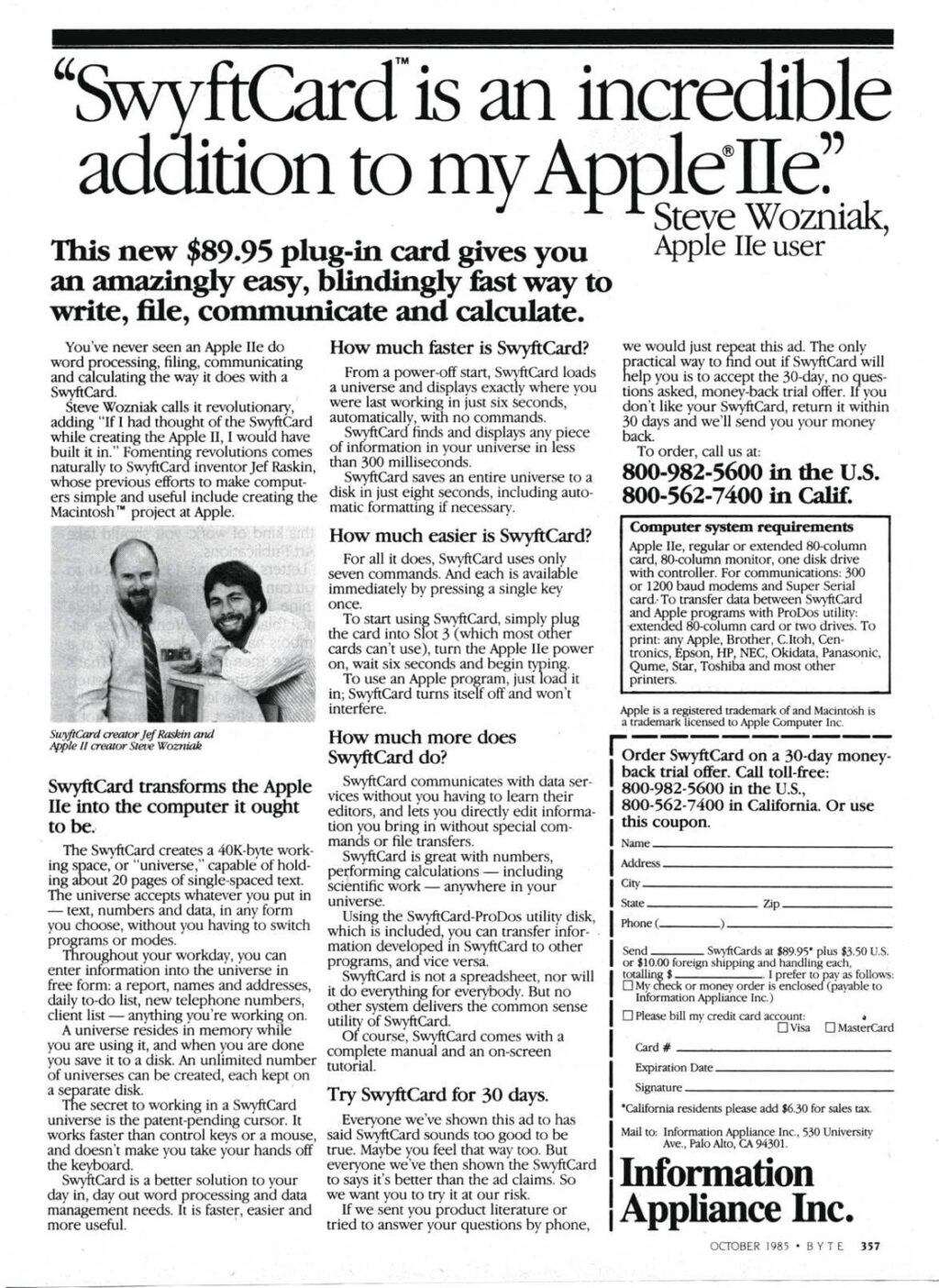
SwyftCard advertisement in Byte, October 1985, with Jef Raskin and Steve Wozniak.
In the meantime, IAI investors prevailed upon management to find a way to release some of the Swyft technology early in a less expensive incarnation. This concept eventually turned into an expansion card for the Apple IIe. Raskin’s team was able to adapt some of the code written for the Swyft to the new device, but because the IIe is also a 6502-based system and is itself limited to a 64K address space, it required its own onboard memory banking hardware as well. With the card installed, the IIe booted into a scaled-down Swyft environment using its onboard 16K EPROM, with the option of disabling it temporarily to boot regular Apple software. Unlike the original Swyft, the Apple II SwyftCard does not use the bitmap display and appears strictly in 80-column non-proportional text. The SwyftCard went on sale in 1985 for $89.95, approximately $270 in 2025 dollars.
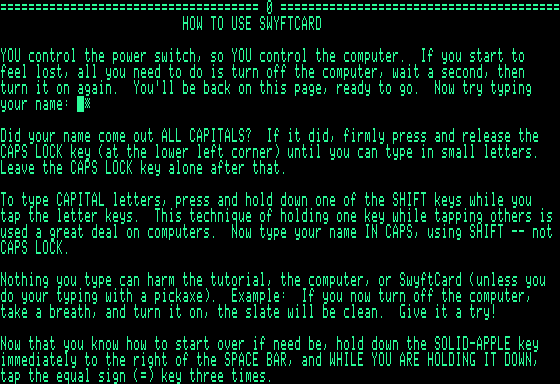
The initial SwyftCard tutorial page. Credit: Cameron Kaiser
The SwyftCard’s unified workspace can be subdivided into various “subdocuments,” which appear as hard page breaks with equals signs. Although up to 200 pages were supported, in practice, the available workspace limits you to about 15 or 20, “densely typed.” It came with a built-in tutorial which began with orienting you to the LEAP keys (i.e., the two Apple keys) and how to navigate: hold one of them down and type the text to leap to (or equals signs to jump to the next subdocument), or tap them repeatedly to slowly “creep.”
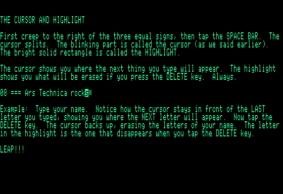
The two-tone cursor. Credit: Cameron Kaiser
Swyft and the SwyftCard implement a two-phased cursor, which the SwyftCard calls either “wide” or “narrow.” By default, the cursor is “narrow,” alternating between a solid and a partially filled block. As you type, the cursor splits into a “wide” form—any text shown in inverse, usually the last character you entered, is what is removed when you press DELETE, with the blinking portion after the inverse text indicating the insertion point. When you creep or leap, the cursor merges back into the “narrow” form. When narrow, DELETE deletes right as a true delete, instead of a backspace. If you selected text by pressing both LEAP keys together, those become highlighted in inverse and can be cut and pasted.
The SwyftCard software defines a USE FRONT key (i.e., the Control key) as well. This was most noticeable as a quick key combination for saving your work to disk, to which the entire workspace was saved in one go with no filenames (i.e., one disk equated one workspace), though it had many other such functions within the program. Since it could be tricky to juggle floppies without overwriting them, the software also took pains to ensure each formatted disk was tagged with a unique identifier to avoid accidental erasure. It also implemented serial communications such that you could dial up a remote system and use USE FRONT-SEND to send it or be dialed into and receive text into the workspace automatically.
SwyftCards didn’t sell in massive numbers, but their users loved them, particularly the speed and flexibility the system afforded. David Thornburg (the designer of the KoalaPad tablet), writing for A+ in November 1985, said it “accomplished something that I never knew was possible. It not only outperforms any Apple II word-processing system, but it lets the Apple IIe outperform the Macintosh… Will Rogers was right: it does take genius to make things simple.”
The Swyft and SwyftCard, however, were as much philosophy as interface; they represented Raskin’s clear desire to “abolish the application.” Rather than starting a potentially different interface to do a particular task, the task should be part of the machine’s standard interface and be launched by direct command. Similarly, even within the single user interface, there should be no “modes” and no switching between different minor behaviors: the interface ought to follow the same rules as much of the time as possible.
“Modes are a significant source of errors, confusion, unnecessary restrictions, and complexity in interfaces,” Raskin wrote in The Humane Interface, illustrating it with the example of “at one moment, tapping Return inserts a return character into the text, whereas at another time, tapping Return cases the text typed immediately prior to that tap to be executed as a command.”
Even a device as simple as a push-button flashlight is modal, argued Raskin, because “[i]f you do not know the present state of the flashlight, you cannot predict what a press of the flashlight’s button will do.” Even if an individual application itself is notionally modeless, Raskin presented the real-world example of Command-N commonly used to open a new document but AOL’s client using Command-M for a new E-mail message; the situation “that gives rise to a mode in this example consists of having a particular application active. The problem occurs when users employ the Command-N command habitually,” he wrote.
Ultimately, wrote Raskin, “[a]n interface is humane if it is responsive to human needs and considerate of human frailties.” In this case, the particular frailty Raskin concentrated on is the natural unconscious human tendency to form habitual behaviors. Because such habits are hard to break, command actions and gestures in an interface should be consistent enough that their becoming habitual makes them more effective, allowing a user to “do the task without having to think about it… We must design interfaces that (1) deliberately take advantage of the human trait of habit development and (2) allow users to develop habits that smooth the flow of their work.” If a task is always accomplished the same way, he asserted, then when the user has acquired the habit of doing so, they will have simultaneously mastered that task.
The Canon Cat’s one and only life
Raskin’s next computer preserved many such ideas from the Swyft, but it only did so in spite of the demands of Canon management, who forced multiple changes during development. Although the original Swyft (though not the SwyftCard) had true proportional text and at least the potential for user-created graphics, Canon’s electric typewriter division was then in charge of the project and insisted on non-proportional fixed-width text and no graphics, because that’s all the official daisywheel printer could generate—even though the system’s bitmapped display remained. (A laser printer option was later added but was nevertheless still limited to text.)
Raskin wanted to use a Mac-like floppy drive that could automatically detect floppy disk insertion, but Canon required the system to use their own floppy drives, which didn’t. Not every change during development was negative. Much of the more complicated Swyft logic board was consolidated into smaller custom gate array chips for mass production, along with the use of a regular 68000 instead of the more limited 68008, which was also cheaper in volume despite only being run at 5MHz.
However, against his repeated demands to the contrary and lengthy explanations of the rationale, Raskin was dismayed to find the device was nevertheless fitted with a power switch; Canon’s engineering staff said they simply thought an error had been made and added it, and by then, it was too late in development to remove it.
Canon management also didn’t understand the new machine’s design philosophy, treating it as an overgrown word processor (dubbed a “WORK Processor [sic]”) instead of the general-purpose computer Raskin intended, and required its programmability in Forth to be removed. This was unpopular with Raskin’s team, so rather than remove it completely, they simply hid it behind an unlikely series of keystrokes and excised it from the manual. On the other hand, because Canon considered it an overgrown word processor, it seemed entirely consistent to keep the Swyft’s primary interface intact otherwise, including its telecommunication features. The new system also got a new name: the Cat.
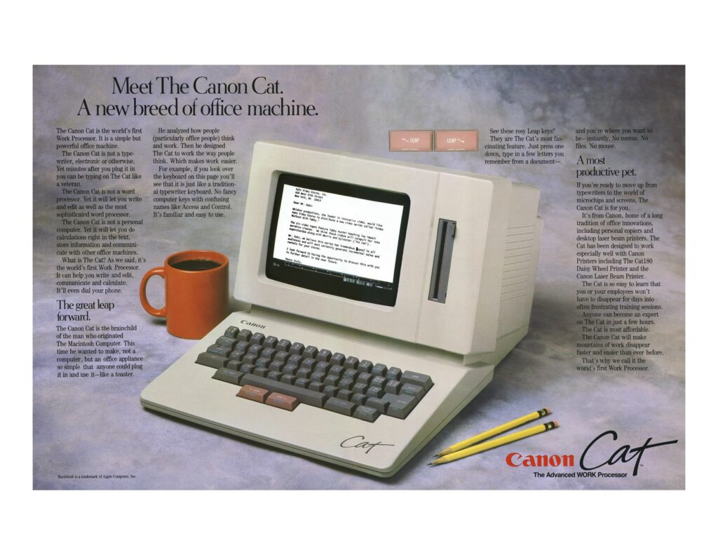
Canon Cat advertising brochure.
Thus was released the Canon Cat, announced in July 1987, for $1,495 (about $4,150 in 2025 dollars ). The released version came with 256K of RAM, with sockets to add an optional 128K more for 384K total, shared between the video circuitry, Forth dictionary, settings, and document text, all of which could be stored to the 3.5-inch floppy. (Another row of solder pads could potentially hold yet another 128K, but no shipping Cat ever populated it.)
Its 256K of system ROM contained the entirety of the editor and tForth runtime, plus built-in help screens, all immediately available as soon as you turned it on. An additional 128K ROM provided a 90,000-word dictionary to which the user could add words that were also automatically saved to the same disk. The system and dictionary ROMs came in versions for US and UK English, French, and German.
The Canon Cat. Cameron Kaiser
Like the Swyft it was based on, the Cat was an all-in-one system. The 9-inch monochrome CRT was retained, but the floppy drive no longer had a door, and the keyboard was extended with several special keys. In particular, the LEAP keys, as befitting their central importance, were given a row to themselves in an eye-catching shade of pink.
Function key combinations with USE FRONT are printed on the front of the keycaps. The Cat provided both a 1200 baud modem and a 9600bps RS-232 connector for serial data; it could dial out or be dialed into to upload text. Text transmitted to the Cat via the serial port was inserted into the document as if it had been typed in at the console. A Centronics-style printer port connected Canon’s official printer options, though many printers were compatible.
The Cat can be (imperfectly) emulated with MAME; the Internet Archive has a preconfigured Wasm version with Canon ROMs that you can also run in your browser. Note that the current MAME driver, as of this writing, will freeze if the emulated Cat makes a beep, and the ROM’s default keyboard layout assumes you’re using a real Cat, not a PC or Mac. These minor issues can be worked around in the emulated Cat’s setup menu by setting the problem signal to Flash (without a beep) and the keyboard to ASCII. The screenshots here are taken from MAME and adjusted to resemble the Cat’s display aspect ratio.
The Swyft and SwyftCard’s editing paradigm transferred to the Canon Cat nearly exactly. Preserved is the “wide” and “narrow” cursor, showing both the deletion range and the insertion point, as well as the use of the LEAP keys to creep, search, and select text ranges. (In MAME, the emulated LEAP keys are typically mapped to both Alt or Option keys.) SHIFT-LEAP can also be used to scroll the screen line by line, tapping LEAP repeatedly with SHIFT down to continue motion, and the Cat additionally implements a single level of undo with a dedicated UNDO key. The USE FRONT key also persisted, usually mapped in MAME to the Control key(s). Text could be bolded or underlined.
Similarly, the Cat inherits the same “multiple document interface” as the Swyfts: the workspace can be arbitrarily divided into documents, here using the DOCUMENT/PAGE key (mapped usually to Page Down in MAME), and the next or previous document can be LEAPed to by using the DOCUMENT/PAGE key as the target.
However, the Cat has an expanded interface compared to the SwyftCard, with a ruler (in character positions) at the bottom, text and keyboard modes, and open areas for on-screen indicators when disk access or computations are in progress.
Calculating data with the Canon Cat. Credit: Cameron Kaiser
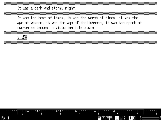
Although Canon had mandated that the Cat’s programmability be suppressed, the IAI team nevertheless maintained the ability to compute expressions, which Canon permitted as an extension of the editor metaphor. Simple arithmetic such as 355/113 could be calculated in place by selecting the text and pressing USE FRONT-CALC (Control-G), which yields the answer with a dotted underline to indicate the result of a computation. (Here, the answer is computed to the default two decimal digits of precision, which is configurable.) Pressing USE FRONT-CALC within that answer reopens the expression to change it.
Computations weren’t merely limited to simple figures, though; the Cat also allowed users to store the result of a computation to a variable and reference that variable in other computations. If the variables underlying a particular computation were changed, its result would automatically update.
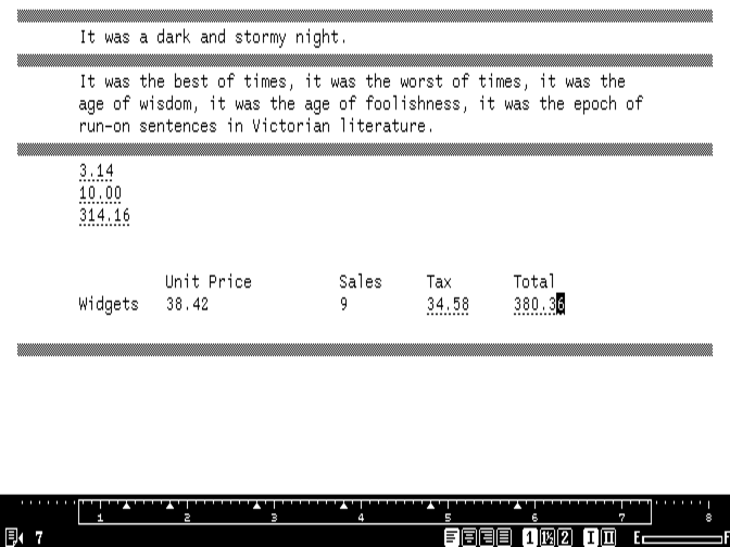
A spreadsheet built with expressions on the Cat. Credit: Cameron Kaiser
This capability, along with the Cat’s non-proportional font, made it possible to construct simple spreadsheets right in the editor using nothing more than expressions and the TAB key to create rows and columns. Cells can be referred to by expressions in other cells using a special function use() with relative coordinates. Constant values in “cells” can simply be entered as plain text; if recalculation is necessary, USE FRONT-CALC will figure it out. The Cat could also maintain and sort simple line lists, which, when combined with the LEARN macro facility, could be used to automate common tasks like mail merges.
The Canon Cat’s built-in on-line help facility. Credit: Cameron Kaiser
The Cat also maintained an extensive set of help screens built into ROM that the SwyftCard, for capacity reasons, was forced to load from floppy disk. Almost every built-in function had a documentation screen accessible from USE FRONT-HELP (Control-N): keep USE FRONT down, release the N key, and then press another key to learn about it. When the USE FRONT key is also released, the Cat instantly returns to the editor. Similarly, if the Cat beeped to indicate an error, pressing USE FRONT-HELP could also explain why. Errors didn’t trigger a modal dialogue or lock out system functions; you could always continue.
Internally, the current workspace contained not only the visible text documents but also any custom words the user added to the dictionary and any additional tForth words defined in memory. Ordinarily, there wouldn’t be any, given that Canon didn’t officially permit the user to program their own software, but there were a very small number of software applications Canon itself distributed on floppy disk: CATFORM, which allowed the user to create, fill out, and print form templates, and CATFILE, Canon’s official mailing list application. Dealers were instructed to provide new users with copies, though the Cat here didn’t come with them. Dealers also had special floppies of their own for in-store demos and customization.
The backdoor to Canon Cat tForth. Credit: Cameron Kaiser
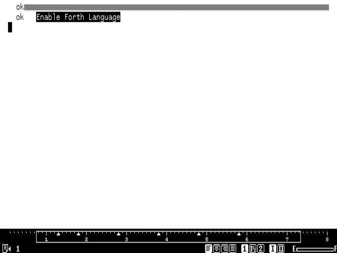
Still, IAI’s back door to Forth quietly shipped in every Cat, and the clue was a curious omission in the online help: USE FRONT-ANSWER. This otherwise unexplained and unused key combination was the gateway. If you entered the string Enable Forth Language, highlighted it, and evaluated it with USE FRONT-ANSWER (not CALC; usually Control-Backspace in MAME), you’d get a Forth ok prompt, and the system was now yours. Reset the Cat or type re to return to the editor.
With Forth enabled, you could either enter code at the prompt, or do so within the editor and press USE FRONT-ANSWER to evaluate it, putting any output into the document just like Applesoft BASIC did on the SwyftCard. Through the Forth interface it was possible to define your own words, saved as part of the workspace, or even hack in 68000 machine code and completely take control of the machine. Extensive documentation on the Cat’s internals eventually surfaced, but no third-party software was ever written for the platform during its commercial existence.
As it happened, whatever commercial existence the Cat did have turned out to be brief and unprofitable anyway. It sold badly, blamed in large part on Canon’s poor marketing, which positioned it as an expensive dedicated word processor in an era where general-purpose PCs and, yes, Macintoshes were getting cheaper and could do more.
Various apocryphal stories circulate about why the Cat was killed—one theory cites internal competition between the typewriter and computer divisions; another holds that Jobs demanded the Cat be killed if Canon wanted a piece of his new venture, NeXT (and Owen Linzmeyer reports that Canon did indeed buy a 16 percent stake in 1989)—but regardless of the reason, it lasted barely six months on the market before it was canceled. The 1987 stock market crash was a further blow to the small company and an additional strain on its finances.
Despite the Cat’s demise, Raskin’s team at IAI attempted to move forward with a successor machine, a portable laptop that would have reportedly weighed just four pounds. The new laptop, christened the Swyft III, used a ROM-based operating system based on the Cat’s but with a newer, more sophisticated “leaping” technology called Hyperleap. At $999, it was to include a 640×200 supertwist LCD, a 2400 bps modem and 512K of RAM (a smaller $799 Swyft I would have had less memory and no modem), as well as an external floppy drive and an interchange facility for file transfers with PCs and Macs.
As Raskin had originally intended, the device achieved its claimed six-hour battery life (NiCad or longer with alkaline) primarily by aggressively sleeping when idle but immediately resuming full functionality when a key was pressed. Only two prototypes were ever made before IAI’s investors, considering the company risky after the Cat’s market failure and little money coming in, finally pulled the plug and caused the company to shut down in 1992. Raskin retained patents on the “leaping” method and the Swyft/Cat’s means of saving and restoring from disk, but their subsequent licensees did little with the technology, and the patents in the present day have lapsed.
If you can’t beat ’em, write software
The Cat is probably the best known of Raskin’s designs (notwithstanding the Macintosh, for reasons discussed earlier), especially as Raskin never led the development of another computer again. Nevertheless, his interface ideas remained influential, and after IAI’s closing, he continued as an author and frequent consultant and reviewer for various consumer products. These observations and others were consolidated into his later book The Humane Interface, from which this article has already liberally quoted. On the page before the table of contents, the book observes that “[w]e are oppressed by our electronic servants. This book is dedicated to our liberation.”
In The Humane Interface, Raskin not only discusses concepts such as leaping and habitual command behaviors but means of quantitative assessment as well. One of the more well-known is Fitts’ Law, after psychologist Paul Fitts, Jr., that predicts the time needed to quickly move to a target area is correlated with both the size of the target and its distance from the starting position.
This has been most famously used to justify the greater utility of a global menu bar completely occupying the edge of a screen (such as in macOS) because the mouse pointer stops at the edge, making the menu bar effectively infinitely large and therefore easy to “hit.” Similarly, Hick’s law (or the Hick-Hyman law, named for psychologists William Edmund Hick and Ray Hyman) asserts that increasing the number of choices a user is presented with will increase their decision time logarithmically. Given experimental constants, both laws can predict how long a user will need to hit a target or make a choice.
Notably, none of Raskin’s systems (at least as designed) superficially depended on either law because they had no explicit pointing device and no menus to select from. A more meaningful metric he also considers might be the Card-Moran-Newell GOMS model (“goals, objects, methods and selection rules”) and how it applies to user motion. While the time needed to mentally prepare, press a key, point to a particular position on the display or move from input device to input device (say, mouse to-and-from keyboard) will vary from person to person, most users will have similar times, and general heuristics exist (e.g., nonsense is easier to type than structured data).
However, the length of time the computer takes to respond is within the designer’s control, and its perception can be reduced by giving prompt and accurate feedback, even if the operation’s actual execution time is longer. Similarly, if we reduce keystrokes or reduce having to move from mouse to keyboard for a given task, the total time to perform that task becomes less for any user.
Although these timings can help to determine experimentally which interface is better for a given task, Raskin points out we can use the same principles to also determine the ideal efficiency of such interfaces. An interface that gives the user no choices but still must be interacted with is maximally inefficient because the user must do some non-zero amount of work to communicate absolutely no information.
A classic example might be a modal alert box with only one button—asynchronous or transparent notifications could be better used instead. Likewise, an interface with multiple choices will nevertheless become less efficient if certain choices are harder or more improbable to access, such as buttons or click areas being smaller than others, or a particular choice needing more typing to select than other choices.
Raskin’s book also considers alternative means of navigation, pointing out that “natural” and “intuitive” are not necessarily synonyms for “easy to use.” (A mouse can be easy to use, but it’s not necessarily natural or intuitive. Recall Scotty in Star Trek IV picking up the Macintosh Plus mouse and talking to it instead of trying to move it, and then eventually having to use the keyboard. Raskin cites this very scene, in fact.)
Besides leaping, Raskin also presents the idea of a zooming user interface (ZUI), allowing the user an easier way to not only reach their goal but also see themselves in relationship to that goal and within the entire workspace. If you see what you want, zoom in. If you’ve lost your place, zoom out. One could access a filesystem this way, or a collection of applications or associated websites. Raskin was hardly the first to propose the ZUI—Ivan Sutherland developed a primitive ZUI for graphics in his 1962 Sketchpad, along with the Spatial Dataland at MIT and Xerox PARC’s Smalltalk with “infinite” desktops—but he recognized its unique abilities to keep a user mentally grounded while navigating large structures that would otherwise become unwieldy. This, he asserts, made it more humane.
To crystallize these concepts, rather than create another new computer, Raskin instead started work on a software package with a team that included his son, Aza, initially called The Humane Environment. THE’s HumaneEditorProject was first unveiled to the world on Christmas Eve 2002, though initially only as a SourceForge CVS tree, since it was considered very unfinished. The original early builds of the Humane Editor were open-source and intended to run on classic Mac OS 9, though QEMU, SheepShaver and Classic under Tiger and earlier will also run it.
Default document. Credit: Cameron Kaiser
As before, the Humane Editor uses a large central workspace subdivided into individual documents, here separated by backtick characters. Our familiar two-tone cursor is also maintained. However, although font sizes, boldface, italic, and underlining were supported, colors (and, additionally, font sizes) were still selected by traditional Mac pulldown menus.
Leaping with the SHIFT and angle bracket keys. Credit: Cameron Kaiser
Leaping, here with a trademark, is again front and center in THE. However, instead of dedicated keys, leaping is merely a part of THE’s internal command line, termed the Humane Quasimode, where other commands can be sent. Notice that the prompt is displayed as translucent text over the work area.
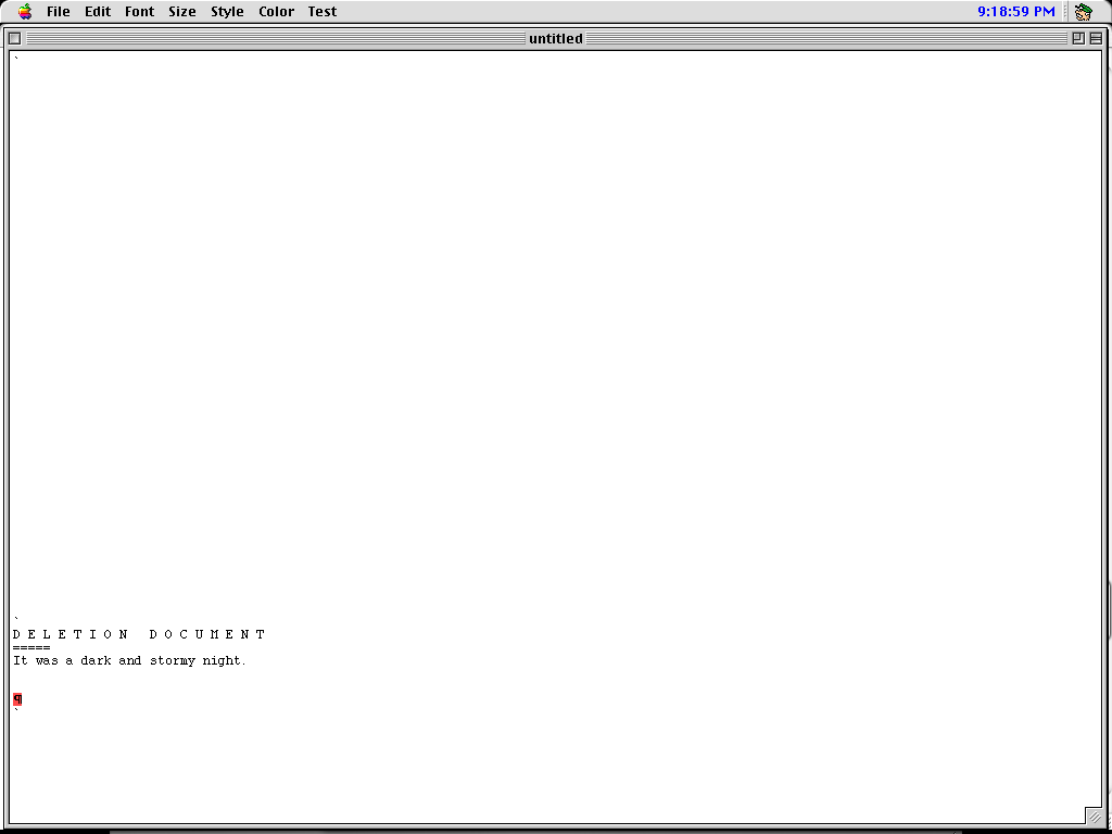
The Deletion Document. Credit: Cameron Kaiser
When text was deleted, either by backspacing over it or pressing DELETE with a selected region, it went to an automatically created and maintained “DELETION DOCUMENT” from which it could be rescued. Effectively, this turned the workspace into a yank buffer along with all your documents, and undoing any destructive editing operation thus became merely another cut and paste. (Deleting from the deletion document just deleted.)
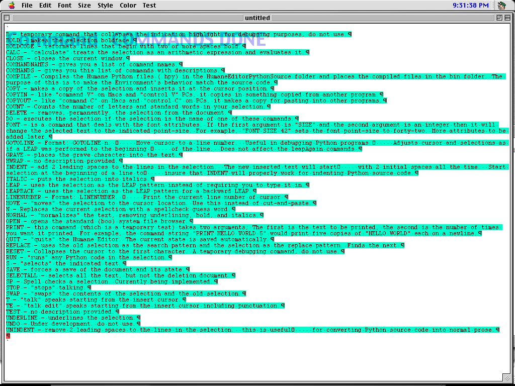
Command listing. Credit: Cameron Kaiser
A full list of commands accepted by the Quasimode was available by typing COMMANDS, which in turn emitted them to the document. These are based on precompiled Python files, which the user could edit or add to, and arbitrary Python expressions and code could also be inserted and run from the document workspace directly.
THE was a fully functioning editor, albeit incomplete, but nevertheless capable enough to write its own documentation with. Despite that, the intention was never to make something that was just an editor, and this aspiration became more obvious as development progressed. To make the software available on more platforms, development subsequently changed to wxPython in 2004, and later Python and Pygame to handle the screen display. The main development platform switched at the same time to Windows, and a Windows demo version of this release was made, although Mac OS X and Linux could still theoretically run it if you installed the prerequisites.
With the establishment of the Raskin Center for Humane Interfaces (RCHI), THE’s development continued under a new name, Archy. (This Wayback Machine link is the last version of the site before it was defaced and eventually domain-parked.) The new name was both a pun on “RCHI” and a reference to the Don Marquis characters, Archy and Mehitabel, specifically Archy the typewriting cockroach, whose alleged writings largely lack capital letters or punctuation because he couldn’t hit the SHIFT key at the same time. Archy’s final release shown here was the unfinished build 124, dated December 15, 2005.
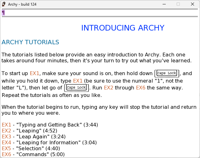
The initial Archy window. Credit: Cameron Kaiser
Archy had come a long way from the original Mac THE, finally including the same sort of online help tutorial that the SwyftCard and Cat featured. It continued the use of a dedicated key to enter commands—in this case, CAPS LOCK. Hold it down, type the command, and then release it.
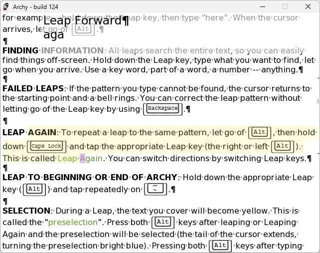
Leaping in Archy. Credit: Cameron Kaiser
Likewise, dedicated LEAP keys returned in Archy, in this case Left and Right Alt, and as before, selection was done by pressing both LEAP keys. A key advancement here is that any text that would be selected, if you chose to select it, is highlighted beforehand in a light shade of yellow so you no longer had to remember where your ranges were.
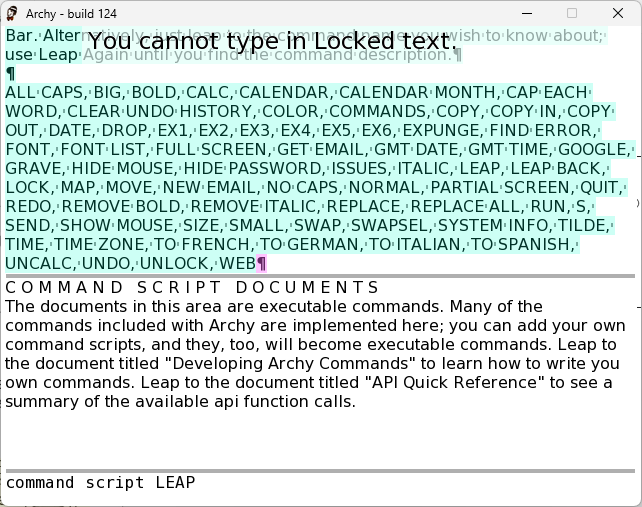
A list of commands in Archy. Credit: Cameron Kaiser
As before, the COMMANDS verb gave you a list of commands. While THE’s command suite was almost entirely specific to an editor application, Archy’s aspirations as a more complete all-purpose environment were evident. In particular, in addition to many of the same commands we saw on the Mac, there were now special Internet-oriented commands like EMAIL and GOOGLE. These commands were now just small documents containing Python embedded in the same workspace—no more separate files you had to corral. You could even change built-in commands, and even LEAP itself.
As you might expect, besides the deletion document (now just “DELETIONS”), things like your email were also now subdocuments, and your email server settings were a subdocument, too. While this was never said explicitly, a logical extension of the metaphor would have been to subsume webpage contents as in-place parts of the workspace as well—your history, bookmarks, and even the pages themselves could be subdocuments of their own, restored immediately and ready for access when entering Archy. Each time you exited, the entire workspace was saved out into a versioned file, so you could even go back in time to a recent backup if you blew it.
Raskin’s legacy
Raskin was found to have pancreatic cancer in December 2004 and, after transitioning the project to become Archy the following January, died shortly afterward on February 26, 2005. In Raskin’s New York Times obituary, Apple software designer Bill Atkinson lauded his work, saying, “He wanted to make them [computers] more usable and friendly to people who weren’t geeks.” Technology journalist Steven Levy agreed, adding that “[h]e really spent his life urging a degree of simplicity where computers would be not only easy to use but delightful.” He left behind his wife Linda Blum and his three children, Aza, Aviva, and Aenea.
Archy was the last project Raskin was directly involved in, and to date it remains unfinished. Some work continued on the environment after his death—this final release came out in December 2005, nearly 10 months later—but the project was ultimately abandoned, and many planned innovations, such as a ZUI of its own, were never fully developed beyond a separate proof of concept.
Similarly, many of Raskin’s more unique innovations have yet to reappear in modern mainstream interfaces. RCHI closed as well and was succeeded in spirit by the Chicago-based Humanized, co-founded by his son Aza. Humanized reworked ideas from Archy into Enso, which expanded the CAPS LOCK-as-command interface with a variety of verbs such as OPEN (to start applications) and DEFINE (to get the dictionary definition of a word), and the ability to perform direct web searches.
By using a system-wide translucent overlay similar to Archy and THE, the program was intended to minimize the need for switching back and forth between multiple applications to complete a task. In 2008, Enso was made free for download, and Humanized’s staff joined Mozilla, where the concept became a Firefox browser extension called Ubiquity, in which web-specific command verbs could be written in JavaScript and executed in an opaque pop-up window activated by a hotkey combination. However, the project was placed on “indefinite hiatus” in 2009 and was never revisited, and it no longer works with current versions of the browser.
Using Raskin 2 on a MacBook Air to browse images. Credit: Cameron Kaiser
The idea of a single workspace that you “leap through” also never resurfaced. Likewise, although ZUI-like animations have appeared more or less as eye candy in environments such as iOS and GNOME, a pervasive ZUI has yet to appear in (or as) any major modern desktop environment. That said, the idea is visually appealing, and some specific applications have made heavier use of the concept.
Microsoft’s 2007 Deepfish project for Windows Mobile conceived of visually shrunken webpages for mobile devices that users could zoom into, but it was dependent on a central server and had high bandwidth requirements, and Microsoft canceled it in 2008. A Swiss company named Raskin Software LLC (apparently no official relation) offers a macOS ZUI file and media browser called Raskin, which has free and paid tiers; on other platforms, the free open-source Eagle Mode project offers a similar file manager with media previews, but also a chess application, a fractal viewer, and even a Linux kernel configuration tool.
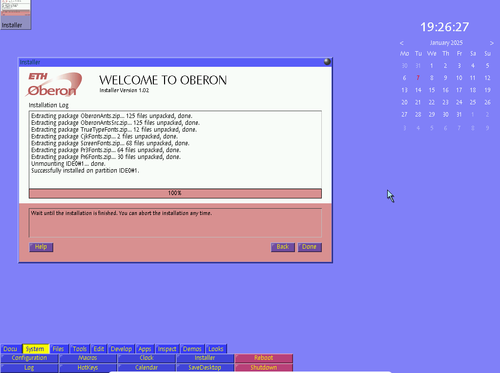
A2 desktop with installer, calendar and clock. Credit: LoganJustice via Wikimedia (CC0)
Perhaps the most complete example of an operating environment built around a ZUI might be A2, a branch of the ETH-Zürich Oberon System. The Oberon System, based around the Oberon programming language descended from Modula-2 and Pascal, was already notable for its unique paneled text user interface, where text is clickable, including text you type; Native Oberon can be booted directly as an operating system by itself.
In 2002, A2 spun off initially as Active Object System, using an updated dialect called Active Oberon supporting improved scheduling, exception handling, and object-oriented programming with processes and threads able to run within an object’s context to make that object “active.” While A2 kept the Oberon System’s clickable text metaphor, windows and gadgets can also be zoomed in or out of on an infinitely scrolling desktop, which is best appreciated in action. It is still being developed, and older live CDs are still available. However, the Oberon System has never achieved general market awareness beyond its small niche, and any forks less so, limiting it to a practical curiosity for most users.
This isn’t to say that Raskin’s quest for a truly humane computer has completely come to naught. Unfortunately, in some respects, we’re truly backsliding, with opaque operating systems that can limit your application choices or your ability to alter or customize them, and despite very public changes in skinning and aesthetics, the key ways that we interact with our computers have not substantially changed since the wide deployment of the Xerox PARC-derived “WIMP” paradigm (windows, icons, menus and pointers)—ironically most visibly promoted by the 1984 post-Raskin Macintosh.
A good interface unavoidably requires work and study, two things that take too long in today’s fast-paced product cycle. Furthermore, Raskin’s emphasis on built-in programmability nevertheless rings a bit quaint in our era, when many home users’ only computer may be a tablet. By his standards, there is little humane about today’s computers, and they may well be less humane than yesterday’s.
Nevertheless, while Raskin’s ideas may have few present-day implementations, that doesn’t mean the spirit in which they were proposed is dead, too. At the very least, some greater consideration is given to the traditional WIMP paradigm’s deficiencies today, particularly with multiple applications and windows, and how it can poorly serve some classes of users, such as those requiring assistive technology. That said, I hold guarded optimism about how much change we’ll see in mainstream systems, and Raskin’s editor-centric, application-less interface becomes more and more alien the more the current app ecosystem reigns dominant.
But as cul-de-sacs go, you can pick far worse places to get lost in than his, and it might even make it out to the main street someday. Until then, at least, you can always still visit—in an upcoming article, we’ll show you how.
Selected bibliography
Linzmeyer, Owen W (2004). Apple Confidential 2.0. No Starch Press, San Francisco, CA.
Raskin, Jef (2000). The humane interface: new directions for designing interactive systems. Addison-Wesley, Boston, MA.
Making the Macintosh: Technology and Culture in Silicon Valley. https://web.stanford.edu/dept/SUL/sites/mac/earlymac.html
Canon’s Cat Computer: The Real Macintosh. https://www.landsnail.com/apple/local/cat/canon.html
Prototype to the Canon Cat: the “Swyft.” https://forum.vcfed.org/index.php?threads/prototype-to-the-canon-cat-the-swyft.12225/
Apple //e and Cat. http://www.regnirps.com/Apple6502stuff/apple_iie_cat.htm