If you’re a Mac user with Logitech accessories and you’ve noticed that your settings and customizations seem to have gone away this week, you’re not alone.
The company’s Logi Options+ and G Hub apps for macOS abruptly stopped functioning on Monday, refusing to launch and reverting all accessories’ settings to their built-in defaults.
The culprit, according to both a Logitech support page and Reddit posts from Logitech Head of Global Marketing Joe Santucci, was a security certificate that was inadvertently allowed to expire, rendering both apps non-functional.
“The certificate that expired is used to secure inter-process communications and the expiration results in the software not being able to start successfully,” wrote Santucci in one post. “We dropped the ball here,” he said in another post. “This is an inexcusable mistake. We’re extremely sorry for the inconvenience caused.”
Logitech is already offering patches for both apps that include an updated certificate. But unfortunately for users, one of the features broken by the expired certificate is the app’s built-in updater, meaning that there’s no automated way for Logitech to fix this problem. Anyone who wants their apps to work and their customizations to return will need to manually grab the patch (or updated versions of the apps, which Logitech says it is also working on). If you use both apps, each will need to be patched separately.
After several weeks of testing, Apple has released the final versions of the 26.1 update to its various operating systems. Those include iOS, iPadOS, macOS, watchOS, tvOS, visionOS, and the HomePod operating system, all of which switched to a new unified year-based version numbering system this fall.
This isn’t the first update that these operating systems have gotten since they were released in September, but it is the first to add significant changes and tweaks to existing features, addressing the early complaints and bugs that inevitably come with any major operating system update.
One of the biggest changes across most of the platforms is a new translucency control for Liquid Glass that tones it down without totally disabling the effect. Users can stay with the default Clear look to see the clearer, glassier look that allows more of the contents underneath Liquid Glass to show through, or the new Tinted look to get a more opaque background that shows only vague shapes and colors to improve readability.
For iPad users, the update re-adds an updated version of the Slide Over multitasking mode, which uses quick swipes to summon and dismiss an individual app on top of the apps you’re already using. The iPadOS 26 version looks a little different and includes some functional changes compared to the previous version—it’s harder to switch which app is being used in Slide Over mode, but the Slide Over window can now be moved and resized just like any other iPadOS 26 app window.
OpenAI has acquired Software Applications Incorporated (SAI), perhaps best known for the core team that produced what became Shortcuts on Apple platforms. More recently, the team has been working on Sky, a context-aware AI interface layer on top of macOS. The financial terms of the acquisition have not been publicly disclosed.
“AI progress isn’t only about advancing intelligence—it’s about unlocking it through interfaces that understand context, adapt to your intent, and work seamlessly,” an OpenAI rep wrote in the company’s blog post about the acquisition. The post goes on to specify that OpenAI plans to “bring Sky’s deep macOS integration and product craft into ChatGPT, and all members of the team will join OpenAI.”
That includes SAI co-founders Ari Weinstein (CEO), Conrad Kramer (CTO), and Kim Beverett (Product Lead)—all of whom worked together for several years at Apple after Apple acquired Weinstein and Kramer’s previous company, which produced an automation tool called Workflows, to integrate Shortcuts across Apple’s software platforms.
The three SAI founders left Apple to work on Sky, which leverages Apple APIs and accessibility features to provide context about what’s on screen to a large language model; the LLM takes plain language user commands and executes them across multiple applications. At its best, the tool aimed to be a bit like Shortcuts, but with no setup, generating workflows on the fly based on user prompts.
Apple’s new Liquid Glass user interface design was one of the most noticeable and divisive features of its major software updates this year. It added additional fluidity and translucency throughout iOS, iPadOS, macOS, and Apple’s other operating systems, and as we noted in our reviews, the default settings weren’t always great for readability.
The upcoming 26.1 update for all of those OSes is taking a step toward addressing some of the complaints, though not by changing things about the default look of Liquid Glass. Rather, the update is adding a new toggle that will let users choose between a Clear and Tinted look for Liquid Glass, with Clear representing the default look and Tinted cranking up the opacity and contrast.
The new toggle adds a half-step between the default visual settings and the “reduce transparency” setting, which, aside from changing a bunch of other things about the look and feel of the operating system, is buried further down inside the Accessibility options. The Tinted toggle does make colors and vague shapes visible beneath the glass panes, preserving the general look of Liquid Glass while also erring on the side of contrast and visibility, where the “reduce transparency” setting is more of an all-or-nothing blunt instrument.
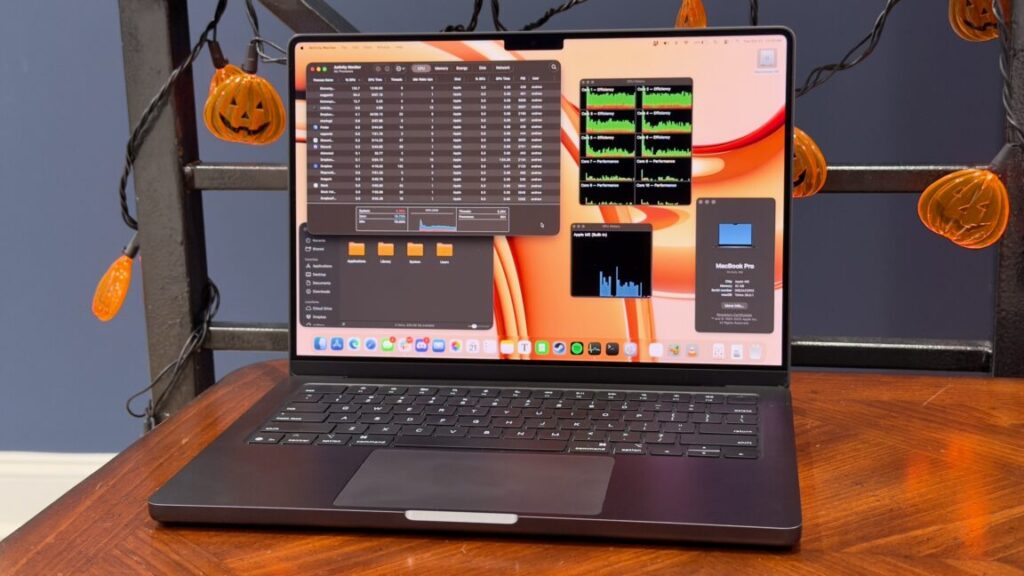
Apple M5 trades blows with Pro and Max chips from older generations.
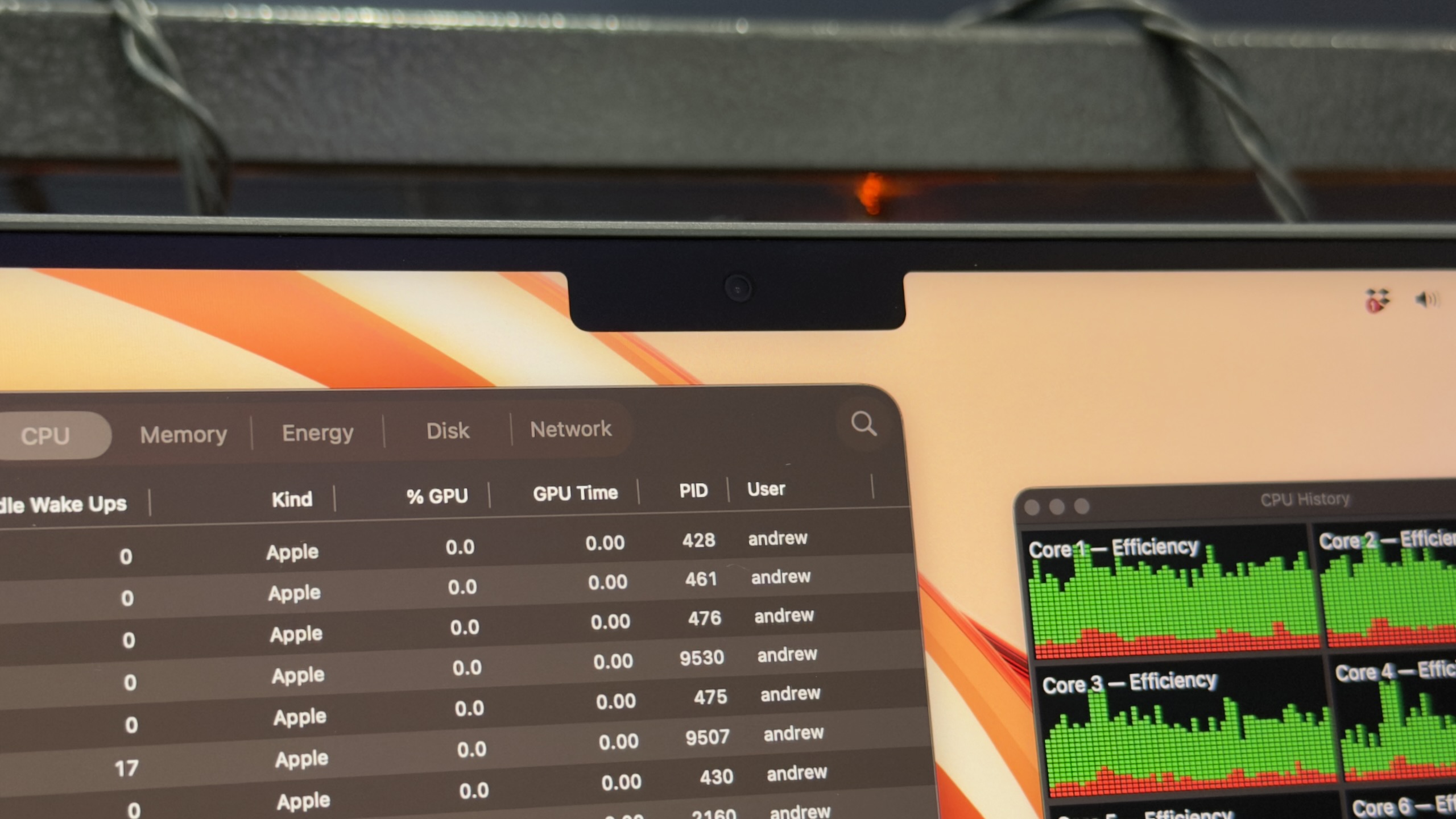
Apple’s M5 MacBook Pro. Credit: Andrew Cunningham
Apple’s M5 MacBook Pro. Credit: Andrew Cunningham
When I’m asked to recommend a Mac laptop for people, Apple’s low-end 14-inch MacBook Pro usually gets lost in the shuffle. It competes with the 13- and 15-inch MacBook Air, significantly cheaper computers that meet or exceed the “good enough” boundary for the vast majority of computer users. The basic MacBook Pro also doesn’t have the benefit of Apple’s Pro or Max-series chips, which come with many more CPU cores, substantially better graphics performance, and higher memory capacity for true professionals and power users.
But the low-end Pro makes sense for a certain type of power user. At $1,599, it’s the cheapest way to get Apple’s best laptop screen, with mini LED technology, a higher 120 Hz ProMotion refresh rate for smoother scrolling and animations, and the optional but lovely nano-texture (read: matte) finish. Unlike the MacBook Air, it comes with a cooling fan, which has historically meant meaningfully better sustained performance and less performance throttling. And it’s also Apple’s cheapest laptop with three Thunderbolt ports, an HDMI port, and an SD card slot, all genuinely useful for people who want to plug lots of things in without having multiple dongles or a bulky dock competing for the Air’s two available ports.
If you don’t find any of those arguments in the basic MacBook Pro’s favor convincing, that’s fine. The new M5 version makes almost no changes to the laptop other than the chip, so it’s unlikely to change your calculus if you already looked at the M3 or M4 version and passed it up. But it is the first Mac to ship with the M5, the first chip in Apple’s fifth-generation chip family and a preview of what’s to come for (almost?) every other Mac in the lineup. So you can at least be interested in the 14-inch MacBook Pro as a showcase for a new processor, if not as a retail product in and of itself.
The Apple Silicon MacBook Pro, take five
Apple has been using this laptop design for about four years now, since it released the M1 Pro and M1 Max versions of the MacBook Pro in late 2021. But for people who are upgrading from an older design—Apple did use the old Intel-era design, Touch Bar and all, for the low-end M1 and M2 MacBook Pros, after all—we’ll quickly hit the highlights.
This basic MacBook Pro only comes in a 14-inch screen size, up from 13-inches for the old low-end MacBook Pro, but some of that space is eaten up by the notch across the top of the display. The strips of screen on either side of the notch are usable by macOS, but only for the menu bar and icons that live in the menu bar—it’s a no-go zone for apps. The laptop is a consistent thickness throughout, rather than tapered, and has somewhat more squared-off and less-rounded corners.
Compared to the 13-inch MacBook Pro, the 14-inch version is the same thickness, but it’s a little heavier (3.4 pounds, compared to 3), wider, and deeper. For most professional users, the extra screen size and the re-addition of the HDMI port and SD card slot mostly justify the slight bump up in size. The laptop also includes three Thunderbolt 3 ports—up from two in the MacBook Airs—and the resurrected MagSafe charging port. But it is worth noting that the 14-inch MacBook Pro is nearly identical in weight to the 15-inch MacBook Air. If screen size is all you’re after, the Air may still be the better choice.
Apple’s included charger uses MagSafe on the laptop end, but USB-C chargers, docks, monitors, and other accessories will continue to charge the laptop if that’s what you prefer to keep using.
I’ve got no gripes about Apple’s current laptop keyboard—Apple uses the same key layout, spacing, and size across the entire MacBook Air and Pro line, though if I had to distinguish between the Pro and Air, I’d say the Pro’s keyboard is very, very slightly firmer and more satisfying to type on and that the force feedback of its trackpad is just a hair more clicky. The laptop’s speaker system is also more impressive than either MacBook Air, with much bassier bass and a better dynamic range.
But the main reason to prefer this low-end Pro to the Air is the screen, particularly the 120 Hz ProMotion support, the improved brightness and contrast of the mini LED display technology, and the option to add Apple’s matte nano texture finish. I usually don’t mind the amount of glare coming off my MacBook Air’s screen too much, but every time I go back to using a nano-texture screen I’m always a bit jealous of the complete lack of glare and reflections and the way you get those benefits without dealing with the dip in image quality you see from many matte-textured screen protectors. The more you use your laptop outdoors or under lighting conditions you can’t control, the more you’ll appreciate it.
The optional nano texture display adds a pleasant matte finish to the screen, but that notch is still notching. Credit: Andrew Cunningham
If the higher refresh rate and the optional matte coating (a $150 upgrade on top of an already pricey computer) don’t appeal to you, or if you can’t pay for them, then you can be pretty confident that this isn’t the MacBook for you. The 13-inch Air is lighter, and the 5-inch Air is larger, and both are cheaper. But we’re still only a couple of years past the M2 version of the low-end MacBook Pro, which didn’t give you the extra ports or the Pro-level screen.
But! Before you buy one of the still-M4-based MacBook Airs, our testing of the MacBook Pro’s new M5 chip should give you some idea of whether it’s worth waiting a few months (?) for an Air refresh.
Testing Apple’s M5
We’ve also run some M5 benchmarks as part of our M5 iPad Pro review, but having macOS rather than iPadOS running on top of it does give us a lot more testing flexibility—more benchmarks and a handful of high-end games to run, plus access to the command line for taking a look at power usage and efficiency.
To back up and re-state the chip’s specs for a moment, though, the M5 is constructed out of the same basic parts as the M4: four high-performance CPU cores, six high-efficiency CPU cores (up from four in the M1/M2/M3), 10 GPU cores, and a 16-core Neural Engine for handling some machine-learning and AI workloads.
The M5’s technical improvements are more targeted and subtle than just a boost to clock speeds or core counts. The first is a 27.5 percent increase in memory bandwidth, from the 120 GB/s of the M4 to 153 GB/s (achieved, I’m told, by a combination of faster RAM and the memory fabric that facilitates communication between different areas of the chip. Integrated GPUs are usually bottlenecked by memory bandwidth first and core count second, so memory bandwidth improvements can have a pretty direct, linear impact on graphics performance.
Apple also says it has added a “Neural Accelerator” to each of its GPU cores, separate from the Neural Engine. These will benefit a few specific types of workloads—things like MetalFX graphics upscaling or frame generation that would previously have had to use the Neural Engine can now do that work entirely within the GPU, eliminating a bit of latency and freeing the Neural Engine up to do other things. Apple is also claiming “over 4x peak GPU compute compared to M4,” which Apple says will speed up locally run AI language models and image generation software. That figure is coming mostly from the GPU improvements; according to Geekbench AI, the Neural Engine itself is only around 10 percent faster than the one on the M4.
(A note about testing: The M4 chip in these charts was in an iMac and not a MacBook Pro. But over several hardware generations, we’ve observed that the actively cooled versions of the basic M-series chips perform the same in both laptops and desktops. Comparing the M5 to the passively cooled M4 in the MacBook Air isn’t apples to apples, but comparing it to the M4 in the iMac is.)
Each of Apple’s chip generations has improved over the previous one by low-to-mid double digits, and the M5 is no different. We measured a 12 to 16 percent improvement over the M4 in single-threaded CPU tests, a 20 to 30 percent improvement in multicore tests, and roughly a 40 percent improvement in graphics benchmarks and the Mac version of the built-in Cyberpunk 2077 benchmark (one benchmark, the GPU-based version of the Blender rendering benchmark, measured a larger 60 to 70 percent improvement for the M5’s GPU, suggesting it either benefits more than most apps from the memory bandwidth improvements or the new neural accelerators).
Those performance additions add up over time. The M5 is typically a little over twice as fast as the M1, and it comes close to the performance level of some Pro and Max processors from past generations.
The M5 MacBook Pro falls short of the M4 Pro, and it will fall even shorter of the M5 Pro whenever it arrives. But its CPU performance generally beats the M3 Pro in our tests, and its GPU performance comes pretty close. Its multi-core CPU performance beats the M1 Max, and its single-core performance is over 80 percent faster. The M5 can’t come close to the graphics performance of any of these older Max or Ultra chips, but if you’re doing primarily CPU-heavy work and don’t need more than 32GB of RAM, the M5 holds up astonishingly well to Apple’s high-end silicon from just a few years ago.
It wasn’t so long ago that this kind of performance improvement was more-or-less normal across the entire tech industry, but Intel, AMD, and Nvidia’s consumer CPUs and GPUs have really slowed their rate of improvement lately, and Intel and AMD are both guilty of re-using old silicon for entry-level chips, over and over again. If you’re using a 6- or 7-year-old PC, sure, you’ll see performance improvements from something new, but it’s more of a crapshoot for a 3- to 4-year-old PC.
If there’s a downside to the M5 in our testing, it’s that its performance improvements seem to come with increased power draw relative to the M4 when all the CPU cores are engaged in heavy lifting. According to macOS built-in powermetrics tool, the M5 drew an average 28 W of power in our Handbrake video encoding test, compared to around 17 W for the M4 running the same test.
Using software tools to compare power draw between different chip manufacturers or even chip generations is dicey, because you’re trusting that different hardware is reporting its power use to the operating system in similar ways. But assuming they’re accurate, these numbers suggest that Apple could be pushing clock speeds more aggressively this generation to squeeze more performance out of the chip.
This would make some sense, since the third-generation 3nm TSMC manufacturing process used for the M5 (likely N3P) looks like a fairly mild upgrade from the second-generation 3nm process used for the M4 (N3E). TSMC says that N3P can boost performance by 5 percent at the same power use compared to N3E, or reduce power draw by 5 to 10 percent at the same performance. To get to the larger double-digit performance improvements that Apple is claiming and that we measured in our testing, you’d definitely expect to see the overall power consumption increase.
To put the M5 in context, the M2 and the M3 came a bit closer to its average power draw in our video encoding test (23.2 and 22.7 W, respectively), and the M5’s power draw comes in much lower than any past-generation Pro or Max chips. In terms of the amount of power used to complete the same task, the M5’s efficiency is worse than the M4’s according to powermetrics, but better than older generations. And Apple’s performance and power efficiency remains well ahead of what Intel or AMD can offer in their high-end products.
Impressive chip, awkward laptop
The low-end MacBook Pro has always occupied an odd in-between place in Apple’s lineup, overlapping in a lot of places with the MacBook Air and without the benefit of the much-faster chips that the 15- and 16-inch MacBook Pros could fit. The M5 MacBook Pro carries on that complicated legacy, and even with the M5 there are still lots of people for whom one of the M4 MacBook Airs is just going to be a better fit.
But it is a very nice laptop, and if your screen is the most important part of your laptop, this low-end Pro does make a decent case for itself. It’s frustrating that the matte display is a $150 upcharge, but it’s an option you can’t get on an Air, and the improved display panel and faster ProMotion refresh rate make scrolling and animations all look smoother and more fluid than they do on an Air’s screen. I still mostly think that this is a laptop without a huge constituency—too much more expensive than the Air, too much slower than the other Pros—but the people who buy it for the screen should still be mostly happy with the performance and ports.
This MacBook Pro is more exciting to me as a showcase for the Apple M5—and I’m excited to see the M5 and its higher-end Pro, Max, and (possibly) Ultra relatives show up in other Macs.
The M5 sports the highest sustained power draw of any M-series chip we’ve tested, but Apple’s past generations (the M4 in particular) have been so efficient that Apple has some room to bump up power consumption while remaining considerably more efficient than anything its competitors are offering. What you get in exchange is an impressively fast chip, as good or better than many of the Pro or Max chips in previous-generation products. For anyone still riding out the tail end of the Intel era, or for people with M1-class Macs that are showing their age, the M5 is definitely fast enough to feel like a real upgrade. That’s harder to come by in computing than it used to be.
The good
M5 is a solid performer that shows how far Apple has come since the M1.
Attractive, functional design, with a nice keyboard and trackpad, great-sounding speakers, a versatile selection of ports, and Apple’s best laptop screen.
Optional nano-texture display finish looks lovely and eliminates glare.
The bad
Harder to recommend than Apple’s other laptops if you don’t absolutely require a ProMotion screen.
A bit heavier than other laptops in its size class (and barely lighter than the 15-inch MacBook Air).
M5 can use more power than M4 did.
The ugly
High price for RAM and storage upgrades, and a $150 upsell for the nano-textured display.
Andrew is a Senior Technology Reporter at Ars Technica, with a focus on consumer tech including computer hardware and in-depth reviews of operating systems like Windows and macOS. Andrew lives in Philadelphia and co-hosts a weekly book podcast called Overdue.
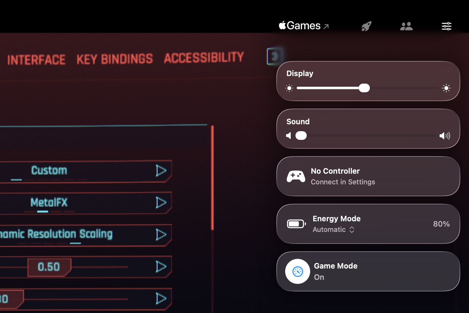
The Game Overlay in macOS Tahoe. Credit: Andrew Cunningham
Tahoe’s new Game Overlay doesn’t add features so much as it groups existing gaming-related features to make them more easily accessible.
The overlay makes itself available any time you start a game, either via a keyboard shortcut or by clicking the rocketship icon in the menu bar while a game is running. The default view includes brightness and volume settings, toggles for your Mac’s energy mode (for turning on high-performance or low-power mode, when they’re available), a toggle for Game Mode, and access to controller settings when you’ve got one connected.
The second tab in the overlay displays achievements, challenges, and leaderboards for the game you’re playing—though only if they offer Apple’s implementation of those features. Achievements for games installed from Steam, for example, aren’t visible. And the last tab is for social features, like seeing your friends list or controlling chat settings (again, when you’re using Apple’s implementation).
More granular notification summaries
I didn’t think the Apple Intelligence notification summaries were very useful when they launched in iOS 18 and macOS 15 Sequoia last year, and I don’t think iOS 26 or Tahoe really changes the quality of those summaries in any immediately appreciable way. But following a controversy earlier this year where the summaries botched major facts in breaking news stories, Apple turned notification summaries for news apps off entirely while it worked on fixes.
Those fixes, as we’ve detailed elsewhere, are more about warning users of potential inaccuracies than about preventing those inaccuracies in the first place.
Apple now provides three broad categories of notification summaries: those for news and entertainment apps, those for communication and social apps, and those for all other kinds of apps. Summaries for each category can be turned on or off independently, and the news and entertainment category has a big red disclaimer warning users to “verify information” in the individual news stories before jumping to conclusions. Summaries are italicized, get a special icon, and a “summarized by Apple Intelligence” badge, just to make super-ultra-sure that people are aware they’re not taking in raw data.
Personally, I think if Apple can’t fix the root of the problem in a situation like this, then it’s best to take the feature out of iOS and macOS entirely rather than risk giving even one person information that’s worse or less accurate than the information they already get by being a person on the Internet in 2025.
As we wrote a few months ago, asking a relatively small on-device language model to accurately summarize any stack of notifications covering a wide range of topics across a wide range of contexts is setting it up to fail. It does work OK when summarizing one or two notifications, or when summarizing straightforward texts or emails from a single person. But for anything else, be prepared for hit-or-miss accuracy and usefulness.
Relocated volume and brightness indicators
The pop-ups you see when adjusting the system volume or screen brightness have been redesigned and moved. The indicators used to appear as large rounded squares, centered on the lower half of your primary display. The design had changed over the years, but this was where they’ve appeared throughout the 25-year existence of Mac OS X.
Now, both indicators appear in the upper-right corner of the screen, glassy rectangles that pop out from items on the menu bar. They’ll usually appear next to the Control Center menu bar item, but the volume indicator will pop out of the Sound icon if it’s visible.
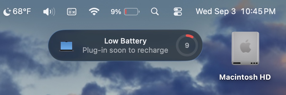
New low battery alert
Tahoe picks up an iPhone-ish low-battery alert on laptops. Credit: Andrew Cunningham
Tahoe tweaks the design of macOS’ low battery alert notification. A little circle-shaped meter (in the same style as battery meters in Apple’s Batteries widgets) shows you in bright red just how close your battery is to being drained.
This notification still shows up separately from others and can’t be dismissed, though it doesn’t need to be cleared and will go away on its own. It starts firing off when your laptop’s battery hits 10 percent and continues to go off when you drop another percentage point from there (it also notified me without the percentage readout changing, seemingly at random, as if to annoy me badly enough to plug my computer in more quickly).
The notification frequency and the notification thresholds can’t be changed, if this isn’t something you want to be reminded about or if it’s something you want to be reminded about even earlier. But you could possibly use the battery level trigger in Shortcuts to customize your Mac’s behavior a bit.
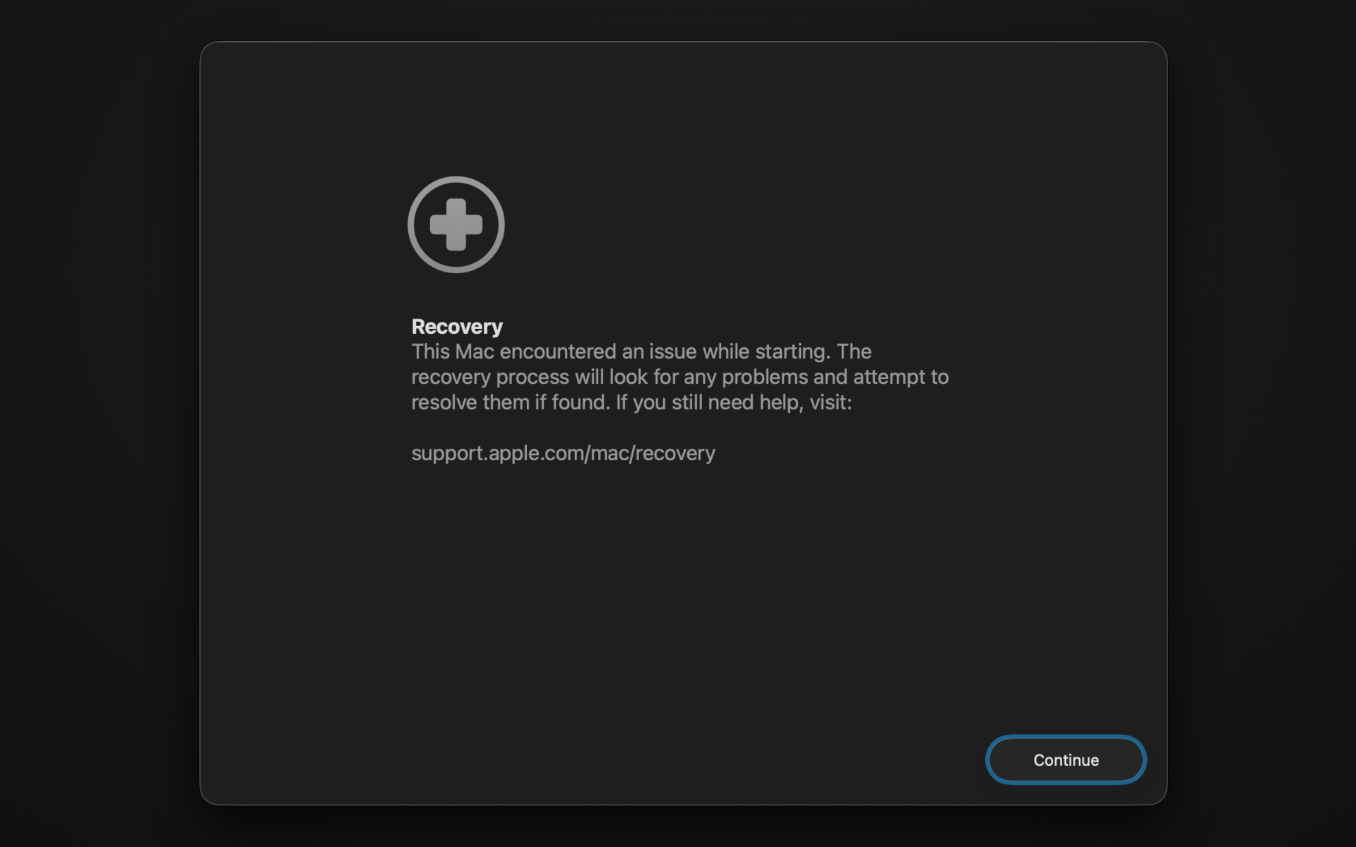
Recovery mode changes
A new automated recovery tool in macOS Tahoe’s recovery volume. Credit: Andrew Cunningham
Tahoe’s version of the macOS Recovery mode gets a new look to match the rest of the OS, but there are a few other things going on, too.
If you’ve ever had a problem getting your Mac to boot, or if you’ve ever just wanted to do a totally fresh install of the operating system, you may have run into the Mac’s built-in recovery environment before. On an Apple Silicon Mac, you can usually access it by pressing and holding the power button when you start up your Mac and clicking the Options button to start up using the hidden recovery volume rather than the main operating system volume.
Tahoe adds a new tool called the Device Recovery Assistant to the recovery environment, accessible from the Utilities menu. This automated tool “will look for any problems” with your system volume “and attempt to resolve them if found.”
Maybe the Recovery Assistant will actually solve your boot problems, and maybe it won’t—it doesn’t tell you much about what it’s doing, beyond needing to unlock FileVault on my system volume to check it out. But it’s one more thing to try if you’re having serious problems with your Mac and you’re not ready to countenance a clean install yet.
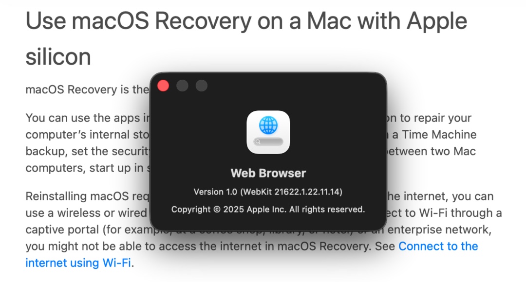
The web browser in the recovery environment is still WebKit, but it’s not Safari-branded anymore, and it sheds a lot of Safari features you wouldn’t want or need in a temporary OS. Credit: Andrew Cunningham
Apple has made a couple of other tweaks to the recovery environment, beyond adding a Liquid Glass aesthetic. The recovery environment’s built-in web browser is simply called Web Browser, and while it’s still based on the same WebKit engine as Safari, it doesn’t have Safari’s branding or its settings (or other features that are extraneous to a temporary recovery environment, like a bookmarks menu). The Terminal window picks up the new Clear theme, new SF Mono Terminal typeface, and the new default 120-row-by-30-column size.
A new disk image format
Not all Mac users interact with disk images regularly, aside from opening them up periodically to install an app or restore an old backup. But among other things, disk images are used by Apple’s Virtualization framework, which makes it relatively simple to run macOS and Linux virtual machines on the platform for testing and other things. But the RAW disk image format used by older macOS versions can come with quite severe performance penalties, even with today’s powerful chips and fast PCI Express-connected SSDs.
Enter the Apple Sparse Image Format, or ASIF. Apple’s developer documentation says that because ASIF images’ “intrinsic structure doesn’t depend on the host file system’s capabilities,” they “transfer more efficiently between hosts or disks.” The upshot is that reading files from and writing files to these images should be a bit closer to your SSD’s native performance (Howard Oakley at The Eclectic Light Company has some testing that suggests significant performance improvements in many cases, though it’s hard to make one-to-one comparisons because testing of the older image formats was done on older hardware).
The upshot is that disk images should be capable of better performance in Tahoe, which will especially benefit virtual machines that rely on disk images. This could benefit the lightweight virtualization apps like VirtualBuddy and Viable that mostly exist to provide a front end for the Virtualization framework, as well as virtualization apps like Parallels that offer support for Windows.
Quantum-safe encryption support
You don’t have a quantum computer on your desk. No one does, outside of labs where this kind of technology is being tested. But when or if they become more widely used, they’ll render many industry-standard forms of encryption relatively easy to break.
OpenAI’s GPT-5 model went live for most ChatGPT users this week, but lots of people use ChatGPT not through OpenAI’s interface but through other platforms or tools. One of the largest deployments is iOS, the iPhone operating system, which allows users to make certain queries via GPT-4o. It turns out those users won’t have to wait long for the latest model: Apple will switch to GPT-5 in iOS 26, iPadOS 26, and macOS Tahoe 26, according to 9to5Mac.
Apple has not officially announced when those OS updates will be released to users’ devices, but these major releases have typically been released in September in recent years.
GPT-5 purports to hallucinate 80 percent less and heralds a major rework of how OpenAI positions its models; for example, GPT-5 by default automatically chooses whether to use a reasoning-optimized model based on the nature of the user’s prompt. Free users will have to accept whatever the choice is, while paid ChatGPT accounts allow manually picking which model to use on a prompt-by-prompt basis. It’s unclear how that will work in iOS; will it stick to GPT-5’s non-reasoning mode all the time, or will it utilize GPT-5 “(with thinking)”? And if it supports the latter, will paid ChatGPT users be able to manually pick like they can in the ChatGPT app, or will they be limited to whatever ChatGPT deems appropriate, like free users? We don’t know yet.
Apple has released the fourth developer betas of iOS 26, iPadOS 26, macOS 26 and its other next-generation software updates today. And along with their other changes and fixes, the new builds are bringing back Apple Intelligence notification summaries for news apps.
Apple disabled news notification summaries as part of the iOS 18.3 update in January. Incorrect summaries circulating on social media prompted news organizations to complain to Apple, particularly after one summary said that Luigi Mangione, alleged murderer of UnitedHealthcare CEO Brian Thompson, had died by suicide (he had not and has not).
Upon installing the new update, users of Apple Intelligence-compatible devices will be asked to enable or disable three broad categories of notifications: those for “News & Entertainment” apps, for “Communication & Social” apps, and for all other apps. The operating systems will list sample apps based on what you currently have installed on your device.
All Apple Intelligence notification summaries continue to be listed as “beta,” but Apple’s main change here is a big red disclaimer when you enable News & Entertainment notification summaries, pointing out that “summarization may change the meaning of the original headlines.” The notifications also get a special “summarized by Apple Intelligence” caption to further distinguish them from regular, unadulterated notifications.
Cyberpunk is a big get for the Mac’s gaming team, as it’s an enduringly popular open-world game with a distinctive look, but it’s also of a piece with all of the AAA gaming launches the Mac has seen in the last couple of years. It’s a popular and graphically impressive game from a major studio, but it’s also coming to the Mac years after it initially arrived on PCs and consoles.
Cyberpunk’s graphics settings show where the Mac could have advantages as a gaming platform, though. Like PCs, Apple Silicon Macs are available at all kinds of price and performance levels, from the low-end fanless MacBook Air to the top-tier M3 Ultra Mac Studio. But unlike PCs, where developers can’t account for all of the possible CPU, GPU, motherboard, storage, and RAM configurations, Windows versions, and graphics driver updates, the Mac comes in a more finite number of configurations with more tightly controlled software. This makes it easier for developers to target and tune for specific hardware.
Case in point, Cyberpunk’s “For this Mac” preset. Unlike the PC game’s Steam Deck preset, this isn’t a fixed collection of specific settings made with one particular hardware configuration in mind. Rather, it’s a dynamic preset that chooses different settings based on which specific Mac hardware you’re running the game on. An M1 Mac using this preset would get different settings than an M4 Max Mac using the same preset, and players can choose it knowing that they ought to get reasonably smooth and consistent performance with the best settings that their individual Mac can reasonably handle. (The one setting “For this Mac” doesn’t touch is ray-tracing, which can be manually enabled on M3- and M4-series Macs with the GPU hardware to support it but which won’t be turned on automatically.)
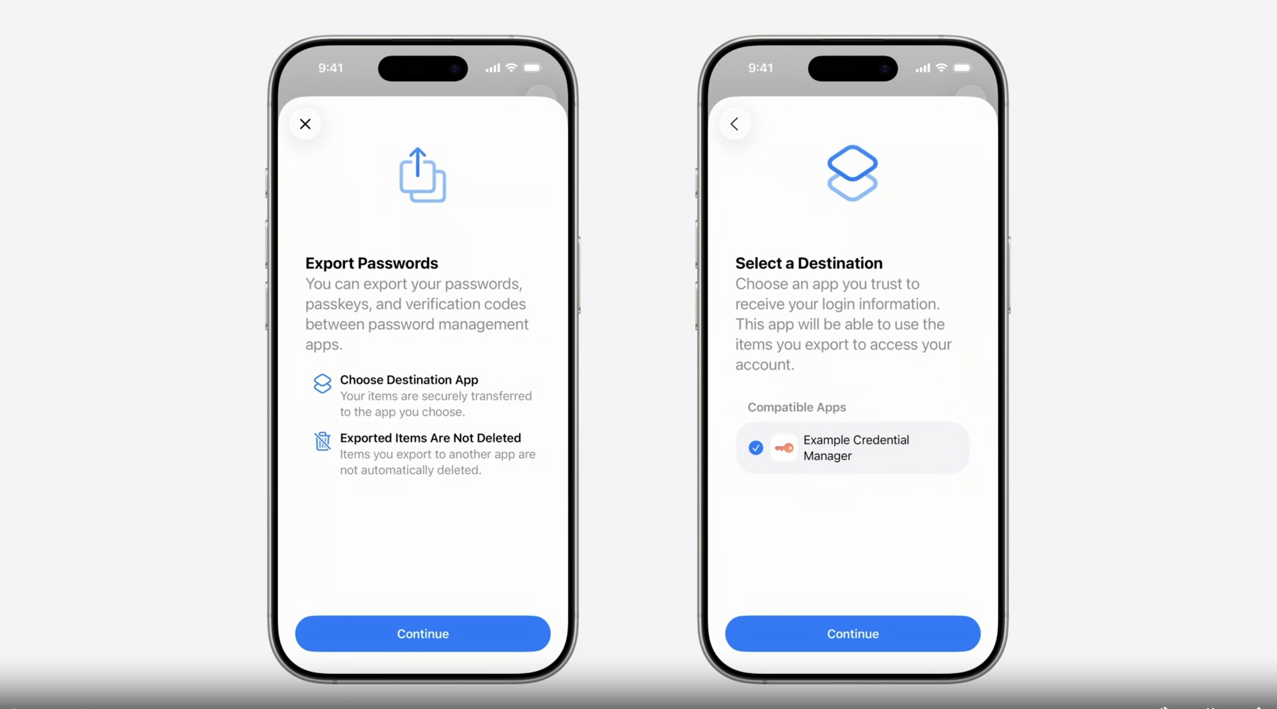
This new process is fundamentally different and more secure than traditional credential export methods, which often involve exporting an unencrypted CSV or JSON file, then manually importing it into another app. The transfer process is user initiated, occurs directly between participating credential manager apps and is secured by local authentication like Face ID.
This transfer uses a data schema that was built in collaboration with the members of the FIDO Alliance. It standardizes the data format for passkeys, passwords, verification codes, and more data types.
The system provides a secure mechanism to move the data between apps. No insecure files are created on disk, eliminating the risk of credential leaks from exported files. It’s a modern, secure way to move credentials.
The push to passkeys is fueled by the tremendous costs associated with passwords. Creating and managing a sufficiently long, randomly generated password for each account is a burden on many users, a difficulty that often leads to weak choices and reused passwords. Leaked passwords have also been a chronic problem.
Passkeys, in theory, provide a means of authentication that’s immune to credential phishing, password leaks, and password spraying. Under the latest “FIDO2” specification, it creates a unique public/private encryption keypair during each website or app enrollment. The keys are generated and stored on a user’s phone, computer, YubiKey, or similar device. The public portion of the key is sent to the account service. The private key remains bound to the user device, where it can’t be extracted. During sign-in, the website or app server sends the device that created the key pair a challenge in the form of pseudo-random data. Authentication occurs only when the device signs the challenge using the corresponding private key and sends it back.
This design ensures that there is no shared secret that ever leaves the user’s device. That means there’s no data to be sniffed in transit, phished, or compromised through other common methods.
As I noted in December, the biggest thing holding back passkeys at the moment is their lack of usability. Apps, OSes, and websites are, in many cases, islands that don’t interoperate with their peers. Besides potentially locking users out of their accounts, the lack of interoperability also makes passkeys too difficult for many people.
Apple’s demo this week provides the strongest indication yet that passkey developers are making meaningful progress in improving usability.
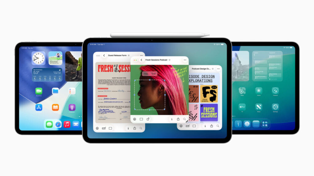
CUPERTINO, Calif.—When Apple Senior Vice President of Software Engineering Craig Federighi introduced the new multitasking UI in iPadOS 26 at the company’s Worldwide Developers Conference this week, he did it the same way he introduced the Calculator app for the iPad last year or timers in the iPad’s Clock app the year before—with a hint of sarcasm.
“Wow,” Federighi enthuses in a lightly exaggerated tone about an hour and 19 minutes into a 90-minute presentation. “More windows, a pointier pointer, and a menu bar? Who would’ve thought? We’ve truly pulled off a mind-blowing release!”
This elicits a sensible chuckle from the gathered audience of developers, media, and Apple employees watching the keynote on the Apple Park campus, where I have grabbed myself a good-but-not-great seat to watch the largely pre-recorded keynote on a gigantic outdoor screen.
Federighi is acknowledging—and lightly poking fun at—the audience of developers, pro users, and media personalities who have been asking for years that Apple’s iPad behave more like a traditional computer. And after many incremental steps, including a big swing and partial miss with the buggy, limited Stage Manager interface a couple of years ago, Apple has finally responded to requests for Mac-like multitasking with a distinctly Mac-like interface, an improved file manager, and better support for running tasks in the background.
But if this move was so forehead-slappingly obvious, why did it take so long to get here? This is one of the questions we dug into when we sat down with Federighi and Senior Vice President of Worldwide Marketing Greg Joswiak for a post-keynote chat earlier this week.
It used to be about hardware restrictions
People have been trying to use iPads (and make a philosophical case for them) as quote-unquote real computers practically from the moment they were introduced 15 years ago.
But those early iPads lacked so much of what we expect from modern PCs and Macs, most notably robust multi-window multitasking and the ability for third-party apps to exchange data. The first iPads were almost literally just iPhone internals connected to big screens, with just a fraction of the RAM and storage available in the Macs of the day; that necessitated the use of a blown-up version of the iPhone’s operating system and the iPhone’s one-full-screen-app-at-a-time interface.
“If you want to rewind all the way to the time we introduced Split View and Slide Over [in iOS 9], you have to start with the grounding that the iPad is a direct manipulation touch-first device,” Federighi told Ars. “It is a foundational requirement that if you touch the screen and start to move something, that it responds. Otherwise, the entire interaction model is broken—it’s a psychic break with your contract with the device.”
Mac users, Federighi said, were more tolerant of small latency on their devices because they were already manipulating apps on the screen indirectly, but the iPads of a decade or so ago “didn’t have the capacity to run an unlimited number of windowed apps with perfect responsiveness.”
It’s also worth noting the technical limitations of iPhone and iPad apps at the time, which up until then had mostly been designed and coded to match the specific screen sizes and resolutions of the (then-manageable) number of iDevices that existed. It simply wasn’t possible for the apps of the day to be dynamically resized as desktop windows are, because no one was coding their apps that way.
Apple’s iPad Pros—and, later, the iPad Airs—have gradually adopted hardware and software features that make them more Mac-like. Credit: Andrew Cunningham
Of course, those hardware limitations no longer exist. Apple’s iPad Pros started boosting the tablets’ processing power, RAM, and storage in earnest in the late 2010s, and Apple introduced a Microsoft Surface-like keyboard and stylus accessories that moved the iPad away from its role as a content consumption device. For years now, Apple’s faster tablets have been based on the same hardware as its slower Macs—we know the hardware can do more because Apple is already doing more with it elsewhere.
“Over time the iPad’s gotten more powerful, the screens have gotten larger, the user base has shifted into a mode where there is a little bit more trackpad and keyboard use in how many people use the device,” Federighi told Ars. “And so the stars kind of aligned to where many of the things that you traditionally do with a Mac were possible to do on an iPad for the first time and still meet iPad’s basic contract.”
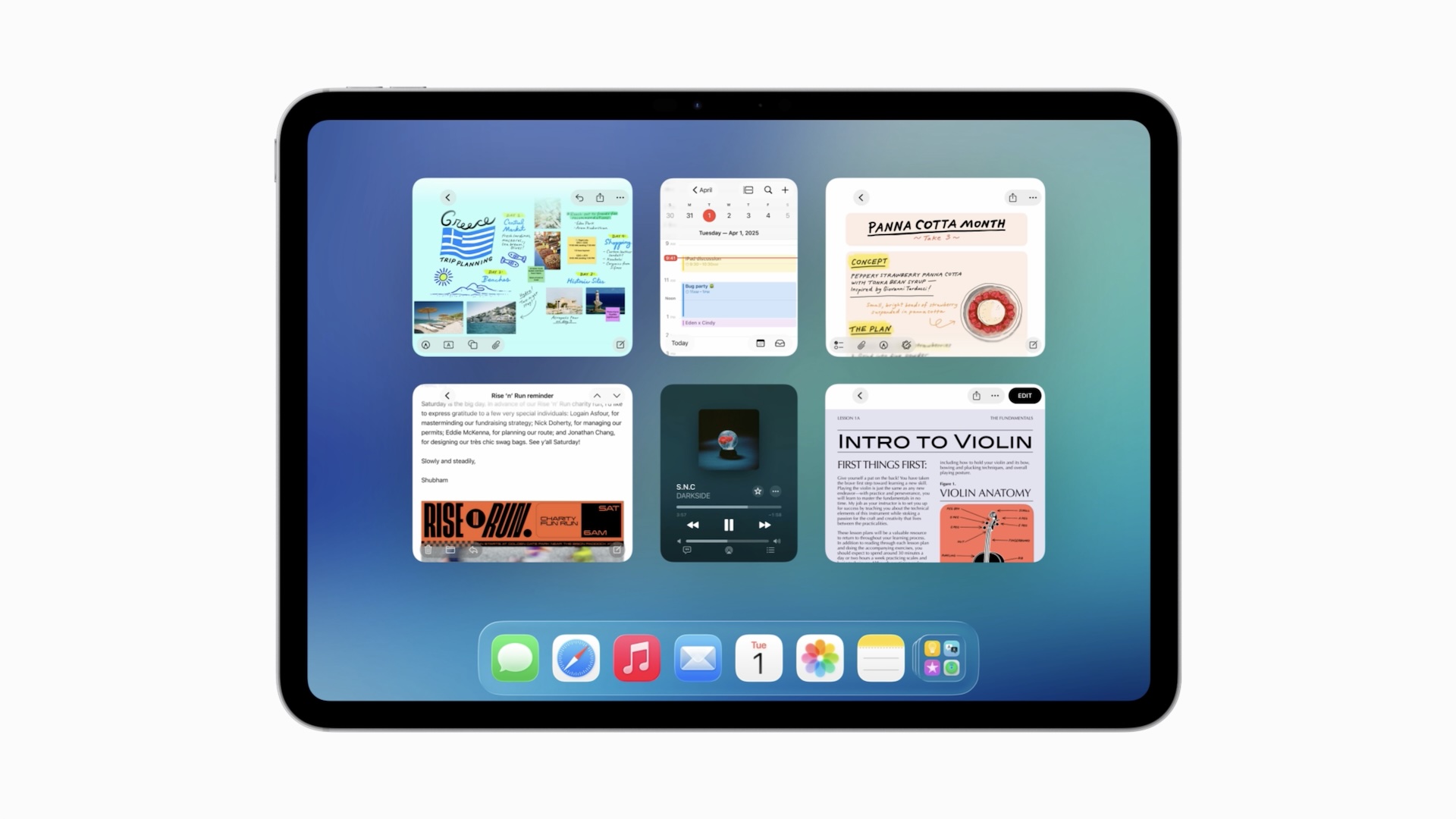
On correcting some of Stage Manager’s problems
More multitasking in iPadOS 26. Credit: Apple
Apple has already tried a windowed multitasking system on modern iPads once this decade, of course, with iPadOS 16’s Stage Manager interface.
Any first crack at windowed multitasking on the iPad was going to have a steep climb. This was the first time Apple or its developers had needed to contend with truly dynamically resizable app windows in iOS or iPadOS, the first time Apple had implemented a virtual memory system on the iPad, and the first time Apple had tried true multi-monitor support. Stage Manager was in such rough shape that Apple delayed that year’s iPadOS release to keep working on it.
But the biggest problem with Stage Manager was actually that it just didn’t work on a whole bunch of iPads. You could only use it on new expensive models—if you had a new cheap model or even an older expensive model, your iPad was stuck with the older Slide Over and Split View modes that had been designed around the hardware limitations of mid-2010s iPads.
“We wanted to offer a new baseline of a totally consistent experience of what it meant to have Stage Manager,” Federighi told Ars. “And for us, that meant four simultaneous apps on the internal display and an external display with four simultaneous apps. So, eight apps running at once. And we said that’s the baseline, and that’s what it means to be Stage Manager; we didn’t want to say ‘you get Stage Manager, but you get Stage Manager-lite here or something like that. And so immediately that established a floor for how low we could go.”
Fixing that was one of the primary goals of the new windowing system.
“We decided this time: make everything we can make available,” said Federighi, “even if it has some nuances on older hardware, because we saw so much demand [for Stage Manager].”
That slight change in approach, combined with other behind-the-scenes optimizations, makes the new multitasking model more widely compatible than Stage Manager is. There are still limits on those devices—not to the number of windows you can open, but to how many of those windows can be active and up-to-date at once. And true multi-monitor support would remain the purview of the faster, more-expensive models.
“We have discovered many, many optimizations,” Federighi said. “We re-architected our windowing system and we re-architected the way that we manage background tasks, background processing, that enabled us to squeeze more out of other devices than we were able to do at the time we introduced Stage Manager.”
Stage Manager still exists in iPadOS 26, but as an optional extra multitasking mode that you have to choose to enable instead of the new windowed multitasking system. You can also choose to turn both multitasking systems off entirely, preserving the iPad’s traditional big-iPhone-for-watching-Netflix interface for the people who prefer it.
“iPad’s gonna be iPad”
The $349 base-model iPad is one that stands to gain the most from iPadOS 26. Credit: Andrew Cunningham
However, while the new iPadOS 26 UI takes big steps toward the Mac’s interface, the company still tries to treat them as different products with different priorities. To date, that has meant no touch screens on the Mac (despite years of rumors), and it will continue to mean that there are some Mac things that the iPad will remain unable to do.
“But we’ve looked and said, as [the iPad and Mac] come together, where on the iPad the Mac idiom for doing something, like where we put the window close controls and maximize controls, what color are they—we’ve said why not, where it makes sense, use a converged design for those things so it’s familiar and comfortable,” Federighi told Ars. “But where it doesn’t make sense, iPad’s gonna be iPad.”
There will still be limitations and frustrations when trying to fit an iPad into a Mac-shaped hole in your computing setup. While tasks can run in the background, for example, Apple only allows apps to run workloads with a definitive endpoint, things like a video export or a file transfer. System agents or other apps that perform some routine on-and-off tasks continuously in the background aren’t supported. All the demos we’ve seen so far are also on new, high-end iPad hardware, and it remains to be seen how well the new features behave on low-end tablets like the 11th-generation A16 iPad, or old 2019-era hardware like the iPad Air 3.
But it does feel like Apple has finally settled on a design that might stick and that adds capability to the iPad without wrecking its simplicity for the people who still just want a big screen for reading and streaming.
Andrew is a Senior Technology Reporter at Ars Technica, with a focus on consumer tech including computer hardware and in-depth reviews of operating systems like Windows and macOS. Andrew lives in Philadelphia and co-hosts a weekly book podcast called Overdue.
The center of Whisky’s homepage. The page now carries a persistent notice that “Whisky is no longer actively maintained. Apps and games may break at any time.”
Credit: Whisky
The center of Whisky’s homepage. The page now carries a persistent notice that “Whisky is no longer actively maintained. Apps and games may break at any time.” Credit: Whisky
CodeWeavers’ CEO wrote on the company’s blog late last week about the Whisky shutdown, topped with an image of a glass of the spirit clinking against a glass of wine. “Whisky may have been a CrossOver competitor, but that’s not how we feel today,” wrote James B. Ramey. “Our response is simply one of empathy, understanding, and acknowledgement for Isaac’s situation.”
Ramey noted that Whisky was a free packaging of an open source project, crafted by someone who, like CrossOver, did it as “a labor of love built by people who care deeply about giving users more choices.” But Marovitz faced “an avalanche of user expectations,” Ramey wrote, regarding game compatibility, performance, and features. “The reality is that testing, support, and development take real resources … if CodeWeavers were not viable because of CrossOver not being sustainable, it would likely dampen the future development of WINE and Proton and support for macOS gaming,” Ramey wrote.
“We ‘tip our cap’ to Isaac and the impact he made to macOS gaming,” Ramey wrote, strangely choosing that colloquial salute instead of the more obvious beverage analogy for the two projects.
Marovitz told Ars that while user expectations were “definitely an issue,” they were not the major reason for ceasing development. “I’ve worked on other big projects before and during Whisky’s development, so I’m not a stranger to tuning out the noise of constant user expectations.”
Open source projects shutting down because of the tremendous pressure they put on their unpaid coders is a kind of “dog bites man” story in the coding world. It’s something else entirely when a prolific coder sees a larger ecosystem as not really benefiting from their otherwise very neat tool, and chooses deference. Still, during its run, the Whisky app drew attention to Mac gaming and the possibilities of Wine, and by extension Apple’s own Game Porting Toolkit, itself based on CrossOver. And likely gave a few Mac owners some great times with games they couldn’t get on their favorite platform.
Marovitz, while stepping back, is not done with Mac gaming, however. “Right now I’m working on the recompilation of Sonic Unleashed and bringing it fully to Mac, alongside other folks, but for the most part my goals and passions have remained the same,” Marovitz told Ars.


