Rubik’s WOWCube adds complexity, possibility by reinventing the puzzle cube
Technology is a double-edged sword in the $399 Rubik’s Cube-inspired toy.
There’s something special about the gadget that “just works.” Technology can open opportunities for those devices but also complicate and weigh down products that have done just fine without things like sensors and software.
So when a product like the beloved Rubik’s Cube gets stuffed with wires, processors, and rechargeable batteries, there’s demand for it to be not just on par with the original—but markedly better.
The Cubios Rubik’s WOWCube successfully breathes fresh life into the classic puzzle, but it’s also an example of when too much technology can cannibalize a gadget’s main appeal.
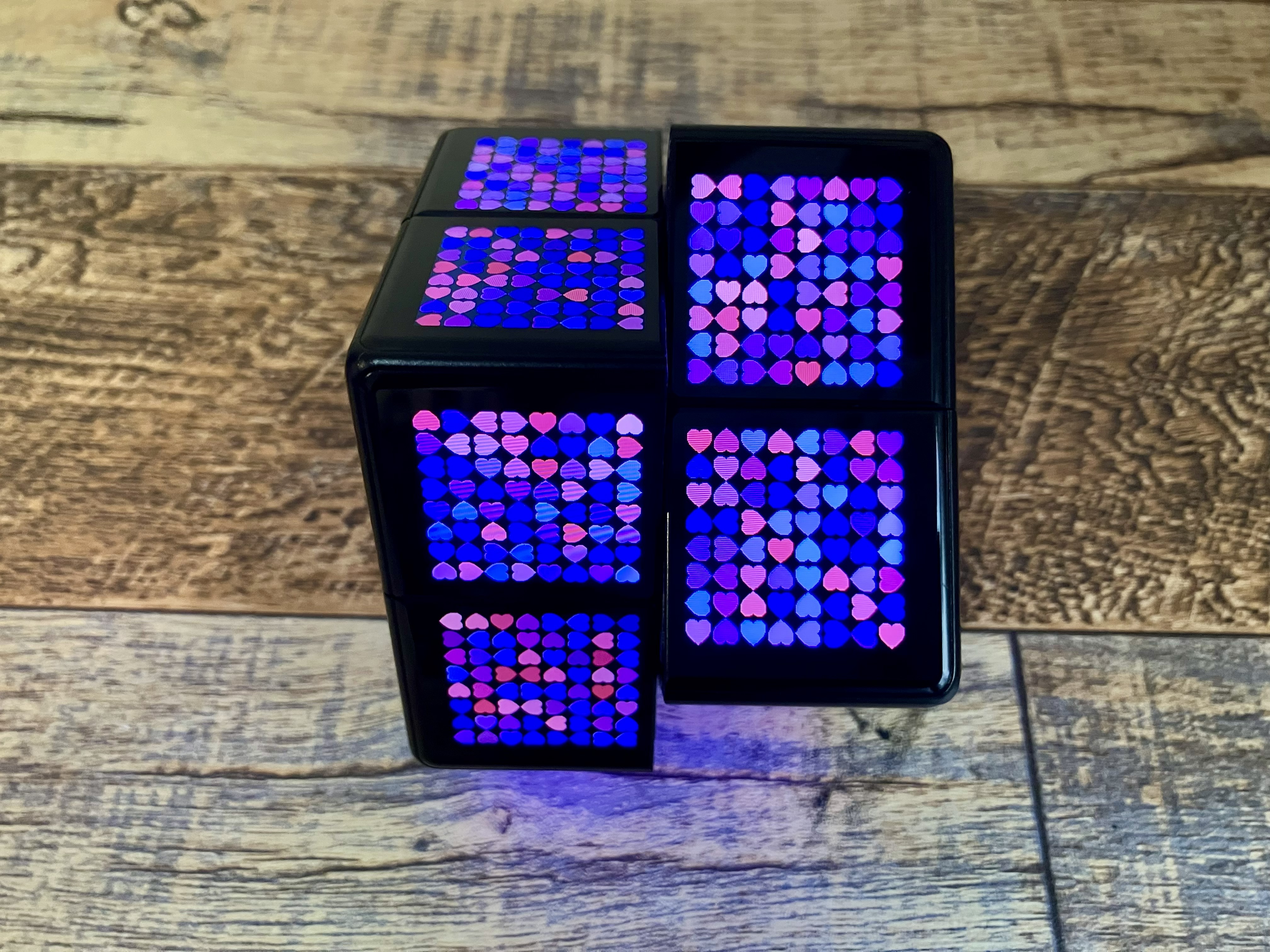
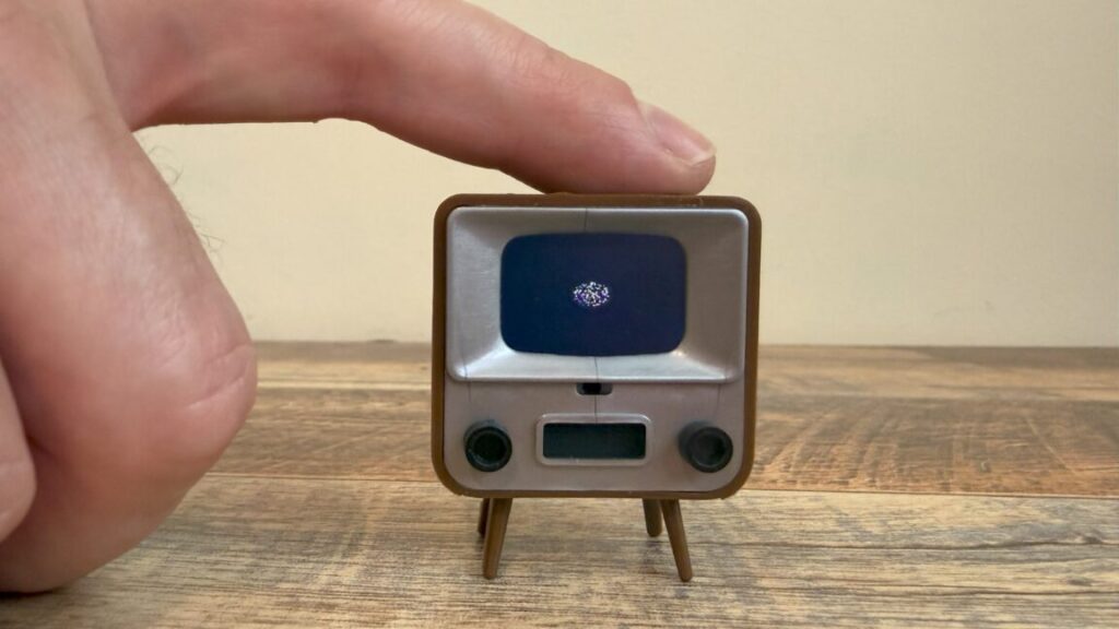
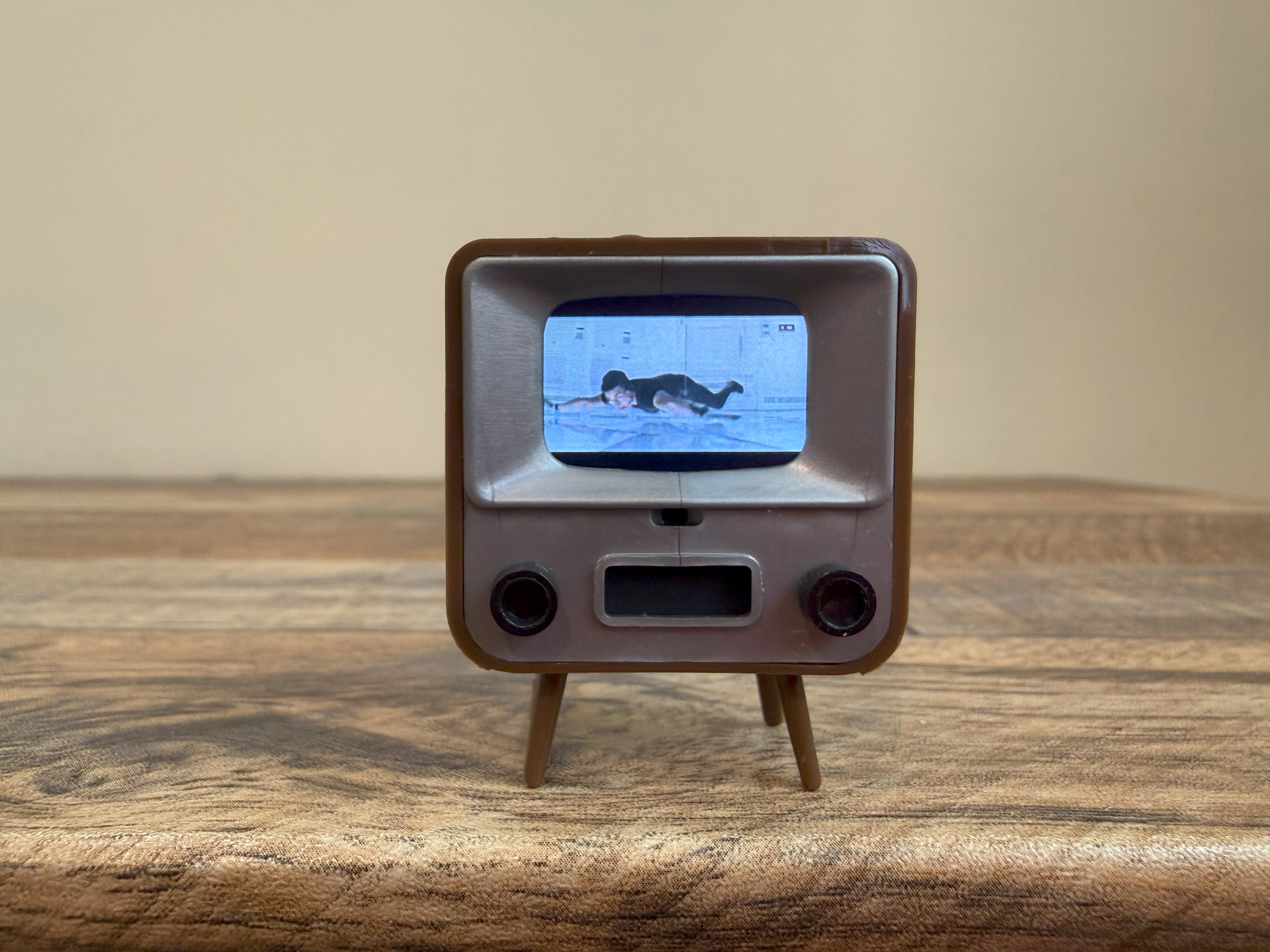
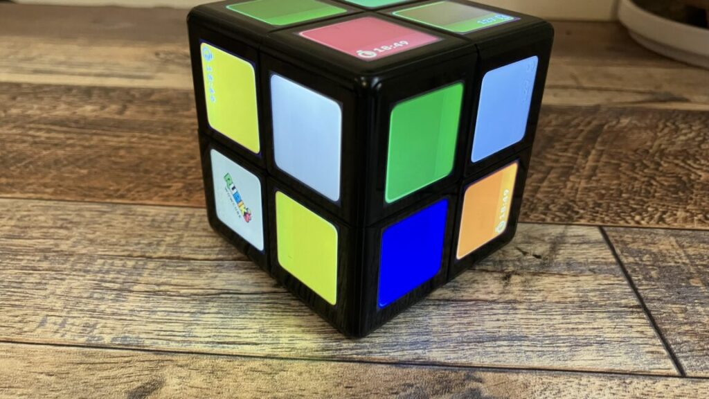
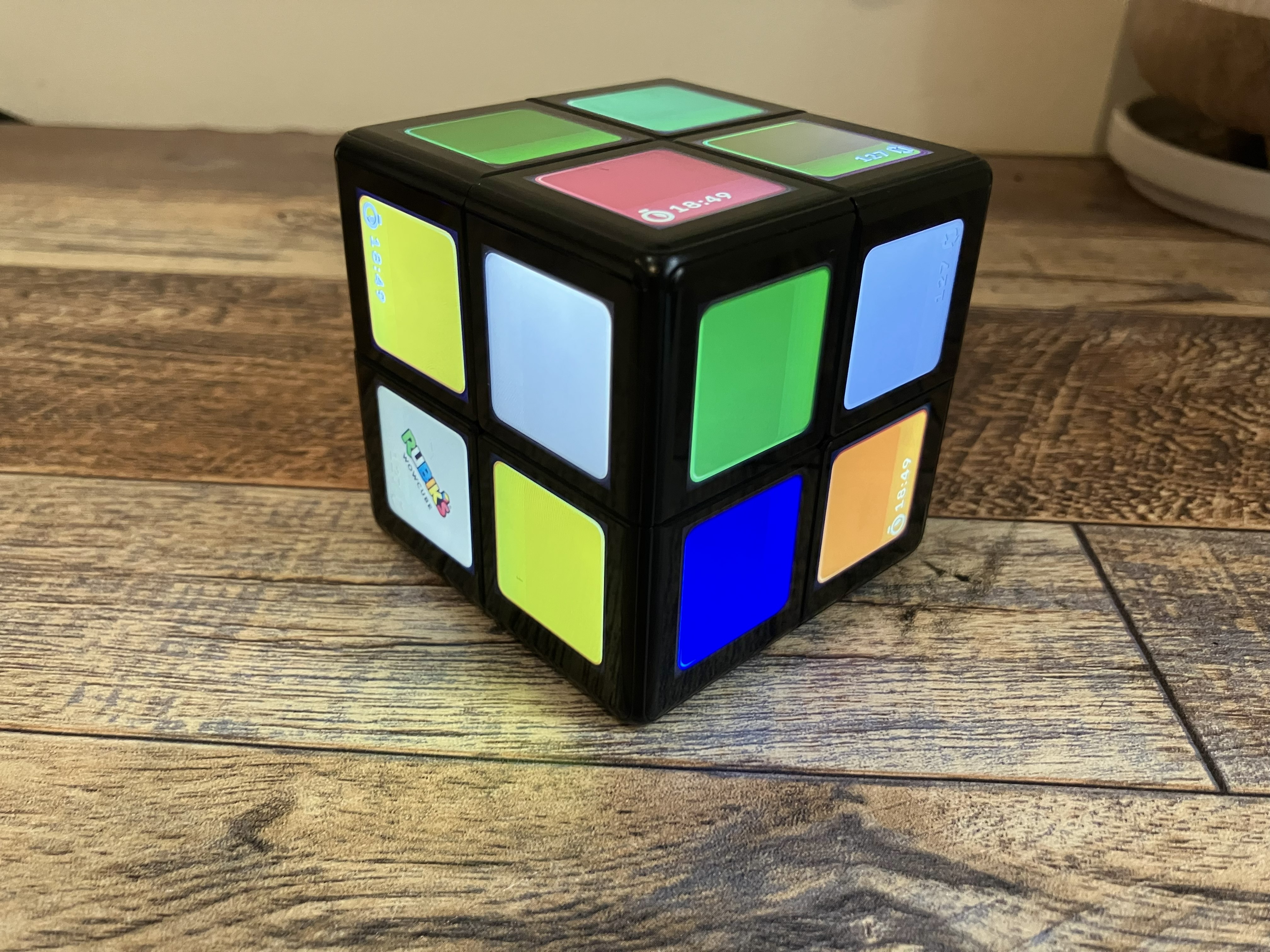
The WOWCube showing off one of its screensavers.
Credit: Scharon Harding
The WOWCube showing off one of its screensavers. Credit: Scharon Harding
The WOWCube is a modern take on the Rubik’s Cube, an experiment from Hungarian architecture professor Ernő Rubik. Rubik aimed to make a structure composed of eight cubes that could move independently without the structure collapsing. The Rubik’s Cube became a widely distributed toy, an ’80s craze, and, eventually, a puzzle icon.
The Rubik’s Cube did all that without electronics and with a current MSRP of $10. The WOWCube takes the opposite approach. It’s $399 (as of this writing) and ditches the traditional 3×3 grid in favor of a 2×2 grid that can still do the traditional Rubik’s puzzle (albeit on a smaller scale) and perform a host of other tricks, including playing other games and telling the weather.
A smaller puzzle
The WOWCube’s 2×2 grid will disappoint hardcore puzzlers. There’s no way to play the traditional 3×3 version or even harder modified versions of the 2×2 grid. With only 24 squares, compared to the traditional 54, solving the WOWCube is significantly easier than solving a standard Rubik’s Cube. Although skilled players might enjoy the challenge of trying to solve the WOWCube extra rapidly.
For people who are awful at the original Rubik’s Cube, like this author, a more accessible version of the puzzle is welcome. Solving the new Rubik’s Cube feels more attainable and less frustrating.
The WOWCube is made up of eight modules. Each module has its own PCB, processor, gyroscope, and accelerometer. That may explain why Cubios went with this smaller design. The predicament also begs the question of whether electronics really improve the Rubik’s Cube.
Games and other apps
Once I played some of the WOWCube’s other games, I saw the advantage of the smaller grid. The 2×2 layout is more appropriate for games like White Rabbit, which is like Pac-Man but relies on tilting and twisting the cube, or Ladybug, where you twist the cube to create a path for a perpetually crawling ladybug. A central module might add unneeded complexity and space to these games and other WOWCube apps, like Pixel World, which is like a Rubik’s Cube puzzle but with images depicting global landmarks, or the WOWCube implementation of Gabriele Cirulli’s puzzle game, 2048.
At the time of writing, the WOWCube has 15 “games,” including the Rubik’s Cube puzzle. Most of the games are free, but some, such as Space Invaders Cubed ($30) and Sunny Side Up ($5), cost money.
Unlike the original Rubik’s Cube, which is content to live on your shelf until you need a brain exercise or go on a road trip, the WOWCube craves attention with dozens of colorful screens, sound effects, and efforts to be more than a toy.
With its Widgets app open, the cube can display information, like the time, temperature, and alerts, from a limited selection of messaging apps. More advanced actions, like checking the temperature for tomorrow or opening a WhatsApp message, are unavailable. There’s room for improvement, but further development, perhaps around features like an alarm clock or reminders, could turn the WOWCube into a helpful desk companion.
Technology overload
The new technology makes the Rubik’s Cube more versatile, exciting, and useful while bringing the toy back into the spotlight; at times, though, it also brought more complexity to a simple beloved concept.
Usually, to open an app, make a selection, or otherwise input yes, you “knock” on the side of WOWCube twice. You also have to shake the cube three times in order to exit an app, and you can’t open an app when another app is open. Being able to tap an icon or press an actual button would make tasks, like opening apps or controlling volume and brightness levels, easier. On a couple of occasions, my device got buggy and inadvertently turned off some, but not all, of its screens. The reliance on a battery and charging dock that plugs into a wall presents limitations, too.
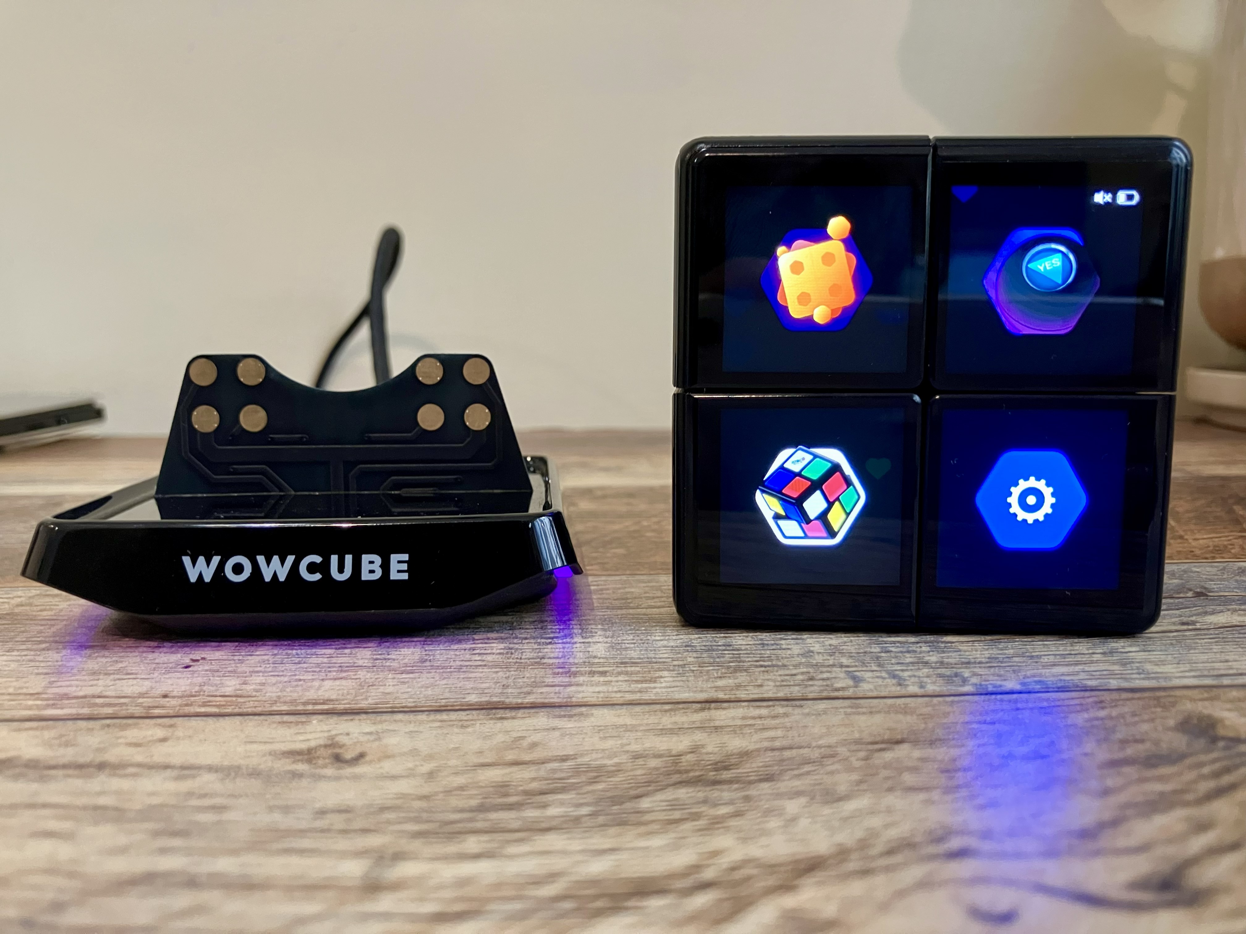
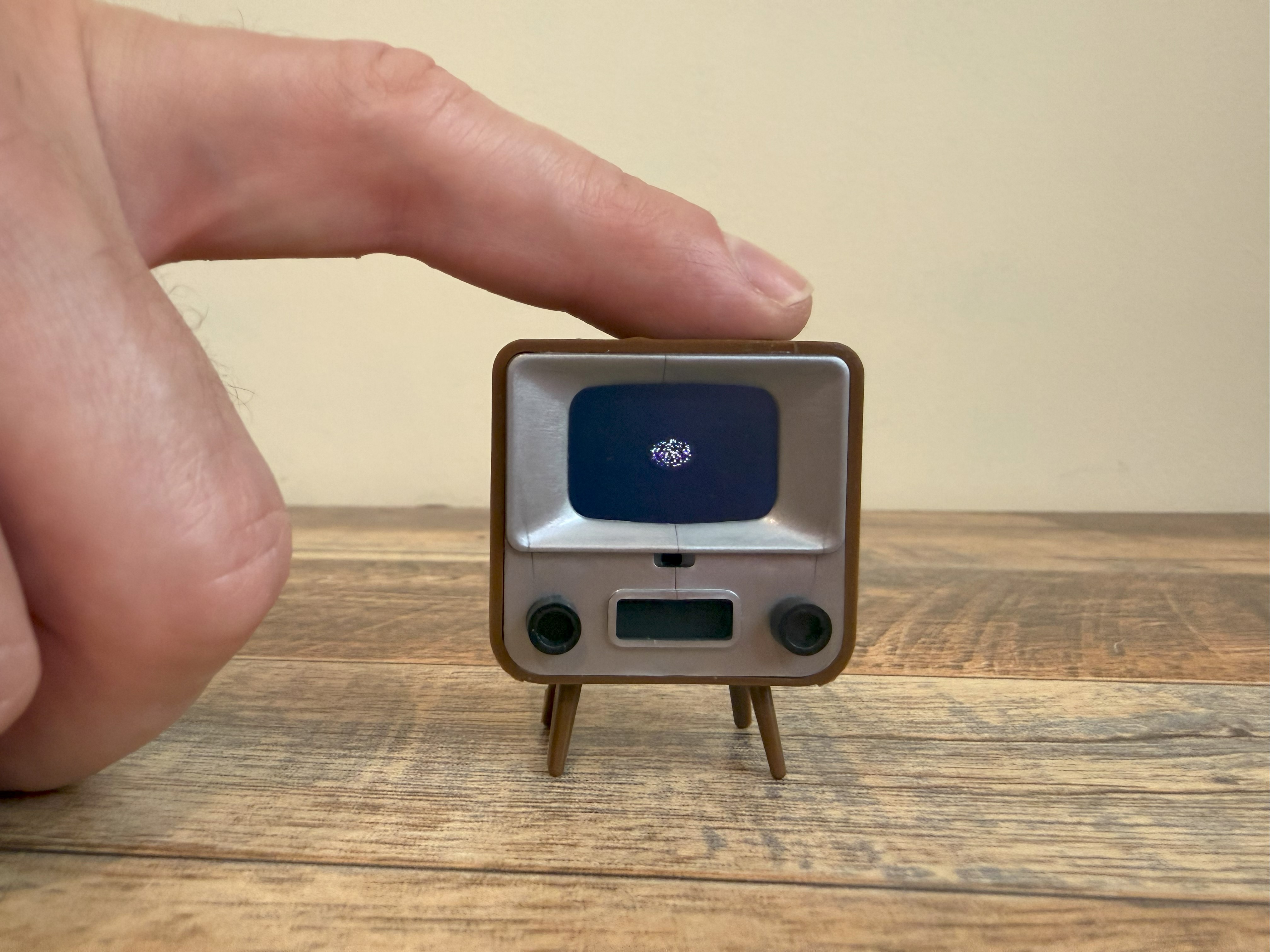
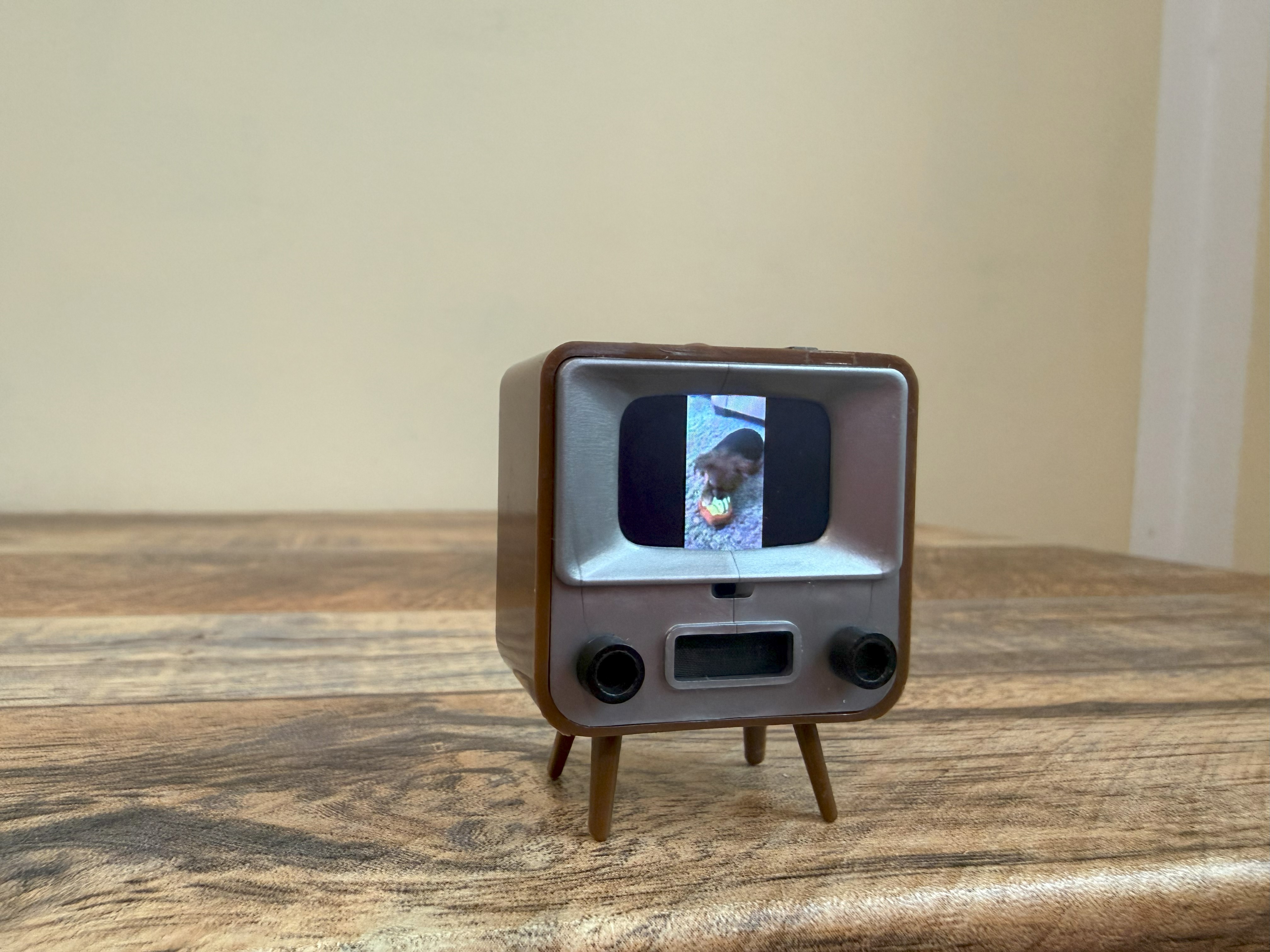
The WOWCube showing its main menu while sitting next to its charging dock.
Credit: Scharon Harding
The WOWCube showing its main menu while sitting next to its charging dock. Credit: Scharon Harding
The WOWCube’s makers brag of the device’s octads of speakers, processors, accelerometer, and gyroscopes, but I found the tilting mechanism unreliable and, at times, frustrating for doing things like highlighting an icon. Perhaps I don’t hold the WOWCube at the angles that its creators intended. There were also times when the image was upside down, and main information was displayed on a side of the cube that was facing away from me.
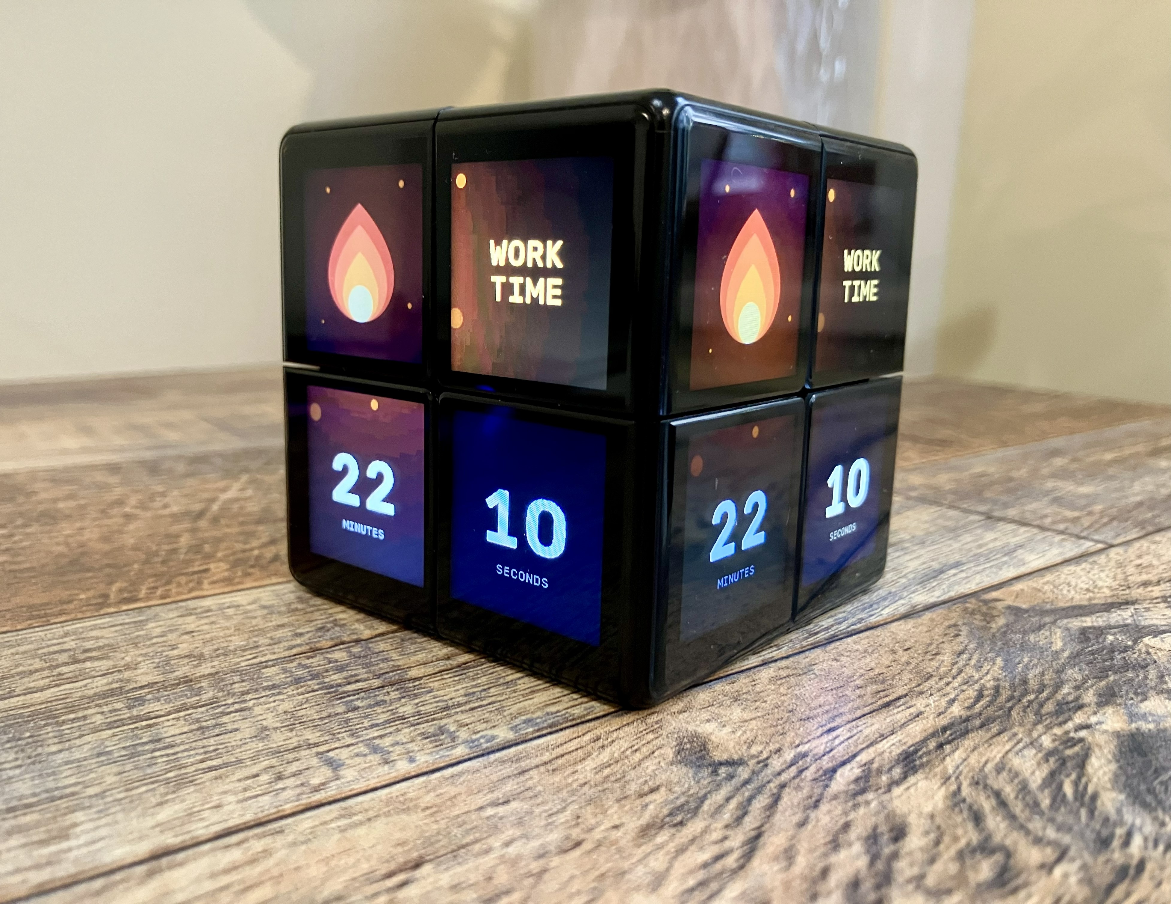
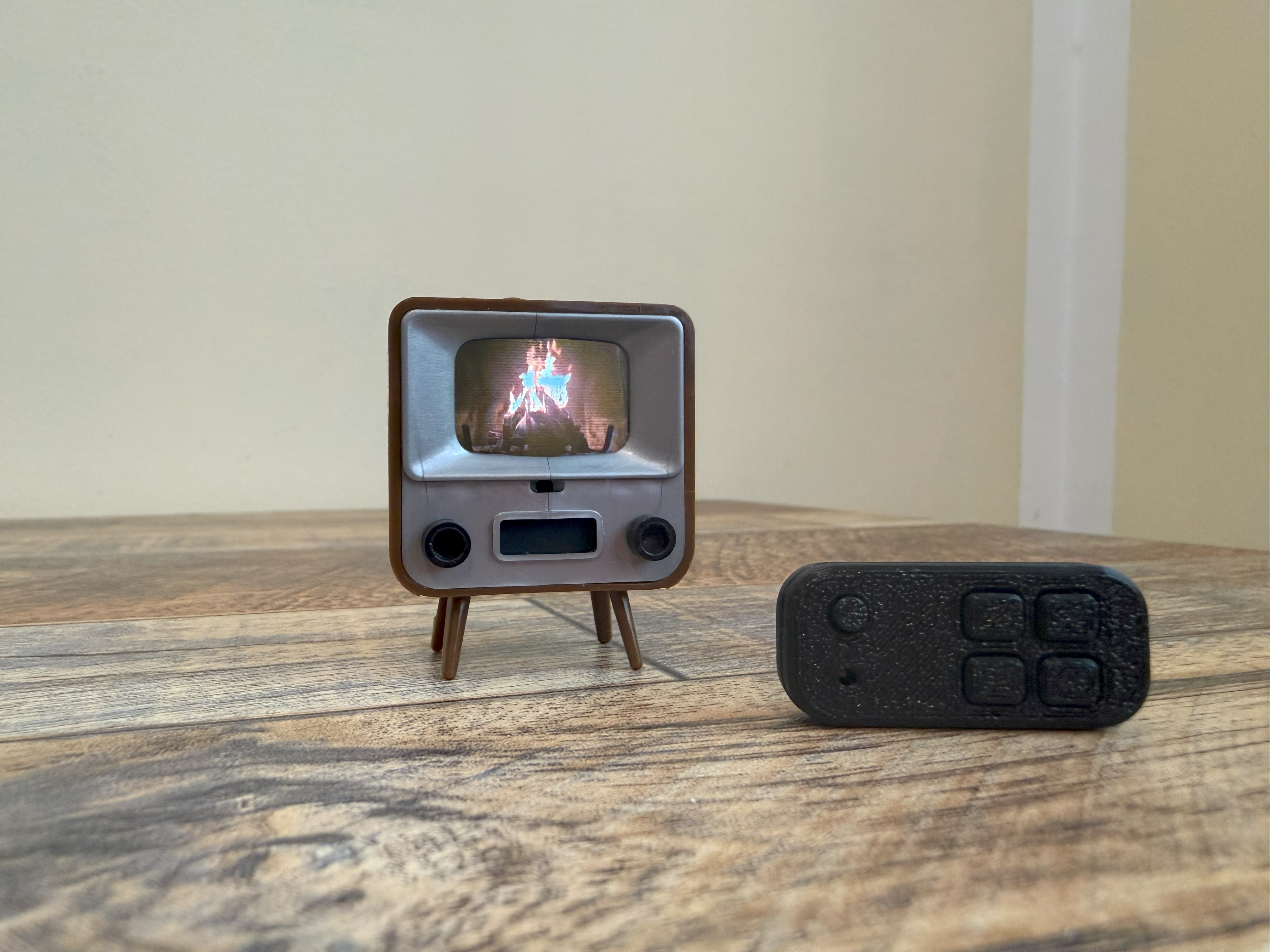
One of my favorite features: WOWCube’s pomodoro-like timer app.
Credit: Scharon Harding
One of my favorite features: WOWCube’s pomodoro-like timer app. Credit: Scharon Harding
The WOWCube has its own iOS and Android app, WOWCube Connect, which lets you connect the toy to your phone via Bluetooth and download new apps to the device via the dock’s Wi-Fi connection. You can also use the app to customize things like widgets, screensavers, and display brightness. If you don’t want to do any of those things, you can disconnect the WOWCube from your phone and reconnect it only when you want to.
I wasn’t able to use the iOS app unless I agreed to allow the “app to track activity.” This gives me privacy concerns, and I’ve reached out to Cubios to ask if there’s a way to use the app without the company tracking your activity.
New-age Rubik’s Cube
Cubios attempted to reinvent a classic puzzle with the WOWCube. In the process, it added bells and whistles that detract from what originally made Rubik’s Cubes great.
The actual Rubik’s Cube puzzle is scaled back, and the idea of spending hours playing with the cube is hindered by its finite battery life (the WOWCube can last up to five hours of constant play, Cubios claims). The device’s reliance on sensors and chips doesn’t always yield a predictable user experience, especially when navigating apps. And all of its tech makes the puzzle about 40 times pricier than the classic toy.
IPS screens, integrated speakers, and app integration add more possibilities, but some might argue that the Rubik’s Cube was sufficient without them. Notably, the WOWCube began as its own product and got the rights to use Rubik’s branding in 2024.
We’ve seen technology come for the Rubik’s Cube before. The Rubik’s Revolution we tested years ago had pressure-sensitive, LED-lit buttons for faces. In 2020, Rubik’s Connected came out with its own companion app. Clearly, there’s interest in bringing the Rubik’s Cube into the 20th century. For those who believe in that mission, the WOWCube is a fascinating new chapter for the puzzle.
I applaud Cubios’ efforts to bring the Rubik’s Cube new relevance and remain intrigued by the potential of new software-driven puzzles and uses. But it’s hard to overlook the downfalls of its tech reliance.
And the WOWCube could never replace the classic.

Scharon is a Senior Technology Reporter at Ars Technica writing news, reviews, and analysis on consumer gadgets and services. She’s been reporting on technology for over 10 years, with bylines at Tom’s Hardware, Channelnomics, and CRN UK.
Rubik’s WOWCube adds complexity, possibility by reinventing the puzzle cube Read More »