
How to downgrade from macOS 26 Tahoe on a new Mac
Most new Macs can still be downgraded with few downsides. Here’s what to know.

An Ars Technica colleague recently bought a new M4 MacBook Air. I have essentially nothing bad to say about this hardware, except to point out that even in our current memory shortage apocalypse, Apple is still charging higher-than-market-rates for RAM and SSD upgrades. Still, most people buying this laptop will have a perfectly nice time with it.
But for this colleague, it was also their first interaction with macOS 26 Tahoe and the Liquid Glass redesign, the Mac’s first major software design update since the Apple Silicon era began with macOS 11 Big Sur in 2020.
Negative consumer reaction to Liquid Glass has been overstated by some members of the Apple enthusiast media ecosystem, and Apple’s data shows that iOS 26 adoption rates are roughly in line with those of the last few years. But the Mac’s foray into Liquid Glass has drawn particular ire from longtime users (developers Jeff Johnson and Norbert Heger have been tracking persistently weird Finder and window resizing behavior, to pick two concrete examples, and Daring Fireball’s John Gruber has encouraged users not to upgrade).
My general approach to software redesigns is to just roll with them and let their imperfections and quirks become background noise over time—it’s part of my job to point out problems where I see them, but I also need to keep up with new releases whether I’m in love with them or not.
But this person has no such job requirement, and they had two questions: Can I downgrade this? And if so, how?
The answer to the first question is “yes, usually,” and Apple provides some advice scattered across multiple documentation pages. This is an attempt to bring all of those steps together into one page, aimed directly at new Mac buyers who are desperate to switch from Tahoe to the more-familiar macOS 15 Sequoia.
Table of Contents
A preemptive warning about security updates and older versions of macOS
Before we begin: Apple handles macOS updates differently from iOS updates. Eventually, Apple requires devices that support the latest iOS and iPadOS versions to install those updates if they want to continue getting security patches. That means if your iPhone or iPad can run iOS or iPadOS 26, it needs to be running iOS or iPadOS 26 to stay patched.
Older macOS versions, on the other hand, are updated for around three years after they’re initially released. The first year, they get both security patches and new features. The next two years, they get security patches and new versions of the Safari browser. Macs running older-but-supported macOS versions also generally continue to get the same firmware updates as those running the latest macOS version.
Generally, we’d recommend against using macOS versions after security updates have dried up. For macOS 15 Sequoia, that will happen around September or October of 2027. Apple also sometimes leaves individual vulnerabilities unpatched on older operating systems; only the latest releases are guaranteed to get every patch. If you can look past the elements of Tahoe’s design that bother you most, staying on it is the safest option.
You can follow steps similar to the ones in this guide to downgrade some Macs to even older versions of macOS, but I wouldn’t recommend it; macOS 14 Sonoma will get security and Safari updates for only another six months or so, which isn’t long enough to justify spending the time to install it.
What we won’t cover is how to transfer data you want to keep from your Tahoe install to an older version of macOS. We’re assuming you have a new and relatively pristine Mac to downgrade, one that you haven’t loaded up with data other than what you already have synced to iCloud.
Can my Mac downgrade?
Mostly, yes. Any Mac with an M4 family chip or older, including the M4 MacBook Air and everything else in Apple’s current lineup, should support the current version of Sequoia (as of this writing, 15.7.4, with Safari 26.3).
As a rule of thumb, Macs will not run any version of macOS older than the one they shipped with when they launched. Apple provides security updates for older versions of macOS, but it doesn’t bother backporting drivers and other hardware support from newer versions to older ones.
The only Mac to launch since Tahoe was released is the M5 MacBook Pro, so owners of that system will need Tahoe or newer. If Apple puts out new Macs in early March as expected, those Macs will also only work with Tahoe or newer, and downgrades won’t be possible.
Although we’re mainly talking about new Macs here, these steps should all be identical for any Apple Silicon Mac, from the original M1 computers on up. If you buy a recently used Mac that ships with Tahoe installed, a downgrade still works the same way. We won’t cover the steps for installing anything on an Intel Mac—vanishingly few of them support Tahoe in the first place, and most people certainly shouldn’t be buying them at this late date.
Option one: A bootable USB installer
Apple hasn’t shipped physical install media for macOS in 15 years, but each downloadable installer still includes the bits you need to make a bootable USB install drive. And while late-Intel-era Macs with Apple T2 chips briefly made booting from external media kind of a pain, Apple Silicon Macs will boot from a USB drive just as easily and happily as early Intel-era Macs did.
This method will be the easiest for most people because it only requires you to own a single Mac—the one you’re downgrading.
Create the USB installer
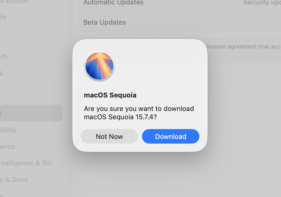
Downloading the Sequoia installer through Software Update. Downloading this way serves as an additional compatibility check; your Mac won’t download any version of macOS too old for it to run.
Credit: Andrew Cunningham
Downloading the Sequoia installer through Software Update. Downloading this way serves as an additional compatibility check; your Mac won’t download any version of macOS too old for it to run. Credit: Andrew Cunningham
To make a USB installer, you’ll need a 32GB or larger USB flash drive and the downloadable macOS Sequoia installer. A 16GB drive was large enough for macOS for many years, but Sequoia and Tahoe are too large by a couple of gigabytes.
Apple’s support page here links to every downloadable macOS installer going back to 2011’s 10.7 Lion. In Tahoe, the macOS Sequoia link takes you to the App Store, which then bounces you to Software Update in the Settings app. This process has enough points of failure that it may not work the first time; try clicking the “Get” button in the App Store again and it usually goes.
If you’re downloading the installer from within macOS Tahoe, you’ll see a pop-up when the download completes, telling you that the installer can’t be run from within that version of macOS. Since we’ll be running it off of its own USB stick, you can safely ignore this message.
While the installer is downloading, install and prepare your USB drive. Open Disk Utility, click the View button, and select “show all devices.” Click the root of your USB drive under the “external” header in the left sidebar, and click the Erase button in the upper-right control area.
Change the disk’s name to whatever you want—I use “MyVolume” so I don’t have to change Apple’s sample terminal commands when copying the installer files—and make sure the Format is set to Mac OS Extended (Journaled) and the Scheme is set to GUID Partition Map. (That’s not an error; the macOS installer still wants an HFS+ filesystem rather than APFS.)
The handy thing is that if you have a larger USB drive, you can create installers for multiple macOS versions by partitioning the disk with the Partition button. A 64GB drive split into three ~21GB partitions could boot Tahoe, Sequoia, and another past or future macOS version; I just have it split into two volumes so I can boot Sequoia and Tahoe installers from the same drive.
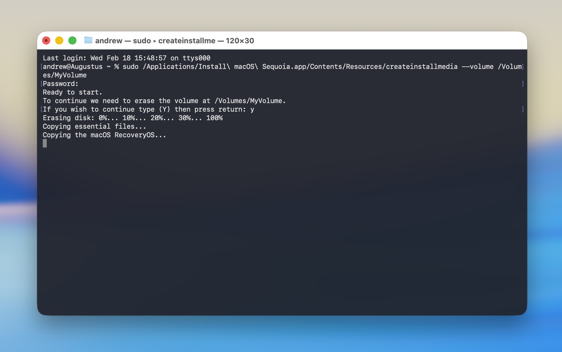
Running the Terminal command to create our macOS 15 Sequoia boot drive.
Credit: Andrew Cunningham
Running the Terminal command to create our macOS 15 Sequoia boot drive. Credit: Andrew Cunningham
Once the Sequoia installer is in your Applications folder, run a Terminal command to copy the installer files. Apple has commands for each version of macOS on this page. Use this one for Sequoia:
sudo /Applications/Install macOS Sequoia.app/Contents/Resources/createinstallmedia --volume /Volumes/MyVolume
If you named the USB drive something other than MyVolume when you formatted it, change the name in the command as well. Note that names with spaces require a backslash before each space.
The Terminal will prompt you for your password and ask you to type Y to confirm. It will then reformat the drive and copy the files over. The time this takes will vary depending on the speed of the USB drive you’re using, but for most USB 3 drives, it should only take a few minutes to create the installer. When the Terminal command is done running, leave the disk inserted and shut down your Mac.
Using the USB installer
With your Mac powered down and the USB installer drive inserted, press and hold the power button on your Mac (the Touch ID button on any laptop or the dedicated power button on a desktop) until the text under the Apple logo changes to “loading startup options.” You should see the macOS Sequoia installer listed alongside Macintosh HD as a boot option; highlight it and click Continue. If you don’t see the Sequoia installer, you may need an extra step—highlight Options, then click Continue, and we’ll talk more about this momentarily.
Once booted, the Sequoia installer will automatically launch the macOS installer to do an in-place upgrade, which isn’t what we want. Hit Command+Q to quit the installer and click through the confirmation, and you’ll get the typical menu of recovery environment options; from here, launch Disk Utility, click the top level of the internal Macintosh HD disk, and click Erase. Click through the prompts to erase the Mac and restart.
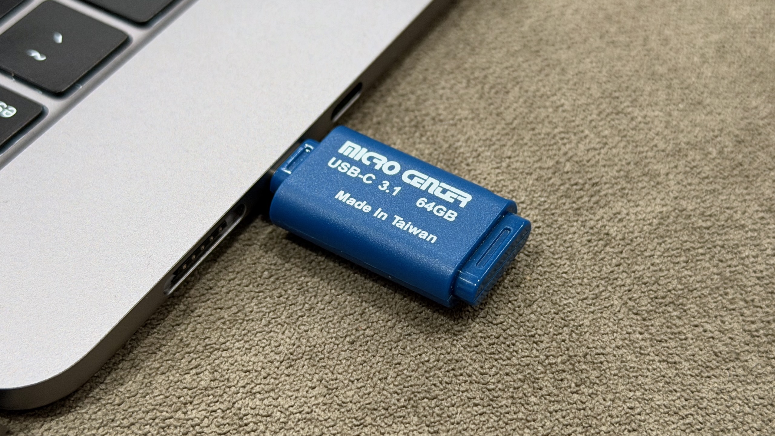
My own macOS USB installer from my beloved Micro Center.
Credit: Andrew Cunningham
My own macOS USB installer from my beloved Micro Center. Credit: Andrew Cunningham
After the Mac restarts, you’ll need an Internet connection to activate it before you can do anything else with it; connect using the Wi-Fi menu in the top-right, typing in your network SSID and password manually if the menu doesn’t auto-populate. This will activate your Mac and get you back to the recovery environment menu.
Here, select the Sequoia installer and click through the prompts—you should be able to install Sequoia on the now-empty Macintosh HD volume with no difficulty. From here, there’s nothing else to do. Wait until the installation completes, and when it’s ready, it will boot into a fresh Sequoia install, ready to be set up.
If you didn’t see your Sequoia installer in the boot menu before and you clicked the Options gear instead, it usually means that FileVault encryption or Find My was enabled on the Mac—maybe you signed into your Apple account when you were initially setting up Tahoe before you decided you wanted nothing to do with it.
When you boot into the recovery environment, you’ll be asked to select a user you know the password for, which will unlock the encrypted disk. If all you want to do is erase the Mac and make it bootable from your USB stick, don’t worry about this; just select Recovery Assistant from the menu, select Erase Mac, and click through the prompts. Then, use the steps above to boot from your USB stick, and you should be able to install a fresh copy of whatever macOS version you want to the now-erased internal drive.
The nuclear option: A DFU restore
Normally, a bootable USB installer does everything you need it to do. It wipes the data from your Mac’s internal storage and replaces it with new data. But occasionally you need to drill a little deeper, either because your Mac becomes unresponsive or you’ve been running beta software and want to switch back to a stable release. Or just because other steps haven’t worked for you.
The nuclear option for resetting a Mac is a DFU (or Device Firmware Upgrade) restore. Based on the restore process for iPhones and iPads, a DFU restore uses a compressed IPSW archive that contains not only the macOS system files but also firmware files for all Apple Silicon Macs. The USB installer just replaces macOS; the DFU restore replaces everything from the firmware on up. (These are also the same files used to create macOS virtual machines using Apple’s Virtualization Framework.)
Because a DFU restore can only be performed on a Mac that’s booted into a special DFU mode, you’ll need a second Mac with a USB-C or Thunderbolt port, plus a USB-C cable. Apple says the USB-C charging cable included with Macs will work for this but not to use a Thunderbolt cable; I’ve used a generic USB-C cable, and it has worked fine.
The first step is to download the relevant IPSW file from Apple. This page on the Mr. Macintosh site is the one I have bookmarked because it’s a good repository of virtually every macOS IPSW file Apple has ever released, including beta versions for when those are useful.
First, download the macOS 15.6.1 IPSW file linked on that page (and here) to your host Mac (Apple stops releasing IPSW files for older OSes once newer ones have been released, so this is the newest file you’ll be able to get for macOS 15). Both iPhones and iPads have model-specific IPSW files, but for macOS, there’s just one image that works with all Macs.
On the Mac you’re trying to restore—we’ll call it the “target Mac” for simplicity’s sake—figure out which of its USB-C ports is the designated DFU port. There’s only one that will work, and it’s usually the leftmost or rightmost port. Plug one end of the USB-C cable into that DFU port and the other into any USB-C port on your host Mac and follow Apple’s instructions for how to boot the system into DFU mode.
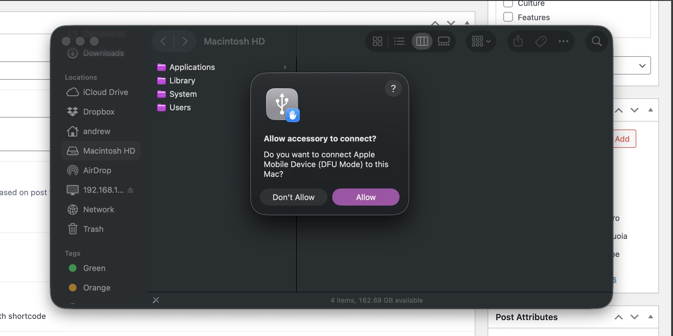
A Mac in DFU mode will need permission before your Mac can work with it.
Credit: Andrew Cunningham
A Mac in DFU mode will need permission before your Mac can work with it. Credit: Andrew Cunningham
When it’s successfully booted into DFU mode, your host Mac will see the target Mac, and you’ll see the same notification you get any time you plug in USB accessories for the first time. Allow it to connect, open a Finder window, and scroll down the left-hand sidebar until you get to “Mac” under the Locations heading.
The Finder’s DFU interface is pretty simple—a picture, a line of text, and two buttons. We want to restore, not revive, the Mac. Clicking the Revive Mac button will normally download and install the latest macOS version from Apple. But you can force it to use a different IPSW file—like the Sequoia one we just downloaded—by holding down the Option key as you click it. Navigate to the IPSW file, open it, and allow the restore process to begin.
This will take some time; you can track progress in the first phase in the Finder window. After a few minutes, the Mac you’re restoring will light back up, and you can watch its progress there. Once the target Mac reboots with its signature chime, the process is complete.
Because the IPSW file is for an outdated version of Sequoia, the first thing you’ll want to do is hit Software Update for the latest Sequoia and Safari versions; you’ll be offered a Tahoe upgrade, but you obviously won’t want to do that after the trouble you just went through. Scroll down to “other updates,” and you’ll be offered all the non-Tahoe updates available.
Downgrader’s remorse?
You will run into a handful of downsides when running an older version of macOS, especially if you’re trying to use it with iPhones and/or iPads that have been updated to version 26.
Most of the awkwardness will involve new features introduced in Messages, Notes, Reminders, and other Apple apps that sync between devices. The Messages app in Sequoia doesn’t support background images or polls, and it handles spam filtering slightly differently. They’re minor absences and annoyances, mostly, but they’re still absences and annoyances.
At least for the time being, though, you’ll find Sequoia pretty well-supported by most of Apple’s ecosystem. Core services like iCloud and iMessage aren’t going anywhere; Xcode still supports Sequoia, as does every Apple Creator Studio app update aside from the new Pixelmator Pro. App support may eventually drop off, but there’s not a lot that requires the latest and greatest version of macOS.
If and when you decide it’s time to step up to a newer version of macOS, Tahoe (or whatever macOS 27 is called) will be there in Software Update waiting for you. You’ll need to install a new version eventually if you want to keep getting app updates and security patches. But you don’t have to yet.

Andrew is a Senior Technology Reporter at Ars Technica, with a focus on consumer tech including computer hardware and in-depth reviews of operating systems like Windows and macOS. Andrew lives in Philadelphia and co-hosts a weekly book podcast called Overdue.
How to downgrade from macOS 26 Tahoe on a new Mac Read More »


