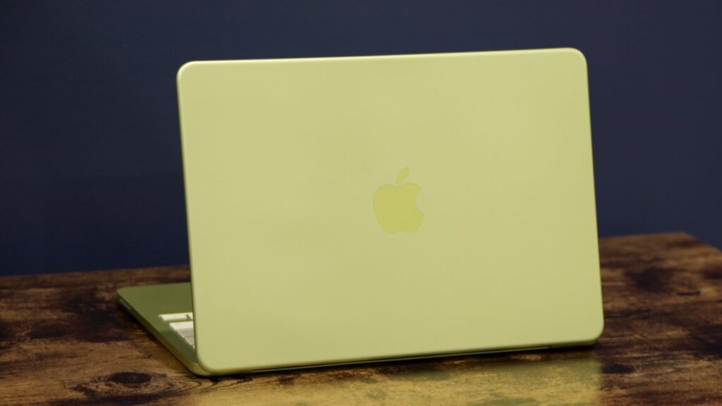
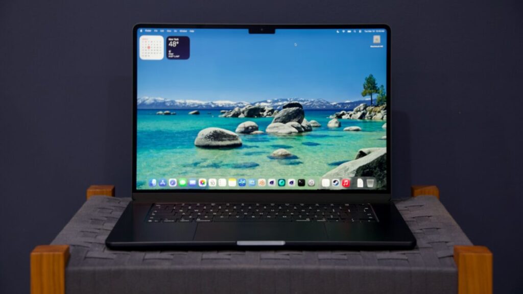
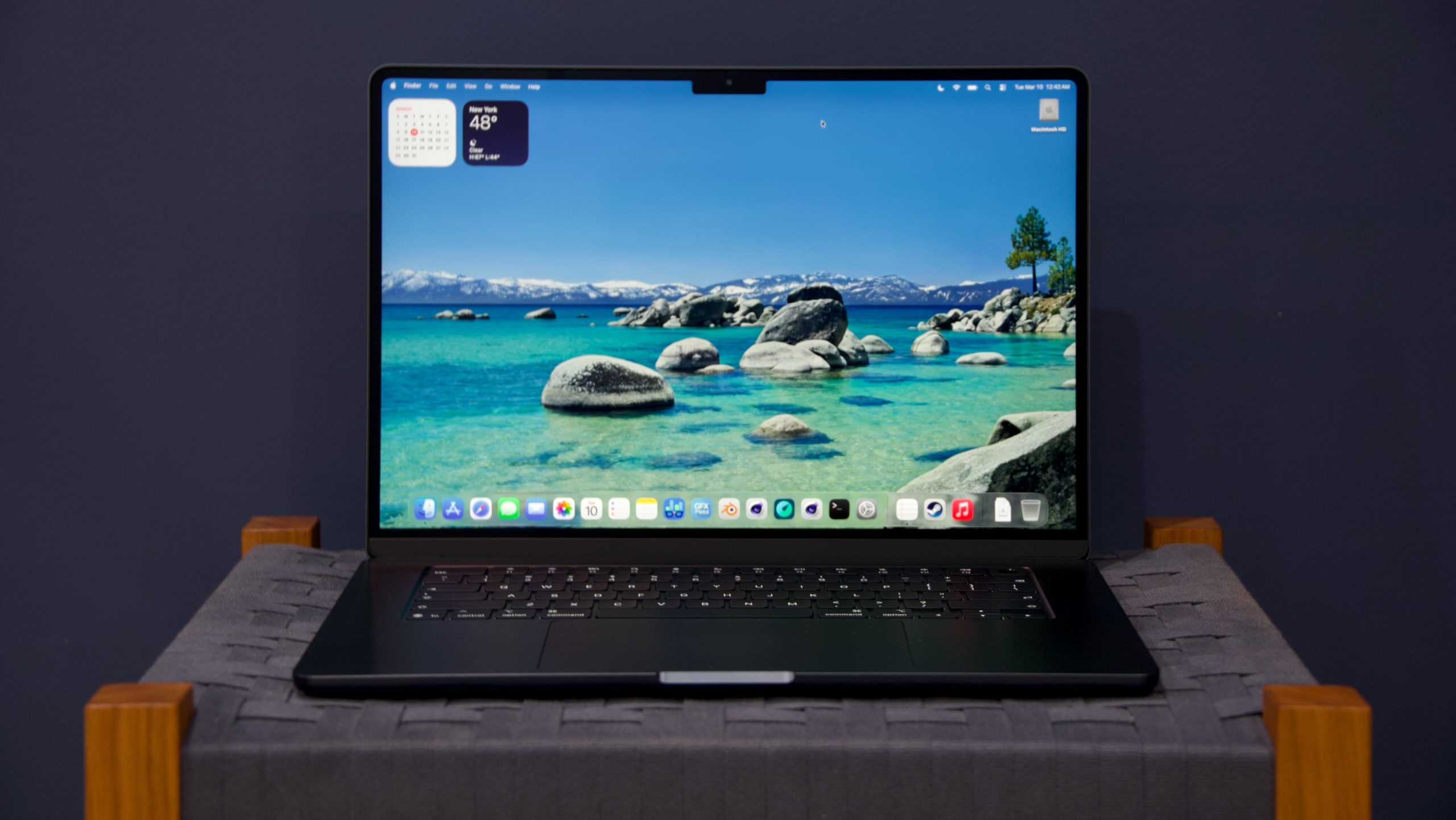
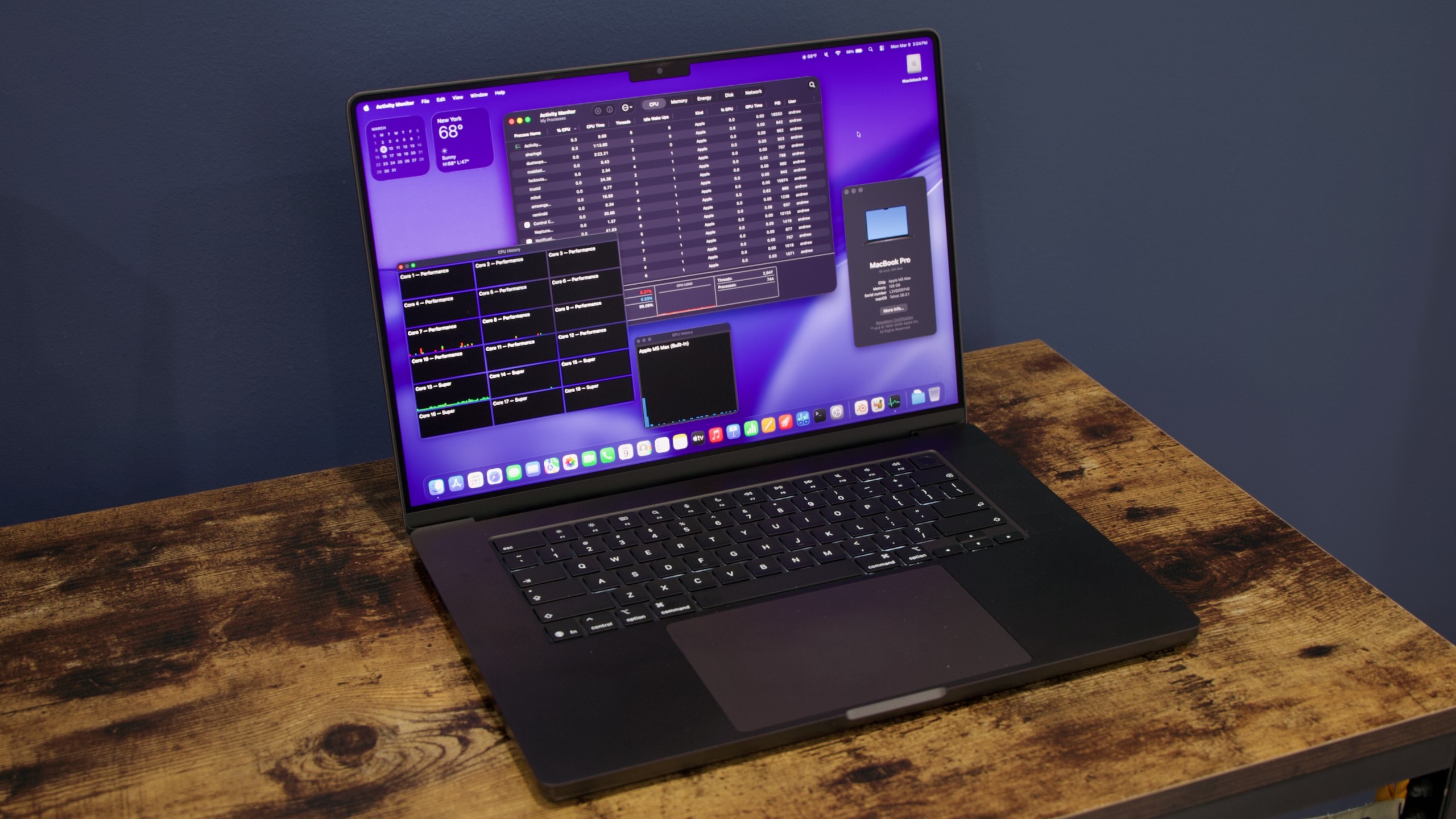
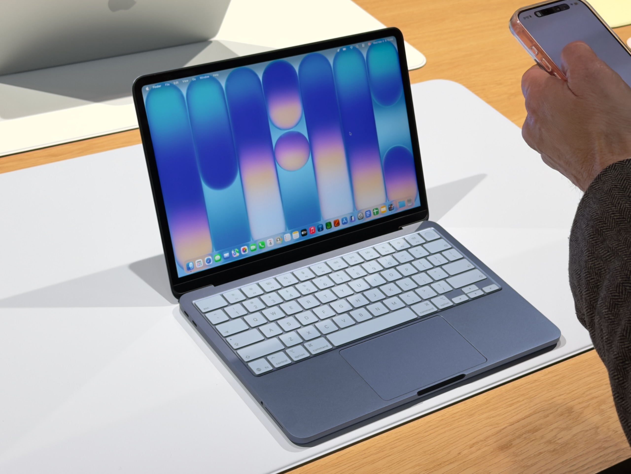
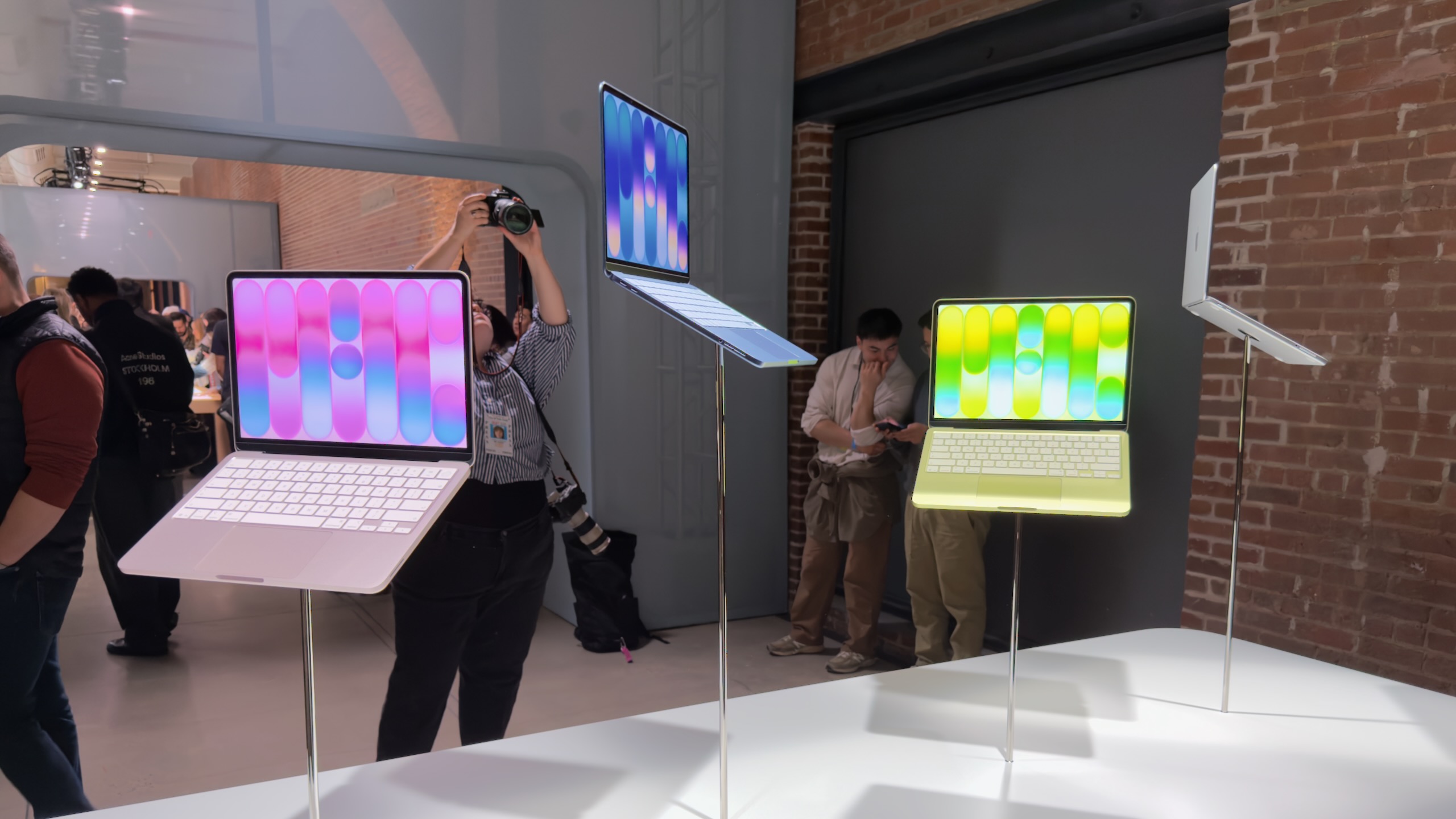
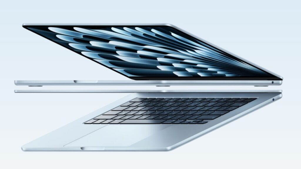
At multiple points over many years, Apple executives have taken great pains to point out that they think touchscreen Macs are a silly idea. But it remains one of those persistent Mac rumors that crops up over and over again every couple of years, from sources that are reliable enough that they shouldn’t be dismissed out of hand.
Today’s contribution comes from supply chain analyst Ming Chi-Kuo, who usually has some insight into what Apple is testing and manufacturing. Kuo says that touchscreen MacBook Pros are “expected to enter mass production by late 2026,” and that the devices will also shift to using OLED display panels instead of the Mini LED panels on current-generation MacBook Pros.
Kuo says that Apple’s interest in touchscreen Macs comes from “long-term observation of iPad user behavior.” Apple’s tablet hardware launches in the last few years have also included keyboard and touchpad accessories, and this year’s iPadOS 26 update in particular has helped to blur the line between the touch-first iPad and the keyboard-and-pointer-first Mac. In other words, Apple has already acknowledged that both kinds of input can be useful when combined in the same device; taking that same jump on the Mac feels like a natural continuation of work Apple is already doing.
Touchscreens became much more common on Windows PCs starting in 2012 when Windows 8 was released, itself a response to Apple’s introduction of the iPad a couple of years before. Microsoft backed off on almost all of Windows 8’s design decisions in the following years after the dramatic UI shift proved unpopular with traditional mouse-and-keyboard users, but touchscreen PCs like Microsoft’s Surface lineup have persisted even as the software has changed.
Spotlighting the most helpful new features of iOS 26.
The new Clear icons look in iOS 26 can make it hard to identify apps, since they’re all the same color. Credit: Scharon Harding
iOS 26 became publicly available this week, ushering in a new OS naming system and the software’s most overhauled look since 2013. It may take time to get used to the new “Liquid Glass” look, but it’s easier to appreciate the pared-down controls.
Beyond a glassy, bubbly new design, the update’s flashiest new features also include new Apple Intelligence AI integration that varies in usefulness, from fluffy new Genmoji abilities to a nifty live translation feature for Phones, Messages, and FaceTime.
New tech is often bogged down with AI-based features that prove to be overhyped, unreliable, or just not that useful. iOS 26 brings a little of each, so in this review, we’ll home in on the iOS updates that will benefit both mainstream and power users the most.
Table of Contents
Let’s start with Liquid Glass
If we’re talking about changes that you’re going to use a lot, we should start with the new Liquid Glass software design that Apple is applying across all of its operating systems. iOS hasn’t had this much of a makeover since iOS 7. However, where iOS 7 applied a flatter, minimalist effect to windows and icons and their edges, iOS 26 adds a (sometimes frosted) glassy look and a mildly fluid movement to actions such as pulling down menus or long-pressing controls. All the while, windows look like they’re reflecting the content underneath them. When you pull Safari’s menu atop a webpage, for example, blurred colors from the webpage’s images and text are visible on empty parts of the menu.
Liquid Glass is now part of most of Apple’s consumer devices, including Macs and Apple TVs, but the dynamic visuals and motion are especially pronounced as you use your fingers to poke, slide, and swipe across your iPhone’s screen.
For instance, when you use a tinted color theme or the new clear theme for Home Screen icons, colors from the Home Screen’s background look like they’re refracting from under the translucent icons. It’s especially noticeable when you slide to different Home Screen pages. And in Safari, the address bar shrinks down and becomes more translucent as you scroll to read an article.
Because the theme is incorporated throughout the entire OS, the Liquid Glass effect can be cheesy at times. It feels forced in areas such as Settings, where text that just scrolled past looks slightly blurred at the top of the screen.
Liquid Glass makes the top of the Settings menu look blurred.
Credit: Scharon Harding
Liquid Glass makes the top of the Settings menu look blurred. Credit: Scharon Harding
Other times, the effect feels fitting, like when pulling the Control Center down and its icons appear to stretch down to the bottom of the screen and then quickly bounce into their standard size as you release your finger. Another place Liquid Glass flows nicely is in Photos. As you browse your pictures, colors subtly pop through the translucent controls at the bottom of the screen.
This is a matter of appearance, so you may have your own take on whether Liquid Glass looks tasteful or not. But overall, it’s the type of redesign that’s distinct enough to be a fun change, yet mild enough that you can grow accustomed to it if you’re not immediately impressed.
Liquid Glass simplifies navigation (mostly)
There’s more to Liquid Glass than translucency. Part of the redesign is simplifying navigation in some apps by displaying fewer controls.
Opening Photos is now cleaner at launch, bringing you to all of your photos instead of the Collections section, like iOS 18 does. At the bottom are translucent tabs for Library and Collections, plus a Search icon. Once you start browsing, the Library and Collections tabs condense into a single icon, and Years, Months, and All tabs appear, maintaining a translucence that helps keep your focus on your pictures.
You can still bring up more advanced options (such as Flash, Live, Timer) with one tap. And at the top of the camera’s field of view are smaller toggles for night mode and flash. But for when you want to take a quick photo, iOS 26 makes it easier to focus on the necessities while keeping the extraneous within short reach.
Similarly, the initial controls displayed at the bottom of the screen when you open Camera are pared down from six different photo- and video-shooting modes to the two that really matter: Photo and Video.
If you long-press Photo, options for the Time-Lapse, Slow-Mo, Cinematic, Portrait, Spatial, and Pano modes appear.
Credit: Scharon Harding
If you long-press Photo, options for the Time-Lapse, Slow-Mo, Cinematic, Portrait, Spatial, and Pano modes appear. Credit: Scharon Harding
iOS 26 takes the same approach with Video mode by focusing on the essentials (zoom, resolution, frame rate, and flash) at launch.New layout options for navigating Safari, however, slowed me down. In a new Compact view, the address bar lives at the bottom of the screen without a dedicated toolbar, giving the web page more screen space. But this setup makes accessing common tasks, like opening a new or old tab, viewing bookmarks, or sharing a link, tedious because they’re hidden behind a menu button.
If you tend to have multiple browser tabs open, you’ll want to stick with the classic layout, now called Top (where the address bar is at the top of the screen and the toolbar is at the bottom) or the Bottom layout (where the address bar and toolbar are at the bottom of the screen).
On the more practical side of Safari updates is a new ability to turn any webpage into a web app, making favorite and important URLs accessible quickly and via a dedicated Home Screen icon. This has been an iOS feature for a long time, but until now the pages always opened in Safari. Users can still do this if they like, but by default these sites now open as their own distinct apps, with dedicated icons in the app switcher. Web apps open full-screen, but in my experience, back and forward buttons only come up if you go to a new website. Sliding left and right replaces dedicated back and forward controls, but sliding isn’t as reliable as just tapping a button.
Viewing Ars Technica as a web app.
Credit: Scharon Harding
Viewing Ars Technica as a web app. Credit: Scharon Harding
iOS 26 remembers that iPhones are telephones
With so much focus on smartphone chips, screens, software, and AI lately, it can be easy to forget that these devices are telephones. iOS 26 doesn’t overlook the core purpose of iPhones, though. Instead, the new operating system adds a lot to the process of making and receiving phone calls, video calls, and text messages, starting with the look of the Phone app.
Continuing the streamlined Liquid Glass redesign, the Phone app on iOS 26 consolidates the bottom controls from Favorites, Recents, Contacts, Keypad, and Voicemail, to Calls (where voicemails also live), Contacts, and Keypad, plus Search.
I’d rather have a Voicemails section at the bottom of the screen than Search, though. The Voicemails section is still accessible by opening a menu at the top-right of the screen, but it’s less prominent, and getting to it requires more screen taps than before.
On Phone’s opening screen, you’ll see the names or numbers of missed calls and voicemails in red. But voicemails also have a blue dot next to the red phone number or name (along with text summarizing or transcribing the voicemail underneath if those settings are active). This setup caused me to overlook missed calls initially. Missed calls with voicemails looked more urgent because of the blue dot. For me, at first glance, it appeared as if the blue dots represented unviewed missed calls and that red numbers/names without a blue dot were missed calls that I had already viewed. It’s taking me time to adjust, but there’s logic behind having all missed phone activity in one place.
Fighting spam calls and messages
For someone like me, whose phone number seems to have made it to every marketer and scammers’ contact lists, it’s empowering to have iOS 26’s screening features help reduce time spent dealing with spam.
The phone can be set to automatically ask callers with unsaved numbers to state their name. As this happens, iOS displays the caller’s response on-screen, so you can decide if you want to answer or not. If you’re not around when the phone rings, you can view the transcript later and then mark the caller as known, if desired. This has been my preferred method of screening calls and reduces the likelihood of missing a call I want to answer.
There are also options for silencing calls and voicemails from unknown numbers and having them only show in a section of the app that’s separate from the Calls tab (and accessible via the aforementioned Phone menu).
A new Phone menu helps sort important calls from calls that are likely spam.
Credit: Scharon Harding
A new Phone menu helps sort important calls from calls that are likely spam. Credit: Scharon Harding
You could also have iOS direct calls that your cell phone carrier identifies as spam to voicemail and only show the missed calls in the Phone menu’s dedicated Spam list. I found that, while the spam blocker is fairly reliable, silencing calls from unsaved numbers resulted in me missing unexpected calls from, say, an interview source or my bank. And looking through my spam and unknown callers lists sounds like extra work that I’m unlikely to do regularly.
Messages
iOS 26 applies the same approach to Messages. You can now have texts from unknown senders and spam messages automatically placed into folders that are separate from your other texts. It’s helpful for avoiding junk messages, but it can be confusing if you’re waiting for something like a two-factor authentication text, for example.
Elsewhere in Messages is a small but effective change to browsing photos, links, and documents previously exchanged via text. Upon tapping the name of a person in a conversation in Messages, you’ll now see tabs for viewing that conversation’s settings (such as the recipient’s number and a toggle for sending read receipts), as well as separate tabs for photos and links. Previously, this was all under one tab, so if you wanted to find a previously sent link, you had to scroll through the conversation’s settings and photos. Now, you can get to links with a couple of quick taps. Additionally, with iOS 26 you can finally set up custom iMessage backgrounds, including premade ones and ones that you can make from your own photos or by using generative AI. It’s not an essential update but is an easy way to personalize your iPhone by brightening up texts.
Hold Assist
Another time saver is Hold Assist. It makes calling customer service slightly more tolerable by allowing you to hang up during long wait times and have your iPhone ring when someone’s ready to talk to you. It’s a feature that some customer service departments have offered for years already, but it’s handy to always have it available.
You have to be quick to respond, though. One time I answered the phone after using Hold Assist, and the caller informed me that they had said “hello” a few times already. This is despite the fact that iOS is supposed to let the agent know that you’ll be on the phone shortly. If I had waited a couple more seconds to pick up the phone, it’s likely that the customer service rep would have hung up.
Live translations
One of the most novel features that iOS 26 brings to iPhone communication is real-time translations for Spanish, Mandarin, French, German, Italian, Japanese, Korean, and Portuguese. After downloading the necessary language libraries, iOS can translate one of those languages to another in real time when you’re talking on the phone or FaceTime or texting.
The feature worked best in texts, where the software doesn’t have to deal with varying accents, people speaking fast or over one another, stuttering, or background noise. Translated texts and phone calls always show the original text written in the sender’s native language, so you can double-check translations or see things that translations can miss, like acronyms, abbreviations, and slang.
Translating some basic Spanish.
Credit: Scharon Harding
Translating some basic Spanish. Credit: Scharon Harding
During calls or FaceTime, Live Translation sometimes struggled to keep up while it tried to manage the nuances and varying speeds of how different people speak, as well as laughs and other interjections.
However, it’s still remarkable that the iPhone can help remove language barriers without any additional hardware, apps, or fees. It will be even better if Apple can improve reliability and add more languages.
Spatial images on the Home and Lock Screen
The new spatial images feature is definitely on the fluffier side of this iOS update, but it is also a practical way to spice up your Lock Screen, Home Screen, and the Home Screen’s Photos widget.
Basically, it applies a 3D effect to any photo in your library, which is visible as you move your phone around in your hand. Apple says that to do this, iOS 26 uses the same generative AI models that the Apple Vision Pro uses and creates a per-pixel depth map that makes parts of the image appear to pop out as you move the phone within six degrees of freedom.
The 3D effect is more powerful on some images than others, depending on the picture’s composition. It worked well on a photo of my dog sitting in front of some plants and behind a leaf of another plant. I set the display time so that it appears tucked behind her fur, and when I move the phone around, the dog and the leaf in front of her appear to move around, while the background plants stay still.
But in images with few items and sparser backgrounds, the spatial effect looks unnatural. And oftentimes, the spatial effect can be quite subtle.
Still, for those who like personalizing their iPhone with Home and Lock Screen customization, spatial scenes are a simple and harmless way to liven things up. And, if you like the effect enough, a new spatial mode in the Camera app allows you to create new spatial photos.
A note on Apple Intelligence notification summaries
As we’ve already covered in our macOS 26 Tahoe review, Apple Intelligence-based notification summaries haven’t improved much since their 2024 debut in iOS 18 and macOS 15 Sequoia. After problems with showing inaccurate summaries of news notifications, Apple updated the feature to warn users that the summaries may be inaccurate. But it’s still hit or miss when it comes to how easy it is to decipher the summaries.
I did have occasional success with notification summaries in iOS 26. For instance, I understood a summary of a voicemail that said, “Payment may have appeared twice; refunds have been processed.” Because I had already received a similar message via email (a store had accidentally charged me twice for a purchase and then refunded me), I knew I didn’t need to open that voicemail.
Vague summaries sometimes tipped me off as to whether a notification was important. A summary reading “Townhall meeting was hosted; call [real phone number] to discuss issues” was enough for me to know that I had a voicemail about a meeting that I never expressed interest in. It wasn’t the most informative summary, but in this case, I didn’t need a lot of information.
However, most of the time, it was still easier to just open the notification than try to decipher what Apple Intelligence was trying to tell me. Summaries aren’t really helpful and don’t save time if you can’t fully trust their accuracy or depth.
Playful, yet practical
With iOS 26, iPhones get a playful new design that’s noticeable and effective but not so drastically different that it will offend or distract those who are happy with the way iOS 18 works. It’s exciting to experience one of iOS’s biggest redesigns, but what really stands out are the thoughtful tweaks that bring practical improvements to core features, like making and receiving phone calls and taking pictures.
Some additions and changes are superfluous, but the update generally succeeds at improving functionality without introducing jarring changes that isolate users or force them to relearn how to use their phone.
I can’t guarantee that you’ll like the Liquid Glass design, but other updates should make it simpler to do some of the most important tasks with iPhones, and it should be a welcome improvement for long-time users.
Scharon is a Senior Technology Reporter at Ars Technica writing news, reviews, and analysis on consumer gadgets and services. She’s been reporting on technology for over 10 years, with bylines at Tom’s Hardware, Channelnomics, and CRN UK.
The Game Overlay in macOS Tahoe. Credit: Andrew Cunningham
Tahoe’s new Game Overlay doesn’t add features so much as it groups existing gaming-related features to make them more easily accessible.
The overlay makes itself available any time you start a game, either via a keyboard shortcut or by clicking the rocketship icon in the menu bar while a game is running. The default view includes brightness and volume settings, toggles for your Mac’s energy mode (for turning on high-performance or low-power mode, when they’re available), a toggle for Game Mode, and access to controller settings when you’ve got one connected.
The second tab in the overlay displays achievements, challenges, and leaderboards for the game you’re playing—though only if they offer Apple’s implementation of those features. Achievements for games installed from Steam, for example, aren’t visible. And the last tab is for social features, like seeing your friends list or controlling chat settings (again, when you’re using Apple’s implementation).
More granular notification summaries
I didn’t think the Apple Intelligence notification summaries were very useful when they launched in iOS 18 and macOS 15 Sequoia last year, and I don’t think iOS 26 or Tahoe really changes the quality of those summaries in any immediately appreciable way. But following a controversy earlier this year where the summaries botched major facts in breaking news stories, Apple turned notification summaries for news apps off entirely while it worked on fixes.
Those fixes, as we’ve detailed elsewhere, are more about warning users of potential inaccuracies than about preventing those inaccuracies in the first place.
Apple now provides three broad categories of notification summaries: those for news and entertainment apps, those for communication and social apps, and those for all other kinds of apps. Summaries for each category can be turned on or off independently, and the news and entertainment category has a big red disclaimer warning users to “verify information” in the individual news stories before jumping to conclusions. Summaries are italicized, get a special icon, and a “summarized by Apple Intelligence” badge, just to make super-ultra-sure that people are aware they’re not taking in raw data.
Personally, I think if Apple can’t fix the root of the problem in a situation like this, then it’s best to take the feature out of iOS and macOS entirely rather than risk giving even one person information that’s worse or less accurate than the information they already get by being a person on the Internet in 2025.
As we wrote a few months ago, asking a relatively small on-device language model to accurately summarize any stack of notifications covering a wide range of topics across a wide range of contexts is setting it up to fail. It does work OK when summarizing one or two notifications, or when summarizing straightforward texts or emails from a single person. But for anything else, be prepared for hit-or-miss accuracy and usefulness.
Relocated volume and brightness indicators
The pop-ups you see when adjusting the system volume or screen brightness have been redesigned and moved. The indicators used to appear as large rounded squares, centered on the lower half of your primary display. The design had changed over the years, but this was where they’ve appeared throughout the 25-year existence of Mac OS X.
Now, both indicators appear in the upper-right corner of the screen, glassy rectangles that pop out from items on the menu bar. They’ll usually appear next to the Control Center menu bar item, but the volume indicator will pop out of the Sound icon if it’s visible.
New low battery alert
Tahoe picks up an iPhone-ish low-battery alert on laptops. Credit: Andrew Cunningham
Tahoe tweaks the design of macOS’ low battery alert notification. A little circle-shaped meter (in the same style as battery meters in Apple’s Batteries widgets) shows you in bright red just how close your battery is to being drained.
This notification still shows up separately from others and can’t be dismissed, though it doesn’t need to be cleared and will go away on its own. It starts firing off when your laptop’s battery hits 10 percent and continues to go off when you drop another percentage point from there (it also notified me without the percentage readout changing, seemingly at random, as if to annoy me badly enough to plug my computer in more quickly).
The notification frequency and the notification thresholds can’t be changed, if this isn’t something you want to be reminded about or if it’s something you want to be reminded about even earlier. But you could possibly use the battery level trigger in Shortcuts to customize your Mac’s behavior a bit.
Recovery mode changes
A new automated recovery tool in macOS Tahoe’s recovery volume. Credit: Andrew Cunningham
Tahoe’s version of the macOS Recovery mode gets a new look to match the rest of the OS, but there are a few other things going on, too.
If you’ve ever had a problem getting your Mac to boot, or if you’ve ever just wanted to do a totally fresh install of the operating system, you may have run into the Mac’s built-in recovery environment before. On an Apple Silicon Mac, you can usually access it by pressing and holding the power button when you start up your Mac and clicking the Options button to start up using the hidden recovery volume rather than the main operating system volume.
Tahoe adds a new tool called the Device Recovery Assistant to the recovery environment, accessible from the Utilities menu. This automated tool “will look for any problems” with your system volume “and attempt to resolve them if found.”
Maybe the Recovery Assistant will actually solve your boot problems, and maybe it won’t—it doesn’t tell you much about what it’s doing, beyond needing to unlock FileVault on my system volume to check it out. But it’s one more thing to try if you’re having serious problems with your Mac and you’re not ready to countenance a clean install yet.
The web browser in the recovery environment is still WebKit, but it’s not Safari-branded anymore, and it sheds a lot of Safari features you wouldn’t want or need in a temporary OS. Credit: Andrew Cunningham
Apple has made a couple of other tweaks to the recovery environment, beyond adding a Liquid Glass aesthetic. The recovery environment’s built-in web browser is simply called Web Browser, and while it’s still based on the same WebKit engine as Safari, it doesn’t have Safari’s branding or its settings (or other features that are extraneous to a temporary recovery environment, like a bookmarks menu). The Terminal window picks up the new Clear theme, new SF Mono Terminal typeface, and the new default 120-row-by-30-column size.
A new disk image format
Not all Mac users interact with disk images regularly, aside from opening them up periodically to install an app or restore an old backup. But among other things, disk images are used by Apple’s Virtualization framework, which makes it relatively simple to run macOS and Linux virtual machines on the platform for testing and other things. But the RAW disk image format used by older macOS versions can come with quite severe performance penalties, even with today’s powerful chips and fast PCI Express-connected SSDs.
Enter the Apple Sparse Image Format, or ASIF. Apple’s developer documentation says that because ASIF images’ “intrinsic structure doesn’t depend on the host file system’s capabilities,” they “transfer more efficiently between hosts or disks.” The upshot is that reading files from and writing files to these images should be a bit closer to your SSD’s native performance (Howard Oakley at The Eclectic Light Company has some testing that suggests significant performance improvements in many cases, though it’s hard to make one-to-one comparisons because testing of the older image formats was done on older hardware).
The upshot is that disk images should be capable of better performance in Tahoe, which will especially benefit virtual machines that rely on disk images. This could benefit the lightweight virtualization apps like VirtualBuddy and Viable that mostly exist to provide a front end for the Virtualization framework, as well as virtualization apps like Parallels that offer support for Windows.
Quantum-safe encryption support
You don’t have a quantum computer on your desk. No one does, outside of labs where this kind of technology is being tested. But when or if they become more widely used, they’ll render many industry-standard forms of encryption relatively easy to break.
“He wanted to make [computers] more usable and friendly to people who weren’t geeks.”
Consider the cul-de-sac. It leads off the main street past buildings of might-have-been to a dead-end disconnected from the beaten path. Computing history, of course, is filled with such terminal diversions, most never to be fully realized, and many for good reason. Particularly when it comes to user interfaces and how humans interact with computers, a lot of wild ideas deserved the obscure burials they got.
But some deserved better. Nearly every aspiring interface designer believed the way we were forced to interact with computers was limiting and frustrating, but one man in particular felt the emphasis on design itself missed the forest for the trees. Rather than drowning in visual metaphors or arcane iconographies doomed to be as complex as the systems they represented, the way we deal and interact with computers should stress functionality first, simultaneously considering both what users need to do and the cognitive limits they have. It was no longer enough that an interface be usable by a human—it must be humane as well.
What might a computer interface based on those principles look like? As it turns out, we already know.
The man was Jef Raskin, and this is his cul-de-sac.
The Apple core of the Macintosh
It’s sometimes forgotten that Raskin was the originator of the Macintosh project in 1979. Raskin had come to Apple with a master’s in computer science from Penn State University, six years as an assistant professor of visual arts at the University of California, San Diego (UCSD), and his own consulting company. Apple co-founder Steve Jobs subsequently hired Raskin’s company to write the Apple II’s BASIC programming manual, and Raskin joined Apple as manager of publications in 1978.
Raskin’s work on documentation and testing, combined with his technical acumen, gave him outsized influence within the young company. As the 40-column uppercase-only Apple II was ill-suited for Raskin’s writing, Apple developed a text editor and an 80-column display card, and Raskin leveraged his UCSD contacts to port UCSD Pascal and the p-System virtual machine to the Apple II when Steve Wozniak developed the Apple II’s floppy disk drives. (Apple sold this as Apple Pascal, and many landmark software programs like the Apple Presents Apple tutorial were written in it.)
But Raskin nevertheless concluded that a complex computer (by the standards of the day) could never exist in quantity, nor be usable by enough people to matter. In his 1979 essay “Computers by the Millions,” he argued against systems like the Apple II and the in-development Apple III that relied on expansion slots and cards for many advanced features. “What was not said was that you then had the rather terrible task of writing software to support these new ‘boards,’” he wrote. “Even the more sophisticated operating systems still required detailed understanding of the add-ons… This creates a software nightmare.”
Instead, he felt that “personal computers will be self-contained, complete, and essentially un-expandable. As we’ll see, this strategy not only makes it possible to write complete software but also makes the hardware much cheaper and producible.” Ultimately, Raskin believed, only a low-priced, low-complexity design could be manufactured in large enough numbers for a future world and be functional there.
The original Macintosh was designed as an embodiment of some of these concepts. Apple chairman Mike Markkula had a $500 (around $2,200 in 2025) game machine concept in mind called “Annie,” named after the Playboy comic character and intended as a low-end system paired with the Apple II—starting at around double that price at the time—and the higher-end Apple III and Lisa, which were then in development. Raskin wasn’t interested in developing a game console, but he did suggest to Markkula that a $500 computer could have more appeal, and he spent several months writing specifications and design documents for the proposed system before it was approved.
“My message,” wrote Raskin in The Book of Macintosh, “is that computers are easy to use, and useful in everyday life, and I want to see them out there, in people’s hands, and being used.” Finding female codenames sexist, he changed Annie to Macintosh after his favorite variety of apple, though using a variant spelling to avoid a lawsuit with the previously existing McIntosh Laboratory. (His attempt was ultimately for naught, as Apple later ended up having to license the trademark from the hi-fi audio manufacturer and then purchase it outright anyway.)
Raskin’s small team developed the hardware at Apple’s repurposed original Cupertino offices separate from the main campus. Initially, he put together a rough all-in-one concept, originally based on an Apple II (reportedly serial number 2) with a “jury-rigged” monitor. This evolved into a prototype chiefly engineered by Burrell Smith, selecting for its CPU the 8-bit Motorola 6809 as an upgrade from the Apple II’s MOS 6502 but still keeping costs low.
Similarly, a color display and a larger amount of RAM would have also added expense, so the prototype had a small 256×256 monochrome CRT driven by the ubiquitous Motorola 6845 CRTC, plus 64K of RAM. A battery and built-in printer were considered early on but ultimately rejected. The interface emphasized text and keyboard: There was no mouse, and the display was character-based instead of graphical.
Raskin was aware of early graphical user interfaces in development, particularly Xerox PARC’s, and he had even contributed to early design work on the Lisa, but he believed the mouse was inferior to trackballs and tablets and felt such pointing devices were more appropriate for graphics than text. Instead, function keys allowed the user to select built-in applications, and the machine could transparently shift between simple text entry or numeric evaluation in a “calculator-based language” depending on what the user was typing.
During the project’s development, Apple management had recurring concerns about its progress, and it was nearly canceled several times. This changed in late 1980 when Jobs was removed from the Lisa project by President Mike Scott, after which Jobs moved to unilaterally take over the Macintosh, which at that time was otherwise considered a largely speculative affair.
Raskin initially believed the change would be positive, as Jobs stated he was only interested in developing the hardware, and his presence and interest quickly won the team new digs and resources. New team member Bud Tribble suggested that it should be able to take advantage of the Lisa’s powerful graphics routines by migrating to its Motorola 68000, and by February 1981, Smith was able to duly redesign the prototype for the more powerful CPU while maintaining its lower-cost 8-bit data bus.
This new prototype expanded graphics to 384×256, allowed the use of more RAM, and ran at 8 MHz, making the prototype noticeably faster than the 5 MHz Lisa yet substantially cheaper. However, by sharing so much of Lisa’s code, the interface practically demanded a pointing device, and the mouse was selected, even though Raskin had so carefully tried to avoid it. (Raskin later said he did prevail with Jobs on the mouse only having one button, which he believed would be easier for novices, though other Apple employees like Larry Tesler have contested his influence on this decision.)
As Jobs started to take over more and more portions of the project, the two men came into more frequent conflict, and Raskin eventually quit Apple for good in March 1982. The extent of Raskin’s residual impact on the Macintosh’s final form is often debated, but the resulting 1984 Macintosh 128K is clearly a different machine from what Raskin originally envisioned. Apple acknowledged Raskin’s contributions in 1987 by presenting him with one of the six “millionth” Macintoshes, which he auctioned off in 1999 along with the Apple II used in the original concept.
A Swyftly tilting project
After Raskin’s departure from Apple, he established Information Appliance, Inc. in Palo Alto to develop his original concept on his own terms. By this time, it was almost a foregone conclusion that microcomputers would sooner or later make their way to everyone; indeed, home computer pioneers like Jack Tramiel’s Commodore were already selling inexpensive “computers by the millions”—literally. With the technology now evolving at a rapid pace, Raskin wanted to concentrate more on the user interface and the concept’s built-in functionality, reviving the ideas he believed had become lost in the Macintosh’s transition. He christened it with a new name: Swyft.
In terms of industrial design, the Swyft owed a fair bit to Raskin’s prior prototype as it was also an all-in-one machine, using a built-in 9” monochrome CRT display. Unlike the Macintosh, however, the screen was set back at an angle and the keyboard was built-in; it also had a small handle at the base of its sloped keyboard making it at least notionally portable.
Disk technology had advanced, so it sported a 3.5-inch floppy drive (also like the Macintosh, albeit hidden behind a door), though initially the prototype used a less-powerful 8-bit MOS 6502 CPU running at 2MHz. The 6502’s 64K addressing limit and the additional memory banking logic it required eventually proved inadequate, and the CPU was changed during development to the Motorola 68008, a cheaper version of the 68000 with an 8-bit data bus and a maximum address space of 1MB. Raskin intended the Swyft to act like an always-on appliance, always ready and always instant, so it had a lower-power mode and absolutely no power switch.
Instead of Pascal or assembly language, Swyft’s ROM operating system was primarily written in Forth. To reduce the size of the compiled code, developer Terry Holmes created a “tokenized” version that embedded smaller tokens instead of execution addresses into Forth word definitions, trading the overhead of an additional lookup step (which was written in hand-coded assembly and made very quick) for a smaller binary size. This modified dialect was called tForth (for “token,” or “Terry”). The operating system supported the hardware and the demands of the on-screen bitmapped display, which could handle true proportional text.
Swyft’s user interface was also radically different and was based on a “document” metaphor. Most computers of that time and today, mobile devices included, divide functionality among separate applications that access files. Raskin believed this approach was excessive and burdensome, writing in 1986 that “[b]y choosing to focus on computers rather than the tasks we wanted done, we inherited much of the baggage that had accumulated around earlier generations of computers. It is more a matter of style and operating systems that need elaborate user interfaces to support huge application programs.”
He expanded on this point in his 2000 book The Humane Interface: “[Y]ou start in the generating application. Your first step is to get to the desktop. You must also know which icons correspond to the desired documents, and you or someone else had to have gone through the steps of naming those documents. You will also have to know in which folder they are stored.”
Raskin thus conceived of a unified workspace in which everything was stored, accessed through one single interface appearing to the user as a text editor editing one single massive document. The editor was intelligent and could handle different types of text according to its context, and the user could subdivide the large document workspace into multiple subdocuments, all kept together. (This even included Forth code, which the user could write and evaluate in place to expand the system as they wished.) Data received from the serial port was automatically “typed” into the same document, and any or all text could be sent over the serial port or to a printer. Instead of function keys, a USE FRONT key acted like an Option or Command key to access special features.
Because everything was kept in one place, when the user saved the system state to a floppy disk, their entire workspace was frozen and stored in its entirety. Swyft additionally tagged the disk with a unique identifier so it knew when a disk was changed. When that disk was reinserted and resumed, the user picked up exactly where they left off, at exactly the same point, with everything they had been working on. Since everything was kept together and loaded en masse, there was no need for a filesystem.
Swyft also lacked a mouse—or indeed any conventional means of moving the cursor around. To navigate through the document, Swyft instead had LEAP keys, which when pressed alone would “creep” forward or backward by single characters. But when held down, you could type a string of characters and release the key, and the system would search forward or backward for that string and highlight it, jumping entire pages and subdocuments if necessary.
If you knew what was in a particular subdocument, you could find it or just LEAP forward to the next document marker to scan through what was there. Additionally, by leaping to one place, leaping again to another, and then pressing both LEAP keys together, you could select text as well. The steps to send, delete, change, or copy anything in the document are the same for everything in the document. “So the apparent simplicity [of other systems] is arrived at only after considerable work has been done and the user has shouldered a number of mental burdens,” wrote Raskin, adding, “the conceptual simplicity of the methods outlined here would be preferable. In most cases, the work required is also far less.”
Get something on sale faster, said Tom Swyftly
While around 60 Swyft prototypes of varying functionality were eventually made, IAI’s backers balked at the several million dollars additionally required to launch the product under the company’s own name. To increase their chances of a successful return on investment, they demanded a licensee for the design instead that would insulate the small company from the costs of manufacturing and sales. They found it in Japanese manufacturer Canon, which had expanded from its core optical and imaging lines into microcomputers but had spent years unsuccessfully trying to crack the market. However, possibly because of its unusual interface, Canon unexpectedly put its electronic typewriter division in charge of the project, and the IAI team began work with Canon’s engineers to refine the hardware for mass production.
SwyftCard advertisement in Byte, October 1985, with Jef Raskin and Steve Wozniak.
In the meantime, IAI investors prevailed upon management to find a way to release some of the Swyft technology early in a less expensive incarnation. This concept eventually turned into an expansion card for the Apple IIe. Raskin’s team was able to adapt some of the code written for the Swyft to the new device, but because the IIe is also a 6502-based system and is itself limited to a 64K address space, it required its own onboard memory banking hardware as well. With the card installed, the IIe booted into a scaled-down Swyft environment using its onboard 16K EPROM, with the option of disabling it temporarily to boot regular Apple software. Unlike the original Swyft, the Apple II SwyftCard does not use the bitmap display and appears strictly in 80-column non-proportional text. The SwyftCard went on sale in 1985 for $89.95, approximately $270 in 2025 dollars.
The initial SwyftCard tutorial page. Credit: Cameron Kaiser
The SwyftCard’s unified workspace can be subdivided into various “subdocuments,” which appear as hard page breaks with equals signs. Although up to 200 pages were supported, in practice, the available workspace limits you to about 15 or 20, “densely typed.” It came with a built-in tutorial which began with orienting you to the LEAP keys (i.e., the two Apple keys) and how to navigate: hold one of them down and type the text to leap to (or equals signs to jump to the next subdocument), or tap them repeatedly to slowly “creep.”
The two-tone cursor. Credit: Cameron Kaiser
Swyft and the SwyftCard implement a two-phased cursor, which the SwyftCard calls either “wide” or “narrow.” By default, the cursor is “narrow,” alternating between a solid and a partially filled block. As you type, the cursor splits into a “wide” form—any text shown in inverse, usually the last character you entered, is what is removed when you press DELETE, with the blinking portion after the inverse text indicating the insertion point. When you creep or leap, the cursor merges back into the “narrow” form. When narrow, DELETE deletes right as a true delete, instead of a backspace. If you selected text by pressing both LEAP keys together, those become highlighted in inverse and can be cut and pasted.
The SwyftCard software defines a USE FRONT key (i.e., the Control key) as well. This was most noticeable as a quick key combination for saving your work to disk, to which the entire workspace was saved in one go with no filenames (i.e., one disk equated one workspace), though it had many other such functions within the program. Since it could be tricky to juggle floppies without overwriting them, the software also took pains to ensure each formatted disk was tagged with a unique identifier to avoid accidental erasure. It also implemented serial communications such that you could dial up a remote system and use USE FRONT-SEND to send it or be dialed into and receive text into the workspace automatically.
SwyftCards didn’t sell in massive numbers, but their users loved them, particularly the speed and flexibility the system afforded. David Thornburg (the designer of the KoalaPad tablet), writing for A+ in November 1985, said it “accomplished something that I never knew was possible. It not only outperforms any Apple II word-processing system, but it lets the Apple IIe outperform the Macintosh… Will Rogers was right: it does take genius to make things simple.”
The Swyft and SwyftCard, however, were as much philosophy as interface; they represented Raskin’s clear desire to “abolish the application.” Rather than starting a potentially different interface to do a particular task, the task should be part of the machine’s standard interface and be launched by direct command. Similarly, even within the single user interface, there should be no “modes” and no switching between different minor behaviors: the interface ought to follow the same rules as much of the time as possible.
“Modes are a significant source of errors, confusion, unnecessary restrictions, and complexity in interfaces,” Raskin wrote in The Humane Interface, illustrating it with the example of “at one moment, tapping Return inserts a return character into the text, whereas at another time, tapping Return cases the text typed immediately prior to that tap to be executed as a command.”
Even a device as simple as a push-button flashlight is modal, argued Raskin, because “[i]f you do not know the present state of the flashlight, you cannot predict what a press of the flashlight’s button will do.” Even if an individual application itself is notionally modeless, Raskin presented the real-world example of Command-N commonly used to open a new document but AOL’s client using Command-M for a new E-mail message; the situation “that gives rise to a mode in this example consists of having a particular application active. The problem occurs when users employ the Command-N command habitually,” he wrote.
Ultimately, wrote Raskin, “[a]n interface is humane if it is responsive to human needs and considerate of human frailties.” In this case, the particular frailty Raskin concentrated on is the natural unconscious human tendency to form habitual behaviors. Because such habits are hard to break, command actions and gestures in an interface should be consistent enough that their becoming habitual makes them more effective, allowing a user to “do the task without having to think about it… We must design interfaces that (1) deliberately take advantage of the human trait of habit development and (2) allow users to develop habits that smooth the flow of their work.” If a task is always accomplished the same way, he asserted, then when the user has acquired the habit of doing so, they will have simultaneously mastered that task.
The Canon Cat’s one and only life
Raskin’s next computer preserved many such ideas from the Swyft, but it only did so in spite of the demands of Canon management, who forced multiple changes during development. Although the original Swyft (though not the SwyftCard) had true proportional text and at least the potential for user-created graphics, Canon’s electric typewriter division was then in charge of the project and insisted on non-proportional fixed-width text and no graphics, because that’s all the official daisywheel printer could generate—even though the system’s bitmapped display remained. (A laser printer option was later added but was nevertheless still limited to text.)
Raskin wanted to use a Mac-like floppy drive that could automatically detect floppy disk insertion, but Canon required the system to use their own floppy drives, which didn’t. Not every change during development was negative. Much of the more complicated Swyft logic board was consolidated into smaller custom gate array chips for mass production, along with the use of a regular 68000 instead of the more limited 68008, which was also cheaper in volume despite only being run at 5MHz.
However, against his repeated demands to the contrary and lengthy explanations of the rationale, Raskin was dismayed to find the device was nevertheless fitted with a power switch; Canon’s engineering staff said they simply thought an error had been made and added it, and by then, it was too late in development to remove it.
Canon management also didn’t understand the new machine’s design philosophy, treating it as an overgrown word processor (dubbed a “WORK Processor [sic]”) instead of the general-purpose computer Raskin intended, and required its programmability in Forth to be removed. This was unpopular with Raskin’s team, so rather than remove it completely, they simply hid it behind an unlikely series of keystrokes and excised it from the manual. On the other hand, because Canon considered it an overgrown word processor, it seemed entirely consistent to keep the Swyft’s primary interface intact otherwise, including its telecommunication features. The new system also got a new name: the Cat.
Canon Cat advertising brochure.
Thus was released the Canon Cat, announced in July 1987, for $1,495 (about $4,150 in 2025 dollars ). The released version came with 256K of RAM, with sockets to add an optional 128K more for 384K total, shared between the video circuitry, Forth dictionary, settings, and document text, all of which could be stored to the 3.5-inch floppy. (Another row of solder pads could potentially hold yet another 128K, but no shipping Cat ever populated it.)
Its 256K of system ROM contained the entirety of the editor and tForth runtime, plus built-in help screens, all immediately available as soon as you turned it on. An additional 128K ROM provided a 90,000-word dictionary to which the user could add words that were also automatically saved to the same disk. The system and dictionary ROMs came in versions for US and UK English, French, and German.
The Canon Cat. Cameron Kaiser
Like the Swyft it was based on, the Cat was an all-in-one system. The 9-inch monochrome CRT was retained, but the floppy drive no longer had a door, and the keyboard was extended with several special keys. In particular, the LEAP keys, as befitting their central importance, were given a row to themselves in an eye-catching shade of pink.
Function key combinations with USE FRONT are printed on the front of the keycaps. The Cat provided both a 1200 baud modem and a 9600bps RS-232 connector for serial data; it could dial out or be dialed into to upload text. Text transmitted to the Cat via the serial port was inserted into the document as if it had been typed in at the console. A Centronics-style printer port connected Canon’s official printer options, though many printers were compatible.
The Cat can be (imperfectly) emulated with MAME; the Internet Archive has a preconfigured Wasm version with Canon ROMs that you can also run in your browser. Note that the current MAME driver, as of this writing, will freeze if the emulated Cat makes a beep, and the ROM’s default keyboard layout assumes you’re using a real Cat, not a PC or Mac. These minor issues can be worked around in the emulated Cat’s setup menu by setting the problem signal to Flash (without a beep) and the keyboard to ASCII. The screenshots here are taken from MAME and adjusted to resemble the Cat’s display aspect ratio.
The Swyft and SwyftCard’s editing paradigm transferred to the Canon Cat nearly exactly. Preserved is the “wide” and “narrow” cursor, showing both the deletion range and the insertion point, as well as the use of the LEAP keys to creep, search, and select text ranges. (In MAME, the emulated LEAP keys are typically mapped to both Alt or Option keys.) SHIFT-LEAP can also be used to scroll the screen line by line, tapping LEAP repeatedly with SHIFT down to continue motion, and the Cat additionally implements a single level of undo with a dedicated UNDO key. The USE FRONT key also persisted, usually mapped in MAME to the Control key(s). Text could be bolded or underlined.
Similarly, the Cat inherits the same “multiple document interface” as the Swyfts: the workspace can be arbitrarily divided into documents, here using the DOCUMENT/PAGE key (mapped usually to Page Down in MAME), and the next or previous document can be LEAPed to by using the DOCUMENT/PAGE key as the target.
However, the Cat has an expanded interface compared to the SwyftCard, with a ruler (in character positions) at the bottom, text and keyboard modes, and open areas for on-screen indicators when disk access or computations are in progress.
Calculating data with the Canon Cat. Credit: Cameron Kaiser
Although Canon had mandated that the Cat’s programmability be suppressed, the IAI team nevertheless maintained the ability to compute expressions, which Canon permitted as an extension of the editor metaphor. Simple arithmetic such as 355/113 could be calculated in place by selecting the text and pressing USE FRONT-CALC (Control-G), which yields the answer with a dotted underline to indicate the result of a computation. (Here, the answer is computed to the default two decimal digits of precision, which is configurable.) Pressing USE FRONT-CALC within that answer reopens the expression to change it.
Computations weren’t merely limited to simple figures, though; the Cat also allowed users to store the result of a computation to a variable and reference that variable in other computations. If the variables underlying a particular computation were changed, its result would automatically update.
A spreadsheet built with expressions on the Cat. Credit: Cameron Kaiser
This capability, along with the Cat’s non-proportional font, made it possible to construct simple spreadsheets right in the editor using nothing more than expressions and the TAB key to create rows and columns. Cells can be referred to by expressions in other cells using a special function use() with relative coordinates. Constant values in “cells” can simply be entered as plain text; if recalculation is necessary, USE FRONT-CALC will figure it out. The Cat could also maintain and sort simple line lists, which, when combined with the LEARN macro facility, could be used to automate common tasks like mail merges.
The Canon Cat’s built-in on-line help facility. Credit: Cameron Kaiser
The Cat also maintained an extensive set of help screens built into ROM that the SwyftCard, for capacity reasons, was forced to load from floppy disk. Almost every built-in function had a documentation screen accessible from USE FRONT-HELP (Control-N): keep USE FRONT down, release the N key, and then press another key to learn about it. When the USE FRONT key is also released, the Cat instantly returns to the editor. Similarly, if the Cat beeped to indicate an error, pressing USE FRONT-HELP could also explain why. Errors didn’t trigger a modal dialogue or lock out system functions; you could always continue.
Internally, the current workspace contained not only the visible text documents but also any custom words the user added to the dictionary and any additional tForth words defined in memory. Ordinarily, there wouldn’t be any, given that Canon didn’t officially permit the user to program their own software, but there were a very small number of software applications Canon itself distributed on floppy disk: CATFORM, which allowed the user to create, fill out, and print form templates, and CATFILE, Canon’s official mailing list application. Dealers were instructed to provide new users with copies, though the Cat here didn’t come with them. Dealers also had special floppies of their own for in-store demos and customization.
The backdoor to Canon Cat tForth. Credit: Cameron Kaiser
Still, IAI’s back door to Forth quietly shipped in every Cat, and the clue was a curious omission in the online help: USE FRONT-ANSWER. This otherwise unexplained and unused key combination was the gateway. If you entered the string Enable Forth Language, highlighted it, and evaluated it with USE FRONT-ANSWER (not CALC; usually Control-Backspace in MAME), you’d get a Forth ok prompt, and the system was now yours. Reset the Cat or type re to return to the editor.
With Forth enabled, you could either enter code at the prompt, or do so within the editor and press USE FRONT-ANSWER to evaluate it, putting any output into the document just like Applesoft BASIC did on the SwyftCard. Through the Forth interface it was possible to define your own words, saved as part of the workspace, or even hack in 68000 machine code and completely take control of the machine. Extensive documentation on the Cat’s internals eventually surfaced, but no third-party software was ever written for the platform during its commercial existence.
As it happened, whatever commercial existence the Cat did have turned out to be brief and unprofitable anyway. It sold badly, blamed in large part on Canon’s poor marketing, which positioned it as an expensive dedicated word processor in an era where general-purpose PCs and, yes, Macintoshes were getting cheaper and could do more.
Various apocryphal stories circulate about why the Cat was killed—one theory cites internal competition between the typewriter and computer divisions; another holds that Jobs demanded the Cat be killed if Canon wanted a piece of his new venture, NeXT (and Owen Linzmeyer reports that Canon did indeed buy a 16 percent stake in 1989)—but regardless of the reason, it lasted barely six months on the market before it was canceled. The 1987 stock market crash was a further blow to the small company and an additional strain on its finances.
Despite the Cat’s demise, Raskin’s team at IAI attempted to move forward with a successor machine, a portable laptop that would have reportedly weighed just four pounds. The new laptop, christened the Swyft III, used a ROM-based operating system based on the Cat’s but with a newer, more sophisticated “leaping” technology called Hyperleap. At $999, it was to include a 640×200 supertwist LCD, a 2400 bps modem and 512K of RAM (a smaller $799 Swyft I would have had less memory and no modem), as well as an external floppy drive and an interchange facility for file transfers with PCs and Macs.
As Raskin had originally intended, the device achieved its claimed six-hour battery life (NiCad or longer with alkaline) primarily by aggressively sleeping when idle but immediately resuming full functionality when a key was pressed. Only two prototypes were ever made before IAI’s investors, considering the company risky after the Cat’s market failure and little money coming in, finally pulled the plug and caused the company to shut down in 1992. Raskin retained patents on the “leaping” method and the Swyft/Cat’s means of saving and restoring from disk, but their subsequent licensees did little with the technology, and the patents in the present day have lapsed.
If you can’t beat ’em, write software
The Cat is probably the best known of Raskin’s designs (notwithstanding the Macintosh, for reasons discussed earlier), especially as Raskin never led the development of another computer again. Nevertheless, his interface ideas remained influential, and after IAI’s closing, he continued as an author and frequent consultant and reviewer for various consumer products. These observations and others were consolidated into his later book The Humane Interface, from which this article has already liberally quoted. On the page before the table of contents, the book observes that “[w]e are oppressed by our electronic servants. This book is dedicated to our liberation.”
In The Humane Interface, Raskin not only discusses concepts such as leaping and habitual command behaviors but means of quantitative assessment as well. One of the more well-known is Fitts’ Law, after psychologist Paul Fitts, Jr., that predicts the time needed to quickly move to a target area is correlated with both the size of the target and its distance from the starting position.
This has been most famously used to justify the greater utility of a global menu bar completely occupying the edge of a screen (such as in macOS) because the mouse pointer stops at the edge, making the menu bar effectively infinitely large and therefore easy to “hit.” Similarly, Hick’s law (or the Hick-Hyman law, named for psychologists William Edmund Hick and Ray Hyman) asserts that increasing the number of choices a user is presented with will increase their decision time logarithmically. Given experimental constants, both laws can predict how long a user will need to hit a target or make a choice.
Notably, none of Raskin’s systems (at least as designed) superficially depended on either law because they had no explicit pointing device and no menus to select from. A more meaningful metric he also considers might be the Card-Moran-Newell GOMS model (“goals, objects, methods and selection rules”) and how it applies to user motion. While the time needed to mentally prepare, press a key, point to a particular position on the display or move from input device to input device (say, mouse to-and-from keyboard) will vary from person to person, most users will have similar times, and general heuristics exist (e.g., nonsense is easier to type than structured data).
However, the length of time the computer takes to respond is within the designer’s control, and its perception can be reduced by giving prompt and accurate feedback, even if the operation’s actual execution time is longer. Similarly, if we reduce keystrokes or reduce having to move from mouse to keyboard for a given task, the total time to perform that task becomes less for any user.
Although these timings can help to determine experimentally which interface is better for a given task, Raskin points out we can use the same principles to also determine the ideal efficiency of such interfaces. An interface that gives the user no choices but still must be interacted with is maximally inefficient because the user must do some non-zero amount of work to communicate absolutely no information.
A classic example might be a modal alert box with only one button—asynchronous or transparent notifications could be better used instead. Likewise, an interface with multiple choices will nevertheless become less efficient if certain choices are harder or more improbable to access, such as buttons or click areas being smaller than others, or a particular choice needing more typing to select than other choices.
Raskin’s book also considers alternative means of navigation, pointing out that “natural” and “intuitive” are not necessarily synonyms for “easy to use.” (A mouse can be easy to use, but it’s not necessarily natural or intuitive. Recall Scotty in Star Trek IV picking up the Macintosh Plus mouse and talking to it instead of trying to move it, and then eventually having to use the keyboard. Raskin cites this very scene, in fact.)
Besides leaping, Raskin also presents the idea of a zooming user interface (ZUI), allowing the user an easier way to not only reach their goal but also see themselves in relationship to that goal and within the entire workspace. If you see what you want, zoom in. If you’ve lost your place, zoom out. One could access a filesystem this way, or a collection of applications or associated websites. Raskin was hardly the first to propose the ZUI—Ivan Sutherland developed a primitive ZUI for graphics in his 1962 Sketchpad, along with the Spatial Dataland at MIT and Xerox PARC’s Smalltalk with “infinite” desktops—but he recognized its unique abilities to keep a user mentally grounded while navigating large structures that would otherwise become unwieldy. This, he asserts, made it more humane.
To crystallize these concepts, rather than create another new computer, Raskin instead started work on a software package with a team that included his son, Aza, initially called The Humane Environment. THE’s HumaneEditorProject was first unveiled to the world on Christmas Eve 2002, though initially only as a SourceForge CVS tree, since it was considered very unfinished. The original early builds of the Humane Editor were open-source and intended to run on classic Mac OS 9, though QEMU, SheepShaver and Classic under Tiger and earlier will also run it.
Default document. Credit: Cameron Kaiser
As before, the Humane Editor uses a large central workspace subdivided into individual documents, here separated by backtick characters. Our familiar two-tone cursor is also maintained. However, although font sizes, boldface, italic, and underlining were supported, colors (and, additionally, font sizes) were still selected by traditional Mac pulldown menus.
Leaping with the SHIFT and angle bracket keys. Credit: Cameron Kaiser
Leaping, here with a trademark, is again front and center in THE. However, instead of dedicated keys, leaping is merely a part of THE’s internal command line, termed the Humane Quasimode, where other commands can be sent. Notice that the prompt is displayed as translucent text over the work area.
The Deletion Document. Credit: Cameron Kaiser
When text was deleted, either by backspacing over it or pressing DELETE with a selected region, it went to an automatically created and maintained “DELETION DOCUMENT” from which it could be rescued. Effectively, this turned the workspace into a yank buffer along with all your documents, and undoing any destructive editing operation thus became merely another cut and paste. (Deleting from the deletion document just deleted.)
Command listing. Credit: Cameron Kaiser
A full list of commands accepted by the Quasimode was available by typing COMMANDS, which in turn emitted them to the document. These are based on precompiled Python files, which the user could edit or add to, and arbitrary Python expressions and code could also be inserted and run from the document workspace directly.
THE was a fully functioning editor, albeit incomplete, but nevertheless capable enough to write its own documentation with. Despite that, the intention was never to make something that was just an editor, and this aspiration became more obvious as development progressed. To make the software available on more platforms, development subsequently changed to wxPython in 2004, and later Python and Pygame to handle the screen display. The main development platform switched at the same time to Windows, and a Windows demo version of this release was made, although Mac OS X and Linux could still theoretically run it if you installed the prerequisites.
With the establishment of the Raskin Center for Humane Interfaces (RCHI), THE’s development continued under a new name, Archy. (This Wayback Machine link is the last version of the site before it was defaced and eventually domain-parked.) The new name was both a pun on “RCHI” and a reference to the Don Marquis characters, Archy and Mehitabel, specifically Archy the typewriting cockroach, whose alleged writings largely lack capital letters or punctuation because he couldn’t hit the SHIFT key at the same time. Archy’s final release shown here was the unfinished build 124, dated December 15, 2005.
The initial Archy window. Credit: Cameron Kaiser
Archy had come a long way from the original Mac THE, finally including the same sort of online help tutorial that the SwyftCard and Cat featured. It continued the use of a dedicated key to enter commands—in this case, CAPS LOCK. Hold it down, type the command, and then release it.
Leaping in Archy. Credit: Cameron Kaiser
Likewise, dedicated LEAP keys returned in Archy, in this case Left and Right Alt, and as before, selection was done by pressing both LEAP keys. A key advancement here is that any text that would be selected, if you chose to select it, is highlighted beforehand in a light shade of yellow so you no longer had to remember where your ranges were.
A list of commands in Archy. Credit: Cameron Kaiser
As before, the COMMANDS verb gave you a list of commands. While THE’s command suite was almost entirely specific to an editor application, Archy’s aspirations as a more complete all-purpose environment were evident. In particular, in addition to many of the same commands we saw on the Mac, there were now special Internet-oriented commands like EMAIL and GOOGLE. These commands were now just small documents containing Python embedded in the same workspace—no more separate files you had to corral. You could even change built-in commands, and even LEAP itself.
As you might expect, besides the deletion document (now just “DELETIONS”), things like your email were also now subdocuments, and your email server settings were a subdocument, too. While this was never said explicitly, a logical extension of the metaphor would have been to subsume webpage contents as in-place parts of the workspace as well—your history, bookmarks, and even the pages themselves could be subdocuments of their own, restored immediately and ready for access when entering Archy. Each time you exited, the entire workspace was saved out into a versioned file, so you could even go back in time to a recent backup if you blew it.
Raskin’s legacy
Raskin was found to have pancreatic cancer in December 2004 and, after transitioning the project to become Archy the following January, died shortly afterward on February 26, 2005. In Raskin’s New York Times obituary, Apple software designer Bill Atkinson lauded his work, saying, “He wanted to make them [computers] more usable and friendly to people who weren’t geeks.” Technology journalist Steven Levy agreed, adding that “[h]e really spent his life urging a degree of simplicity where computers would be not only easy to use but delightful.” He left behind his wife Linda Blum and his three children, Aza, Aviva, and Aenea.
Archy was the last project Raskin was directly involved in, and to date it remains unfinished. Some work continued on the environment after his death—this final release came out in December 2005, nearly 10 months later—but the project was ultimately abandoned, and many planned innovations, such as a ZUI of its own, were never fully developed beyond a separate proof of concept.
Similarly, many of Raskin’s more unique innovations have yet to reappear in modern mainstream interfaces. RCHI closed as well and was succeeded in spirit by the Chicago-based Humanized, co-founded by his son Aza. Humanized reworked ideas from Archy into Enso, which expanded the CAPS LOCK-as-command interface with a variety of verbs such as OPEN (to start applications) and DEFINE (to get the dictionary definition of a word), and the ability to perform direct web searches.
By using a system-wide translucent overlay similar to Archy and THE, the program was intended to minimize the need for switching back and forth between multiple applications to complete a task. In 2008, Enso was made free for download, and Humanized’s staff joined Mozilla, where the concept became a Firefox browser extension called Ubiquity, in which web-specific command verbs could be written in JavaScript and executed in an opaque pop-up window activated by a hotkey combination. However, the project was placed on “indefinite hiatus” in 2009 and was never revisited, and it no longer works with current versions of the browser.
Using Raskin 2 on a MacBook Air to browse images. Credit: Cameron Kaiser
The idea of a single workspace that you “leap through” also never resurfaced. Likewise, although ZUI-like animations have appeared more or less as eye candy in environments such as iOS and GNOME, a pervasive ZUI has yet to appear in (or as) any major modern desktop environment. That said, the idea is visually appealing, and some specific applications have made heavier use of the concept.
Microsoft’s 2007 Deepfish project for Windows Mobile conceived of visually shrunken webpages for mobile devices that users could zoom into, but it was dependent on a central server and had high bandwidth requirements, and Microsoft canceled it in 2008. A Swiss company named Raskin Software LLC (apparently no official relation) offers a macOS ZUI file and media browser called Raskin, which has free and paid tiers; on other platforms, the free open-source Eagle Mode project offers a similar file manager with media previews, but also a chess application, a fractal viewer, and even a Linux kernel configuration tool.
Perhaps the most complete example of an operating environment built around a ZUI might be A2, a branch of the ETH-Zürich Oberon System. The Oberon System, based around the Oberon programming language descended from Modula-2 and Pascal, was already notable for its unique paneled text user interface, where text is clickable, including text you type; Native Oberon can be booted directly as an operating system by itself.
In 2002, A2 spun off initially as Active Object System, using an updated dialect called Active Oberon supporting improved scheduling, exception handling, and object-oriented programming with processes and threads able to run within an object’s context to make that object “active.” While A2 kept the Oberon System’s clickable text metaphor, windows and gadgets can also be zoomed in or out of on an infinitely scrolling desktop, which is best appreciated in action. It is still being developed, and older live CDs are still available. However, the Oberon System has never achieved general market awareness beyond its small niche, and any forks less so, limiting it to a practical curiosity for most users.
This isn’t to say that Raskin’s quest for a truly humane computer has completely come to naught. Unfortunately, in some respects, we’re truly backsliding, with opaque operating systems that can limit your application choices or your ability to alter or customize them, and despite very public changes in skinning and aesthetics, the key ways that we interact with our computers have not substantially changed since the wide deployment of the Xerox PARC-derived “WIMP” paradigm (windows, icons, menus and pointers)—ironically most visibly promoted by the 1984 post-Raskin Macintosh.
A good interface unavoidably requires work and study, two things that take too long in today’s fast-paced product cycle. Furthermore, Raskin’s emphasis on built-in programmability nevertheless rings a bit quaint in our era, when many home users’ only computer may be a tablet. By his standards, there is little humane about today’s computers, and they may well be less humane than yesterday’s.
Nevertheless, while Raskin’s ideas may have few present-day implementations, that doesn’t mean the spirit in which they were proposed is dead, too. At the very least, some greater consideration is given to the traditional WIMP paradigm’s deficiencies today, particularly with multiple applications and windows, and how it can poorly serve some classes of users, such as those requiring assistive technology. That said, I hold guarded optimism about how much change we’ll see in mainstream systems, and Raskin’s editor-centric, application-less interface becomes more and more alien the more the current app ecosystem reigns dominant.
But as cul-de-sacs go, you can pick far worse places to get lost in than his, and it might even make it out to the main street someday. Until then, at least, you can always still visit—in an upcoming article, we’ll show you how.
Apple’s most famous chips are the A- and M-series processors that power its iPhones, iPads, and Macs, but this year, its effort to build its own wireless chips is starting to bear fruit. Earlier this spring, the iPhone 16e included Apple’s C1 modem, furthering Apple’s ambitions to shed its dependence on Qualcomm, and today’s iPhone Air brought a faster Apple C1X variant, plus something new: the Apple N1, a chip that provides Wi-Fi 7, Bluetooth 6, and Thread support for all of today’s new iPhones.
Apple didn’t dive deep into the capabilities of the N1, or why it had switched from using third-party suppliers (historically, Apple has mostly leaned on Broadcom for Wi-Fi and Bluetooth). However, the company’s press releases say that it should make Continuity features like Personal Hotspot and AirDrop more reliable—these features use Bluetooth for initial communication and then Wi-Fi to establish a high-speed local link between two devices. Other features that use a similar combination of wireless technologies, like using an iPad as an extended Mac display, should also benefit.
These aren’t Apple’s first chips to integrate Wi-Fi or Bluetooth technology. The Apple Watches rely on W-series chips to provide their Bluetooth and Wi-Fi connectivity; the Apple H1 and H2 chips also provide Bluetooth connectivity for many of Apple’s wireless headphones. But this is the first time that Apple has switched to its own Wi-Fi and Bluetooth chip in one of its iPhones, suggesting that the chips have matured enough to provide higher connectivity speeds for more demanding devices.
Apple will likely expand the use of the N1 (and other N-series chips) beyond the iPhone soon enough. Macs and iPads are obvious candidates, but the presence of Thread support also suggests that we’ll see it in new smart home devices like the Apple TV or HomePod.
A new form-vs.-function spectrum emerges as Apple’s phone designs diverge.
The iPhone Air. Credit: Andrew Cunningham
CUPERTINO, Calif.—We’re a long way from the days when a new iPhone launch just meant one new phone. It shifted to “basically the same phone in two sizes” a decade or so ago, and then to a version of “one lineup of regular phones and one lineup of Pro phones” in 2017 when the iPhone 8 was introduced next to the iPhone X.
But thanks to Apple’s newly introduced iPhone Air, the iPhone 17 lineup gives new phone buyers more choices and trade-offs than they’ve ever had before. Apple’s phones are now available in a spectrum of sizes, weights, speeds, costs, and camera configurations. And while options are great to have, it also means you need to know more about which one to pick.
We’ve gone hands-on with all four of Apple’s new phones, and while more extensive tire-kicking will be required, we can at least try to nail down exactly what kind of person each of these phones is for.
The iPhone Air: Designed for first impressions
There’s no more iPhone mini, and there’s no more iPhone Plus. Now we have an iPhone Air, and it is very much its own thing.
The phone is just over two-thirds the thickness of the iPhone 17, not counting what Apple now calls a “camera plateau” that stretches across the top of the device. It’s 0.22 inches thick and weighs 5.82 ounces, compared to 0.31 inches thick and 6.24 ounces for the iPhone 17. You have to go back to the iPhone 12 (5.78 ounces) to find a full-size iPhone that’s equally light, and that one had a 6.1-inch screen instead of the Air’s more expansive 6.5 inches.
Those don’t look like huge numbers on paper, but when you’re holding the iPhone Air, it does make a substantial difference. While the camera plateau makes it look top-heavy in photos, in reality, it’s light, and that weight is distributed evenly enough that it feels as well-balanced as any of the other iPhones.
The combination of a large-ish screen and light weight created a strong perception of lightness, compared to the iPhone 17 or especially the 7.27-ounce iPhone 17 Pro. I also found that the shiny titanium frame, while a fingerprint magnet, did slide around in my hand less than an aluminum finish.
It’s a phone built to make a strong first impression, whether you’re holding it in an Apple Store or just after an Apple event in a throng of YouTubers who are all throwing elbows so that they can film each individual phone in the hands-on area for 20 minutes apiece. But I do worry that living with the Air would be frustrating in the long haul, specifically because of battery life.
Again, on paper, the numbers Apple is quoting aren’t so far apart. The Air is rated for 27 hours of local video playback, compared to 30 hours for the iPhone 17 and 33 hours for the 17 Pro. But there’s a bigger gap between the numbers for streaming video—22 hours, 27 hours, and 30 hours for the Air, 17, and 17 Pro, respectively—that suggests that any activity that’s actively using the A19 Pro chip or wireless communication is going to drain the battery even faster.
Extrapolate that out two years, when your battery is going to be operating at somewhere between 80 and 90 percent of its original capacity, and a midday charge starts to sound like an inevitability. It’s telling that a thickness-and-weight-increasing external battery accessory was announced in the same breath as the iPhone Air.
The iPhone Air’s $99 MagSafe battery accessory. Credit: Andrew Cunningham
Apple’s official acknowledgement of and solution to the battery life issue is a $99 external battery that attaches with MagSafe and charges the phone wirelessly; by Apple’s estimates, it adds roughly 13 hours of runtime on top of what you get from the internal battery.
Doesn’t this defeat the purpose of having an iPhone Air, I hear you asking? Maybe so! But it is at least a better aesthetic match for the iPhone than a chunky third-party brick, and one that’s pretty easy to detach and put away once it has done its job and charged your phone. It has its own separate USB-C port for charging, and a small status light (orange when charging, green when charged) below the Apple logo. The magnetic connection feels sturdy enough that it would be hard to dislodge the battery by accident, but I can’t say that it absolutely couldn’t fall off if you were trying to jam the phone into a pocket or bag and caught the battery on something.
I can say that the iPhone Air probably isn’t for me, because the main things I want from a phone are more battery life and better cameras—I can appreciate something smaller and lighter, but only if it doesn’t compromise that other stuff (I got exactly this kind of upgrade when I jumped from an iPhone 13 Pro to a 15 Pro). That’s fine—when you introduce four phones at once, you don’t need to appeal to every iPhone user with every one of them. But I do wonder whether people will find the Air more convincing than they apparently found the now-departed iPhone mini and iPhone Plus.
The iPhone 17 Pro: Industrial design
If you look at the iPhone Air and you say, “I would actually take a thicker, heavier phone if it had a bigger battery in it,” Apple does already make that phone for you.
The iPhone 17 Pro and Pro Max are more of a design departure from the standard iPhones than they have been in years past, with a distinctive aluminum unibody design and a gigantic camera plateau that replaces the old (and already substantial) three-lens camera bump on the older Pros.
Frankly, I’m not in love with the look of this new design—the aluminum unibody design may be good for durability, but it requires Apple to leave cutouts for other wireless-permeable materials all over the phone’s body, and the result is a two-tone design and a lumpy profile that gives the impression that form follows function on this one. It’s the iPhone equivalent of a polished concrete floor—utilitarian with a trendy veneer. It’s a phone I would be happy to put in a case.
It’s also a bit disappointing that the iPhone 17 Pro continues the Pro phones’ drift back upward in weight—we went from 7.27 ounces to 6.6 ounces from the iPhone 14 Pro to the 15 Pro, then to 7.03 ounces for the 16 Pro, and now right back to 7.27 ounces again. But weight is obviously incidental to other features for many Pro users, and the 17 Pro does at least do cool things that make the increased weight worth it.
The two-toned design, festooned with cutouts, makes the phone look a bit uneven to me. Andrew Cunningham
The one feature that’s easy to wrap your arms around in just a few minutes with the new phone is the upgraded telephoto camera lens, which shifts to a 48MP sensor that enables Apple’s Fusion Camera functionality for telephoto shots for the first time.
If you don’t know, the Fusion Camera system shoots 48MP images and then shrinks them to 12 or 24MP, depending on the phone you’re using—benefiting from the extra detail captured by the 48MP sensor, but keeping photo sizes manageable. To create “optical zoom,” the camera instead crops a native-resolution 12MP image out of the center of that sensor. Quality is reduced somewhat because you lose the benefits of the “pixel binning” process that is used to turn 48MP shots into 12MP or 24MP shots, but you’re still capturing native-resolution images without digital zoom.
Adding that to the telephoto lens for the first time doubles the amount of zoom Apple can offer—it starts at 4x zoom, and can go as high as 8x before you start relying on digital zoom.
Standard lens, iPhone 15 Pro. Andrew Cunningham
We were able to do a bit of shooting with the iPhone 17 Pro’s telephoto camera on the Apple Park campus. Compared to my iPhone 15 Pro and its 3x telephoto lens, the default 4x zoom on the iPhone 17 Pro already gets us a little closer, and the 8x zoom option gets you a lot closer. Zoom all the way in to the orange “hello” and you’ll notice some fuzziness and less-than-tack-sharp details, but for photo prints or sharing digitally the results are impressive.
The extra weight and unfinished look of the iPhone 17 Pro don’t make as good a first impression as the iPhone Air did, but I suspect iPhone Pro users (myself included) will find its larger battery and better camera to be acceptable trade-offs. It will be the easier phone to live with in the long term, in other words.
The iPhone 17: Still the default
The iPhone 17: It’s an iPhone! Credit: Andrew Cunningham
In between the industrial chic aesthetic of the iPhone 17 Pro and the lightness of the iPhone Air is the regular iPhone, which looks a whole lot like last year’s but might actually get the most noticeable functional upgrades of all three of them.
I’m mainly talking about the ProMotion screen, a 120 Hz OLED display panel with a dynamic refresh rate that can go as low as 1 Hz when the phone isn’t being used. Both ProMotion and the always-on screen feature that it enables have been exclusive to the iPhone Pro for years, even as higher-refresh-rate screens have spread through midrange and budget Android phones.
That extra smoothness is tough to give up once you’ve gotten used to it, and it pairs especially well with the extra motion and bounciness present in Apple’s new Liquid Glass interface. Fitting 6.3 inches of screen into a phone the same size as the 6.1-inch iPhone 16 also heightens the edge-to-edge screen effect. And both ProMotion and the larger screen help put some space between the iPhone 17 and the iPhone 16e, Apple’s current “budget” offering that comes in at just $200 under the price of the regular iPhone.
From the back: Still an iPhone! Credit: Andrew Cunningham
The other major functional upgrade for people who just walk into the store (or log on to their carrier’s website) and buy the default iPhone is that the base model has been bumped up to 256GB of storage, a reasonably generous allotment that should keep you from having too much trouble with gigantic movie files or years-old gigabytes-large iMessage conversations that you just can’t bear to delete.
This looks like an iPhone, and it feels like an iPhone, and there’s not a lot to convey from a quick hands-on session other than that. In this case, a lack of surprises is a good thing.
Andrew is a Senior Technology Reporter at Ars Technica, with a focus on consumer tech including computer hardware and in-depth reviews of operating systems like Windows and macOS. Andrew lives in Philadelphia and co-hosts a weekly book podcast called Overdue.
At the time, the community was still searching for iPod owners with syncable copies of the last few titles needed for their library. With today’s addition of Real Soccer 2009 to the project, though, all 54 official iPod clickwheel games are now available together in an easily accessible format for what is likely the first time.
All at once, then slowly
GitHub user Olsro, the originator of the iPod Clickwheel Games Preservation Project, tells Ars that he lucked into contact with three people who had large iPod game libraries in the first month or so after the project’s launch last October. That includes one YouTuber who had purchased and maintained copies of 39 distinct games, even repurchasing some of the upgraded versions Apple sold separately for later iPod models.
Ars’ story on the project shook out a few more iPod owners with syncable iPod game libraries, and subsequentupdates in the following days left just a handful of titles unpreserved. But that’s when the project stalled, Olsro said, with months wasted on false leads and technical issues that hampered the effort to get a complete library.
“I’ve put a lot of time into coaching people that [had problems] transferring the files and authorizing the account once with me on the [Virtual Machine],” Olsro told Ars. “But I kept motivation to continue coaching anyone else coming to me (by mail/Discord) and making regular posts to increase awareness until I could find finally someone that could, this time, go with me through all the steps of the preservation process,” he added on Reddit.
Getting this working copy of Real Soccer 2009 was an “especially cursed” process, Olsro said.
Getting this working copy of Real Soccer 2009 was an “especially cursed” process, Olsro said. Credit: Olsro / Reddit
Getting working access to the final unpreserved game, Real Soccer 2009, was “especially cursed,” Olsro tells Ars. “Multiple [people] came to me during this summer and all attempts failed until a new one from yesterday,” he said. “I even had a situation when someone had an iPod Nano 5G with a playable copy of Real Soccer, but the drive was appearing empty in the Windows Explorer. He tried recovery tools & the iPod NAND just corrupted itself, asking for recovery…”
An all-new iPhone variant, plus a long list of useful (if predictable) upgrades.
Apple’s next product announcement is coming soon. Credit: Apple
Apple’s next product event is happening on September 9, and while the company hasn’t technically dropped any hints about what’s coming, anyone with a working memory and a sense of object permanence can tell you that an Apple event in the month of September means next-generation iPhones.
Apple’s flagship phones have changed in mostly subtle ways since 2022’s iPhone 14 Pro added the Dynamic Island and 2023’s refreshes switched from Lightning to USB-C. Chips get gradually faster, cameras get gradually better, but Apple hasn’t done a seismic iPhone X-style rethinking of its phones since, well, 2017’s iPhone X.
The rumor mill thinks that Apple is working on a foldable iPhone—and such a device would certainly benefit from years of investment in the iPad—but if it’s coming, it probably won’t be this year. That doesn’t mean Apple is totally done iterating on the iPhone X-style design, though. Let’s run down what the most reliable rumors have said we’re getting.
The iPhone 17
Last year’s iPhone 16 Pro bumped the screen sizes from 6.1 and 6.7 inches to 6.3 and 6.9 inches. This year’s iPhone 17 will allegedly get a 6.3-inch screen with a high-refresh-rate ProMotion panel, but the iPhone Plus is said to be going away. Credit: Apple
Apple’s vanilla one-size-fits-most iPhone is always the centerpiece of the lineup, and this year’s iteration is expected to bring the typical batch of gradual iterative upgrades.
The screen will supposedly be the biggest beneficiary, upgrading from 6.1 inches to 6.3 inches (the same size as the current iPhone 16 Pro) and adding a high-refresh-rate ProMotion screen that has typically been reserved for the Pro phones. Apple is always careful not to add too many “Pro”-level features to the entry-level iPhones, but this one is probably overdue—even less-expensive Android phones like the Pixel 9a ship often ship with 90 Hz or 120 Hz screens at this point. It’s not clear whether that will also enable the always-on display feature that has also historically been exclusive to the iPhone Pro, but the fluidity upgrade will be nice regardless.
Aside from that, there aren’t many specific improvements we’ve seen reported on, but there are plenty we can comfortably guess at. Improved front- and rear-facing cameras and a new Apple A19-series chip with at least the 8GB of RAM needed to support Apple Intelligence are both pretty safe bets.
But there’s one thing we supposedly won’t get, which is a new large-sized iPhone Plus. That brings us to our next rumor.
The “iPhone Air”
For the last few years, every new iPhone launch has actually brought us four iPhones—a regular iPhone in two different sizes and an iPhone Pro with a better camera, better screen, faster chip, and other improvements in a regular size and a large size.
It’s the second size of the regular iPhone that has apparently given Apple some trouble. It made a couple of generations of “iPhone mini,” an attempt to address a small-but-vocal contingent of Phones Are Just Too Big These Days people that apparently didn’t sell well enough to continue making. That was replaced by the iPhone Plus, aimed at people who wanted a bigger screen but who weren’t ready to pay for an iPhone Pro Max.
The Plus phones at least gave the iPhone lineup a nice symmetry—two tiers of phone, with a regular one and a big one at each tier—but rumors suggest that the Plus phone is also going away this year. Like the iPhone mini before it, it apparently just wasn’t selling well enough to be worth the continued effort.
That brings us to this year’s fourth iPhone: Apple is supposedly planning to release an “iPhone Air,” which will weigh less than the regular iPhone and is said to be 5.5 or 6 mm thick, depending on who you ask (the iPhone 16 is 7.8 mm).
A 6.3-inch ProMotion display and A19-series chip are also expected to be a part of the iPhone Air, but rather than try to squeeze every feature of the iPhone 17 into a thinner phone, it sounds like the iPhone 17 Air will cater to people who are willing to give a few things up in the interest of getting a thinner and lighter device. It will reportedly have worse battery life than the regular iPhone and just a single-lens camera setup (though the 48 MP sensors Apple has switched to in recent iPhones do make it easier to “fake” optical zoom features than it used to be).
We don’t know anything about the pricing for any of these phones, but Bloomberg’s Mark Gurman suggests that the iPhone Air will be positioned between the regular iPhone and the iPhone Pro—more like the iPad lineup, where the Air is the mid-tier choice, and less like the Mac, where the Air is the entry-level laptop.
iPhone 17 Pro
Apple’s Pro iPhones are generally “the regular iPhone, but more,” and sometimes they’re “what all iPhones will look like in a couple of years, but available right now for people who will pay more for it.” The new ones seem set to continue in that vein.
The most radical change will apparently be on the back—Apple is said to be switching to an even larger camera array that stretches across the entire top-rear section of the phone, an arrangement you’ll occasionally see in some high-end Android phones (Google’s Pixel 10 is one). That larger camera bump will likely enable a few upgrades, including a switch from a 12 MP sensor for the telephoto zoom lens to a 48 MP sensor. And it will also be part of a more comprehensive metal-and-glass body that’s more of a departure from the glass-backed-slab design Apple has been using since the iPhone 12.
A 48MP telephoto sensor could increase the amount of pseudo-optical zoom that the iPhone can offer. The main iPhones will condense a 48 MP photo down to 12 MP when you’re in the regular shooting mode, binning pixels to improve image quality. For zoomed-in photos, it can just take a 12 MP section out of the middle of the 48 MP image—you lose the benefit of pixel binning, but you’re still getting a “native resolution” photo without blurry digital zoom. With a better sensor, Apple could do exactly the same thing with the telephoto lens.
Apple reportedly isn’t planning any changes to screen size this year—still 6.3 inches for the regular Pro and 6.9 inches for the Max. But they are said to be getting new “A19 Pro” series chips that are superior to the regular A19 processors (though in what way, exactly, we don’t yet know). But it could shrink the amount of screen space dedicated to the Dynamic Island.
New Apple Watches
The Apple Watch Series 10 from 2024. Credit: Apple
New iPhone announcements are usually paired with new Apple Watch announcements, though if anything, the Watch has changed even less than the iPhone has over the last few years.
The Apple Watch Series 11 won’t be getting a screen size increase—the Series 10 bumped things up a smidge just last year, from 41 and 45 mm to 42 and 46 mm. But the screen will apparently have a higher maximum brightness—always useful for outdoor visibility—and there will be a modestly improved Apple S11 chip on the inside.
The entry-level Apple Watch SE is also apparently due for an upgrade. The current second-generation SE still uses an Apple S8 chip, and Apple Watch Series 4-era 40 and 44 mm screens that don’t support always-on operation. In other words, there’s plenty that Apple could upgrade here without cannibalizing sales of the mainstream Series 11 watch.
Finally, after missing out on an update last year, Apple also reportedly plans to deliver a new Apple Watch Ultra, with the larger 46 mm screen from the Series 10/11 watches and the same updated S11 chip as the regular Apple Watch. The current Apple Watch Ultra 2 already has a brighter screen than the Series 10—3,000 nits, up from 2,000—so it’s not clear whether the Apple Watch Ultra 3’s screen would also get brighter or if the Series 11’s screen is just getting a brightness boost to match what the Ultra can do.
Smart home, TV, and audio
Though iPhones and Apple Watches are usually a lock for a September event, other products and accessory updates are also possible.
Of these, the most high-profile is probably a refresh for the Apple TV 4K streaming box, which would be its first update in three years. Rumors suggest that the main upgrade for a new model would be an Apple A17 Pro chip, introduced for the iPhone 15 Pro and also used in the iPad mini 7. The A17 Pro is paired with 8GB of RAM, which makes it Apple’s smallest and cheapest chip that’s capable of Apple Intelligence. Apple hasn’t done anything with Apple Intelligence on the Apple TV directly, but to date, that has been partly because none of the hardware is capable of it.
Also in the “possible but not guaranteed” column: new high-end AirPods Pro, the first-ever internal update to 2020’s HomePod Mini speaker, a new AirTag location tracker, and a straightforward internals-only refresh of the Vision Pro headset. Any, all, or none of these could break cover at the event next week, but Gurman claims they’re all “coming soon.”
New software updates
Devices running Apple’s latest beta operating systems. Credit: Apple
We know most of what there is to know about iOS 26, iPadOS 26, macOS 26, and Apple’s other software updates this year, thanks to a three-month-old WWDC presentation and months of public beta testing. There might be a feature or two exclusive to the newest iPhones, but that sort of thing is usually camera-related and usually pretty minor.
The main thing to expect will be release dates for the final versions of all of the updates. Apple usually releases a near-final release candidate build on the day of the presentation, gives developers a week or so to finalize and submit their updated apps for App Review, and then releases the updates after that. Expect to see them rolled out to everyone sometime the week of September 15th (though an earlier release is always a possibility).
What’s probably not happening
We’d be surprised to see anything related to the Mac or the iPad at the event next week, even though several models are in a window where the timing is about right for an Apple M5 refresh.
Macs and iPads have shared the stage with the iPhone before, but in more recent years, Apple has held these refreshes back for another, smaller event later in October or November. If Apple has new MacBook Pro or iPad Pro models slated for 2025, we’d expect to see them in a month or two.
Andrew is a Senior Technology Reporter at Ars Technica, with a focus on consumer tech including computer hardware and in-depth reviews of operating systems like Windows and macOS. Andrew lives in Philadelphia and co-hosts a weekly book podcast called Overdue.
I don’t usually get too excited about user-submitted designs on the Lego Ideas website, especially when those ideas would require negotiating a license with another company—user-generated designs need to reach 10,000 supporters before Lego considers them for production, two pretty high bars to clear even without factoring in some other brand’s conditions and requests.
But I’m both intrigued and impressed by this Lego version of Apple’s old Bondi Blue G3 iMac that has been making the rounds today. Submitted by a user named terauma, the 700-plus-piece set comes complete with keyboard, hockey-puck mouse, a classic Mac OS boot screen, and cathode ray tubes and circuit boards visible through the set’s transparent blue casing (like the original iMac, it may cause controversy by excluding a floppy disk drive). The design has already reached 5,000 supporters, and it has 320 days left to reach the 10,000-supporter benchmark required to be reviewed by Lego.
With its personality-forward aesthetics and Jony Ive-led design, the original iMac was the first step down the path that led to blockbuster products like the iPod and iPhone. It was the company’s first all-new Mac design after CEO Steve Jobs returned to the company in the late ’90s, and while it lacked some features included in contemporary PCs, its tightly integrated design and ease of setup helped it stand out against the beige desktop PCs of the day. Today’s colorful Apple Silicon iMacs are clearly inspired by the original design.
To confront all that, streamers have to turn any knobs they can to balance costs with revenue to satisfy the market. Some have turned to ads as an additional source of revenue, others crack down on password sharing or offer different subscription tiers. But virtually all of them have hiked subscription prices, because the previous price ensured short-term losses for long-term growth.
Apple TV+ does not have ads in any plan, and it hasn’t broken its offering into multiple tiers. (For example, some other streaming services charge more for 4K content.) Because of that, the monthly cost is the only knob it can turn to confront these realities, passing new costs to consumers.
Despite all this, it’s still very possible that even with successes like Ted Lasso, The Studio, and Severance, Apple TV+ is losing some amount of money every year. When reporting to investors each quarter, Apple bundles TV+ into a larger “services” category that includes Apple Music, the App Store, iCloud, AppleCare, and more, making it difficult for outsiders to estimate how well Apple TV+ is doing specifically.
Certainly, its shows have been critically well-received. Both Severance and The Studio in particular have gotten the streaming service positive attention. But the landscape is brutal for a relatively new entry like Apple, so expect Apple’s approach to continue to evolve.
The latest Xcode beta contains clear signs that Apple plans to bring Anthropic’s Claude and Opus large language models into the integrated development environment (IDE), expanding on features already available using Apple’s own models or OpenAI’s ChatGPT.
Apple enthusiast publication 9to5Mac “found multiple references to built-in support for Anthropic accounts,” including in the “Intelligence” menu, where users can currently log in to ChatGPT or enter an API key for higher message limits.
Apple introduced a suite of features meant to compete with GitHub Copilot in Xcode at WWDC24, but first focused on its own models and a more limited set of use cases. That expanded quite a bit at this year’s developer conference, and users can converse about codebases, discuss changes, or ask for suggestions using ChatGPT. They are initially given a limited set of messages, but this can be greatly increased by logging in to a ChatGPT account or entering an API key.
This summer, Apple said it would be possible to use Anthropic’s models with an API key, too, but made no mention of support for Anthropic accounts, which are generally more cost-effective than using the API for most users.
The redesigned version of the feature will be available on the Apple Watch Series 9, Series 10, and Ultra 2 after users install the watchOS 11.6.1 update on their watches and the iOS 18.6.1 update on their paired iPhones.
Apple says that watches outside the US won’t be affected by the update, since they were never subject to the US import ban in the first place. It also won’t affect Apple Watches purchased in the US before the import ban went into effect—Apple never removed the feature from watches it had already sold, so if you bought a Series 9 or Ultra 2 watch in the fall of 2023 or if you’re still using an older watch with the blood oxygen monitoring feature, the updates won’t change anything for you.
Masimo originally sued Apple over the blood oxygen monitoring feature in January of 2020. According to Masimo, Masimo and Apple had initially met in 2013 to talk about a potential partnership or acquisition, but Apple instead poached Masimo’s engineers to implement the feature on its own without Masimo’s involvement.