Zero grip, maximum fun: A practical guide to getting into amateur ice racing
Where we’re racing, we don’t need roads.
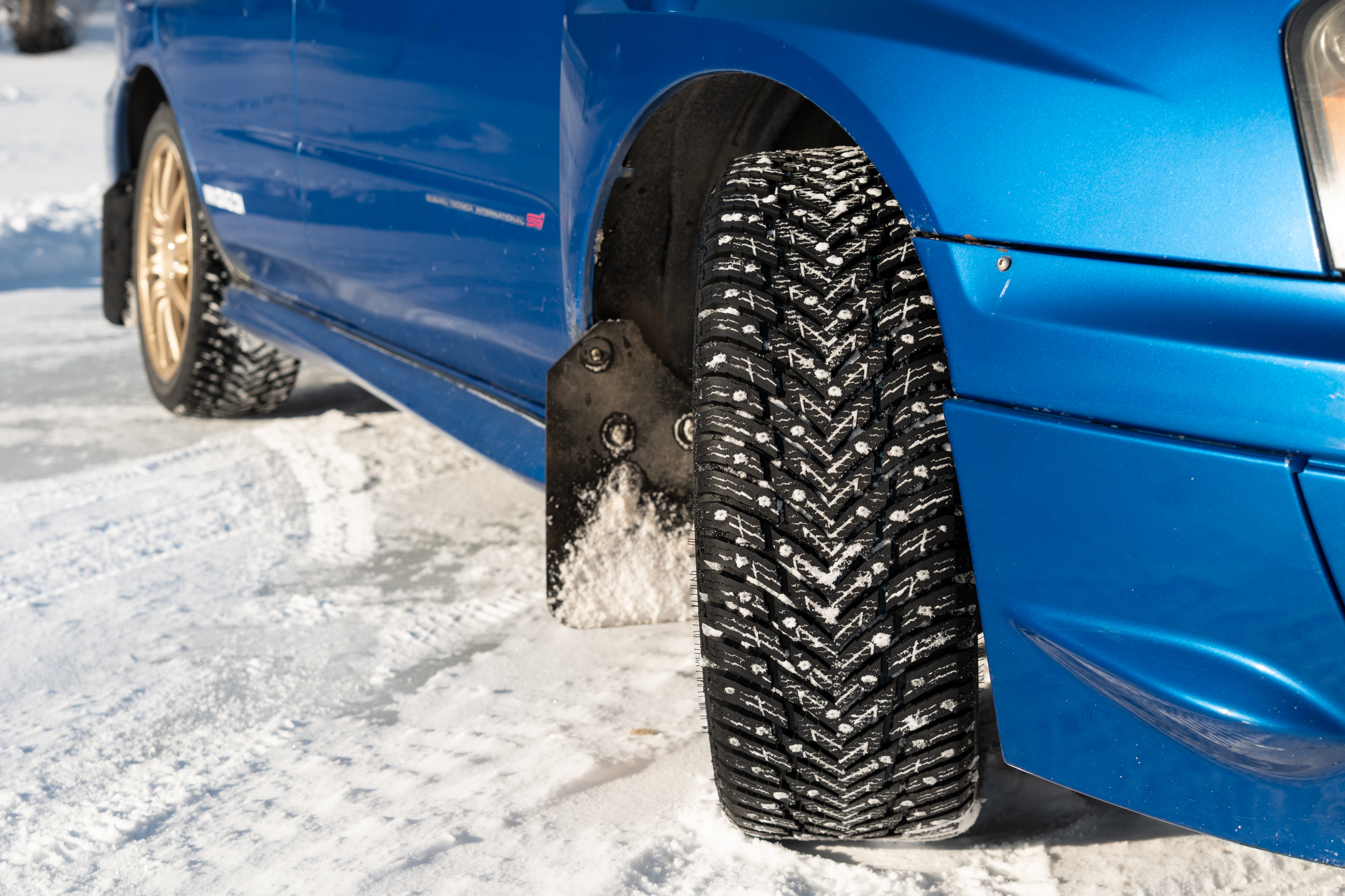
To drive on ice, you just need the right tires. Credit: Tim Stevens
To drive on ice, you just need the right tires. Credit: Tim Stevens
In Formula One, grip is everything. The world’s best engineers devote their careers to designing cars that maximize downforce and grip to squeeze every bit of performance out of a set of four humble tires. These cars punish their drivers by slinging them at six Gs through corners and offer similar levels of abuse in braking.
It’s all wildly impressive, but I’ve long maintained that those drivers are not the ones having the most fun. When it comes to sheer enjoyment, grip is highly overrated, and if you want proof of that, you need to try ice racing.
Should you be lucky enough to live somewhere that gets cold enough consistently enough, all you need is a good set of tires and a car that’s willing and able. That, of course, and a desire to spend more time driving sideways than straight. I’ve been ice racing for well over 20 years now, and I’m here to tell you that there’s no greater thrill on four wheels than sliding through a corner a few inches astern of a hard-charging competitor.
Here’s how you can get started.
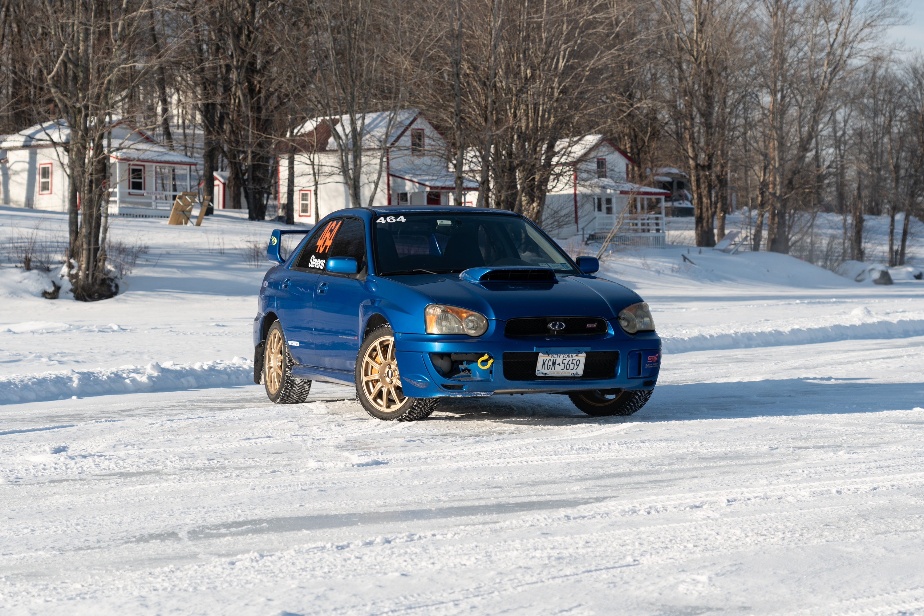
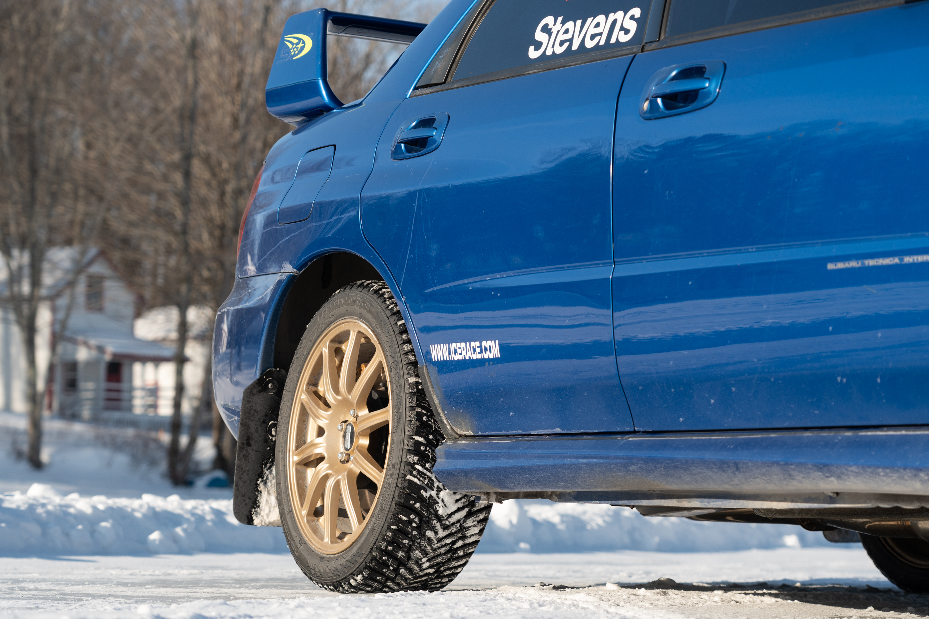
For street legal classes, you don’t even need a roll cage. Just the right tires and the right attitude.
Credit: Tim Stevens
For street legal classes, you don’t even need a roll cage. Just the right tires and the right attitude. Credit: Tim Stevens
Ice racing basics
There are certainly plenty of professionals out there who have dabbled in or got their start in ice racing, F1 legend Alain Prost and touring car maestro Peter Cunningham being two notable examples. And a European ice racing series called Trophée Andros formerly challenged some of the world’s top professionals to race across a series of purpose-built frozen tracks in Europe and even Quebec.
These days, however, ice racing is an almost entirely amateur pursuit, a low-temp, low-grip hobby where the biggest prize you’re likely to bring home on any given Sunday is a smile and maybe a little trophy for the mantel.
That said, there are numerous types of ice racing. The most common and accessible is time trials, basically autocrosses on ice. The Sports Car Club of Vermont ice time trial series is a reliable, well-run example, but you’ll find plenty of others, too.
Some other clubs step it up by hosting wheel-to-wheel racing on plowed ovals. Lakes Region Ice Racing Club in Moultonborough, New Hampshire, is a long-running group that has been blessed with enough ice lately to keep racing even as temperatures have increased.
At the top tier, though, you’re looking at clubs that plow full-on road courses on the ice, groups like the Adirondack Motor Enthusiast Club (AMEC), based in and around the Adirondack Park. Established in 1954, this is among the oldest ice racing clubs in the world and the one I’ve been lucky to be a member of since 2002.
Will any other discipline of motorsport teach you as much about car control? Tim Stevens
AMEC offers numerous classes, providing eligibility for everything from a bone-stock Miata to purpose-built sprint cars that look like they made a wrong turn off a dirt oval. Dedicated volunteers plow courses on lakes throughout the ADK, tirelessly searching for ice of sufficient depth and quality.
Different clubs have different requirements, but most like to see a foot of solid, clean ice. That may not sound like much, but according to the US Army Corps of Engineers, it’s plenty for eight-ton trucks. That’s enough to support not only the 60 to 100 racers that AMEC routinely sees on any frigid Sunday but also the numerous tow rigs, trailers, and plow trucks that support the action.
How do you get started? All you need is a set of tires.
Tires
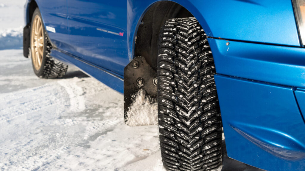
Tires are the most talked-about component of any car competing on the ice, and for good reason. Clubs have different regulations for what is and is not legal for competition, but in general, you can lump ice racing tires into three categories.
The first is unstudded, street-legal tires, such as Bridgestone Blizzacks, Continental WinterContacts, and Michelin X-Ices. These tires generally have chunky, aggressive treads, generous siping, and squishy compounds. Modern snow tires like these are marvelous things, and when there’s a rough surface on the ice or some embedded snow, an unstudded tire can be extremely competitive, even keeping up with a street-legal studded tire.
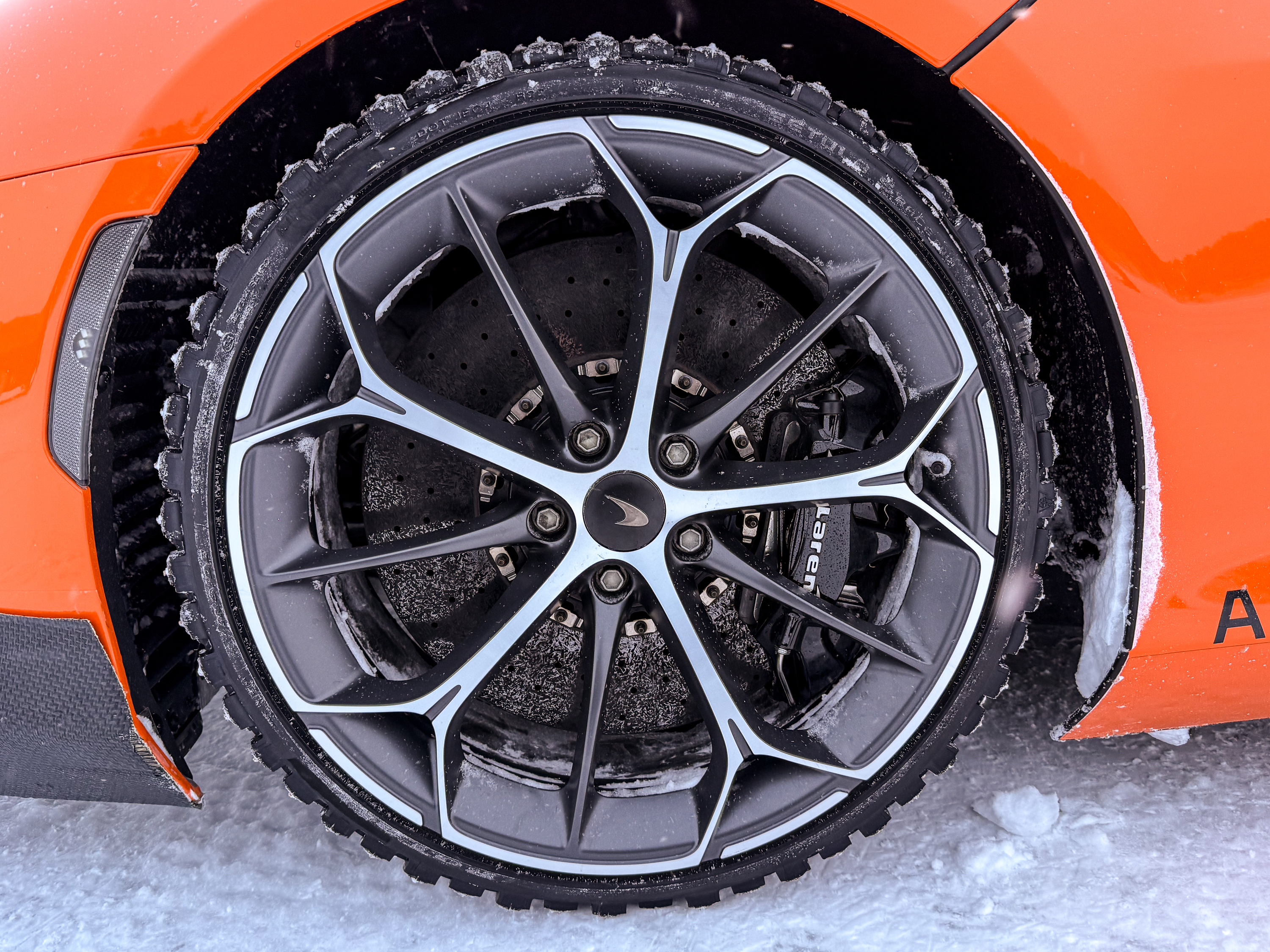
These tires, like the Nokian Hakkapeliita 10 and the Pirelli Winter Ice Zero, take the chunky, aggressive tread pattern of a normal snow tire and embed some number of metallic studs. These tiny studs, which typically protrude only 1 millimeter from the tire surface, provide a massive boost in grip on smooth, polished ice.
Tim races on Nokian Hakka 10 tires, which are a street-legal studded winter tire.
Credit: Tim Stevens
Tim races on Nokian Hakka 10 tires, which are a street-legal studded winter tire. Credit: Tim Stevens
Finally, there is what is broadly called a “race stud” tire, which is anything not legal for road use. These tires range from hand-made bolt tires, put together by people who have a lot of patience and who don’t mind the smell of tire sealant, to purpose-built race rubber of the sort you’ll see on a World Rally car snow stage.
These tires offer massive amounts of grip—so much so that the feel they deliver is more like driving on dirt than on ice. Unless you DIY it, the cost typically increases substantially as well. For that reason, going to grippier tires doesn’t necessarily mean more fun for your dollar, but there are plenty of opinions on where you’ll find the sweet spot of smiles per mile.
Driver skills
The other major factor in finding success on the ice is driver skill. If you have some experience in low-grip, car-control-focused driving like rally or drift, you’ll have a head start over someone who’s starting fresh. But if I had a dollar for every rally maestro or drifter I’ve seen swagger their way out onto the ice and then wedge their car straight into the first snowbank, I’d have at least five or six extra dollars to my name.
Ice racing is probably the purest and most challenging form of low-grip driving. On ice, the performance envelope of a normal car on normal tires is extremely small. Driving fast on ice, then, means learning how to make your car do what you want, even when you’re far outside of that envelope.
There are many techniques involved, but it all starts with getting comfortable with entering your car into a slide and sustaining it. Learning to balance your car in a moderate drift, dancing between terminal understeer (plowing into the snowbank nose-first) and extreme oversteer (spinning into the snowbank tail-first), is key. That comfort simply takes time.
Reading the ice
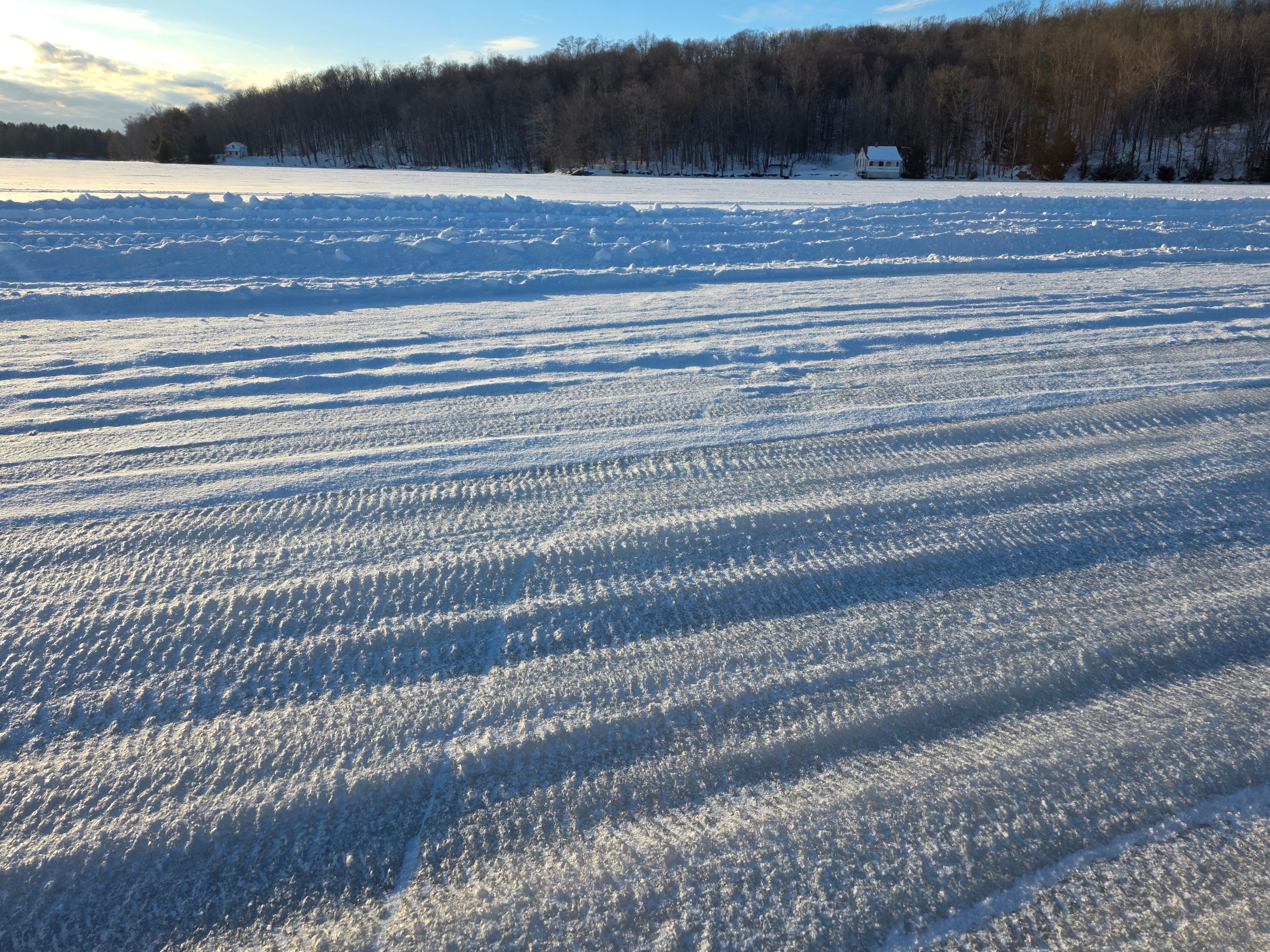
The condition of the track changes constantly.
Credit: Tim Stevens
The condition of the track changes constantly. Credit: Tim Stevens
Once you figure out how to keep your car going in the right direction, and once you stop making sedan-shaped holes in snowbanks, the next trick is to learn how to read the ice.
The grip level of the ice constantly evolves throughout the day. The street-legal tires tend to polish it off, wearing down rougher sections into smoothly polished patches with extremely low grip. The race studs, on the other hand, chew it up again, creating a heavily textured surface.
If you’re on the less extreme sorts of tires, you’ll find the most grip on that rough, unused ice. In a race stud, you want to seek out smooth, clean ice because it will give your studs better purchase.
If you’re familiar with road racing, it’s a little like running a rain line: not necessarily driving the shortest path around, but instead taking the one that offers the most grip. Imagine a rain line that changes every lap and you start to get the picture.
How can I try it?
Intrigued? The good news is that ice racing is among the most accessible and affordable forms of motorsport on the planet, possibly second only to autocrossing. Costs vary widely, but in my club, AMEC, a full day of racing costs $70. That’s for three heat races and a practice session. Again, all you need is a set of snow tires, which will last the full season if you don’t abuse them.
The bad news, of course, is that you need to be close to an ice racing club. They’re getting harder and harder to find, and active clubs generally have shorter seasons with fewer events. If you can’t find one locally, you may need to travel, which increases the cost and commitment substantially.
If you don’t live where the lakes freeze, you’ll have to travel. Tim Stevens
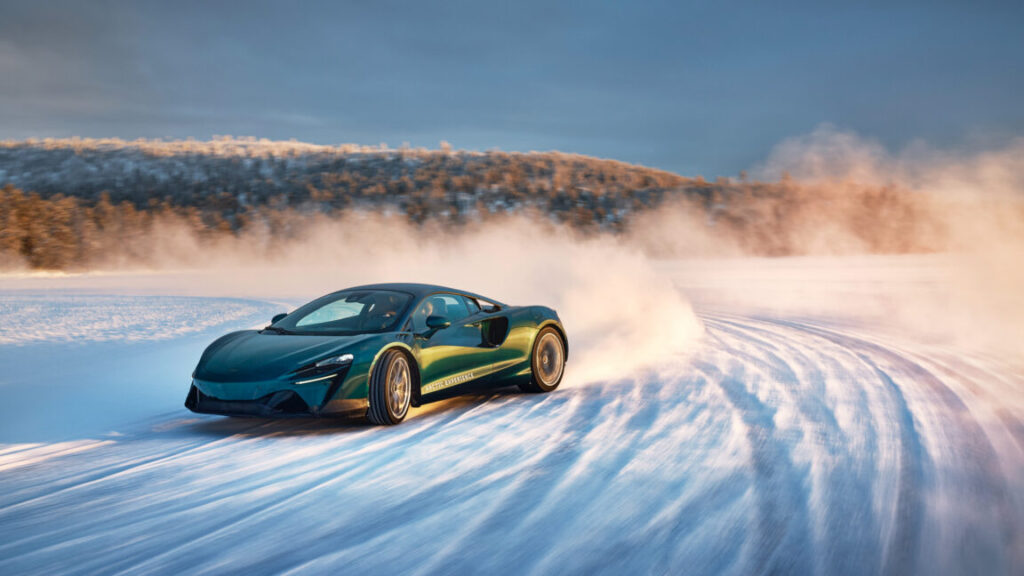
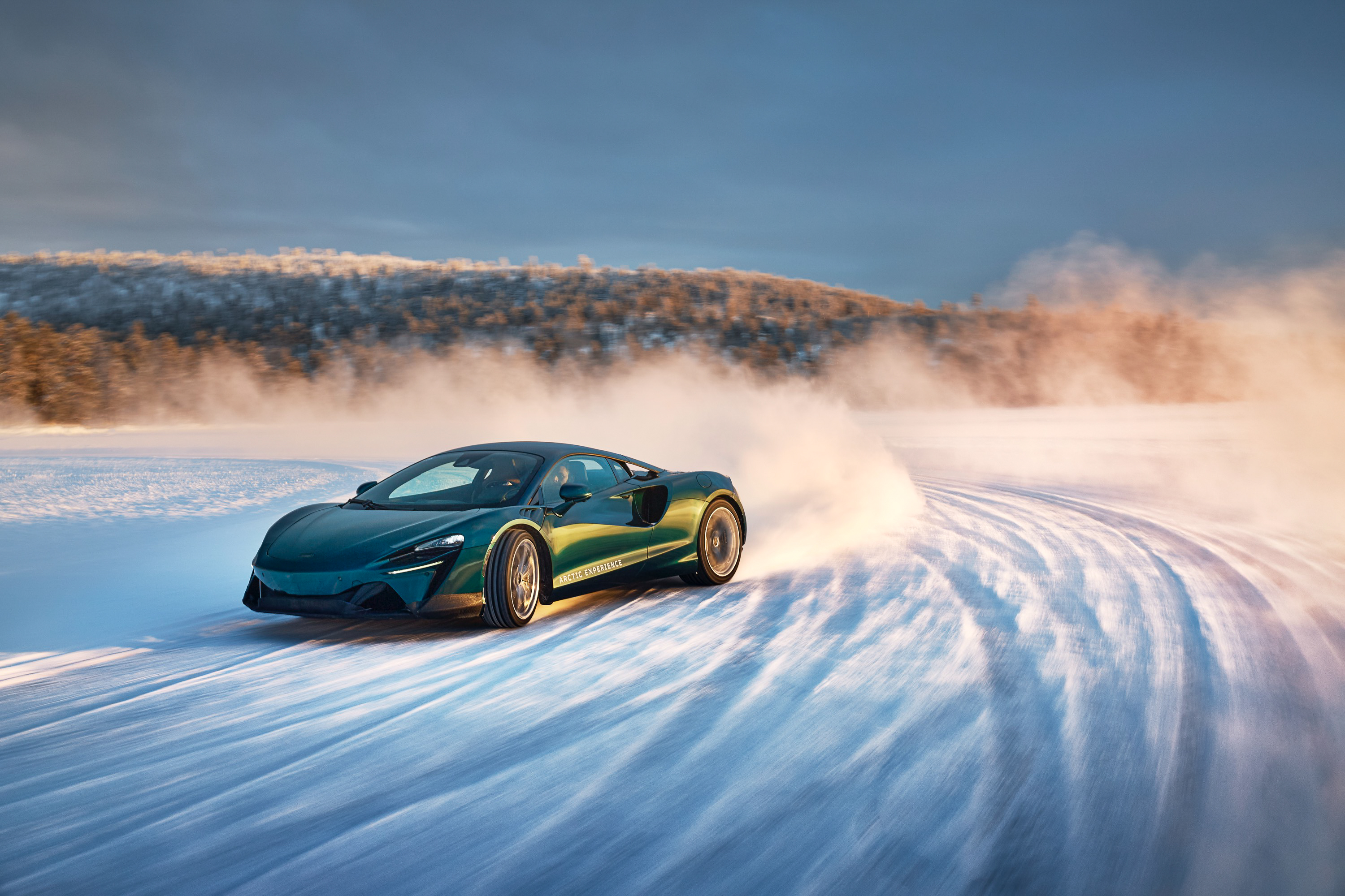
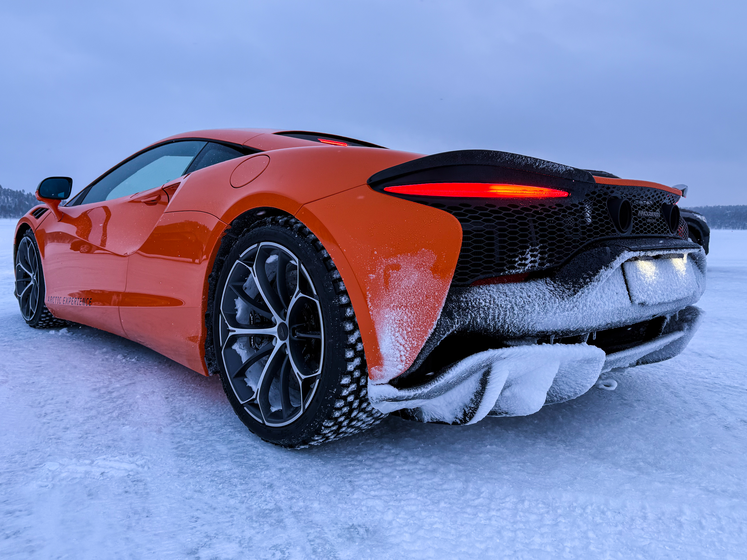
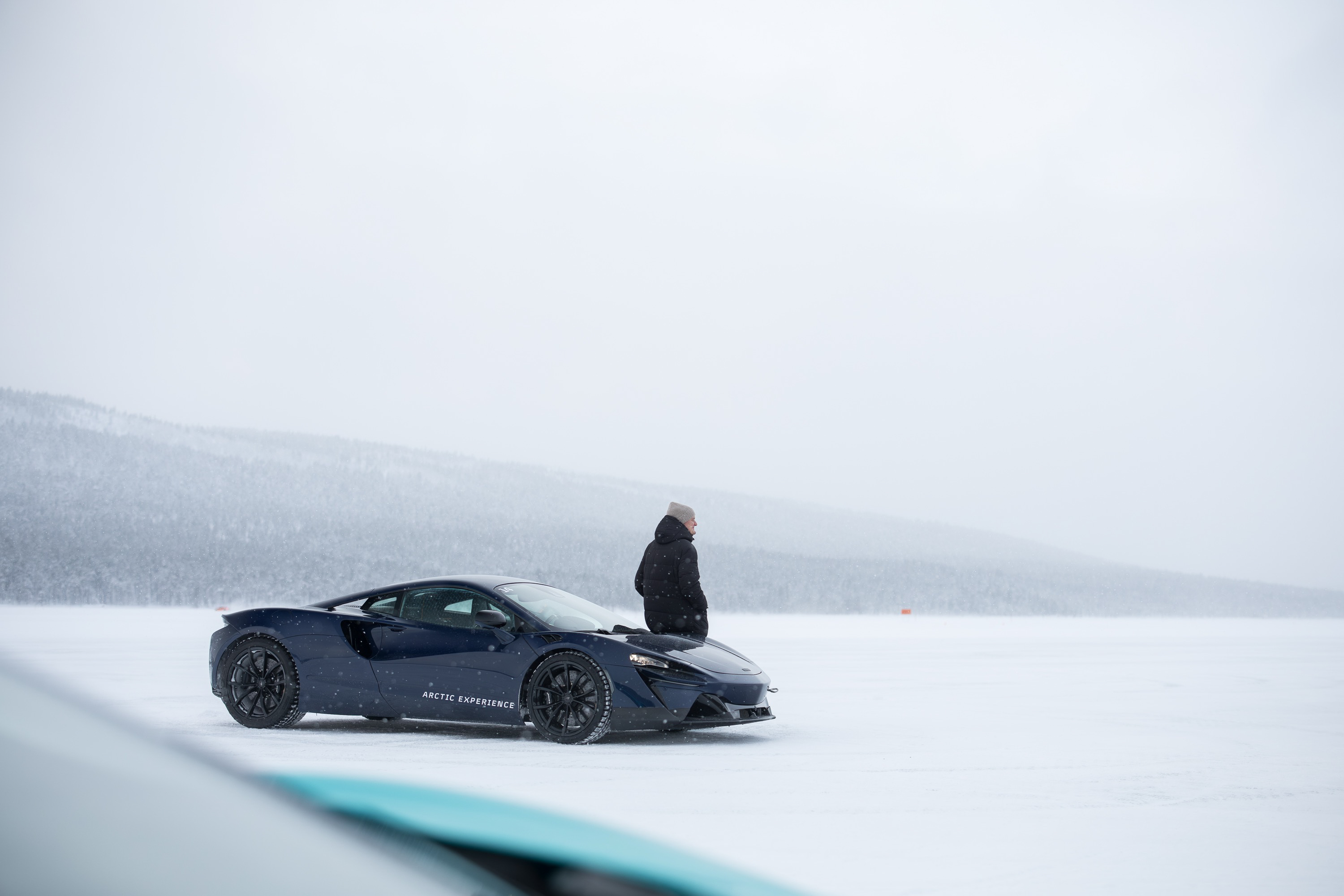
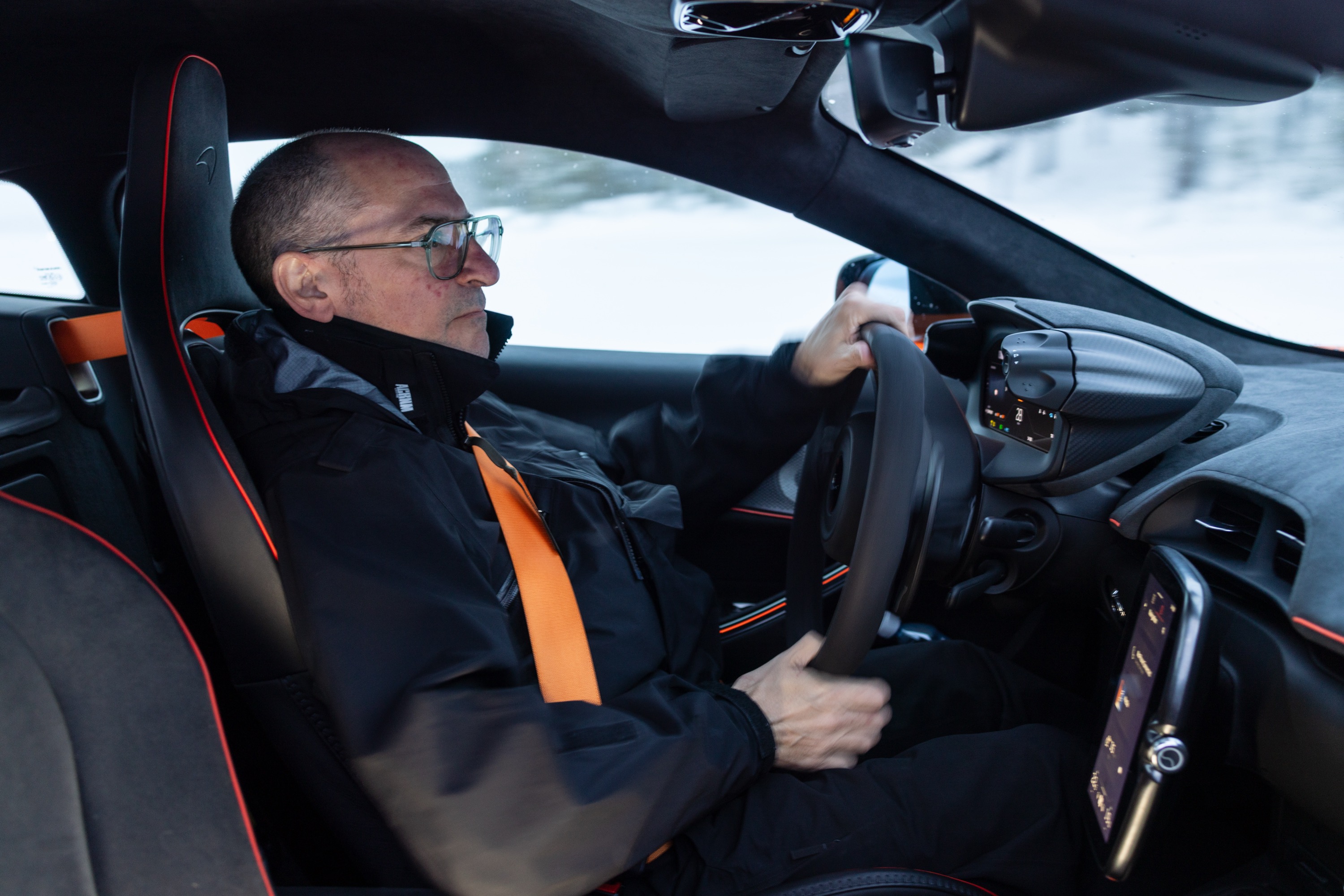
If cost is no issue, you certainly have more opportunities. We’ve already reported on McLaren’s program, but it’s not alone. Exotic brands like Ferrari and Lamborghini also offer winter driving programs, where you can wheel amazing cars in glamorous places like St. Moritz and Livigno. The cost is very much in the “if you have to ask” category.
Dirtfish, one of the world’s greatest rally schools, also offers an ice-driving program in Wisconsin, starting at about $2,000 for a single day. This is a great, if expensive, way to get a feel for the skills you’ll need on ice.
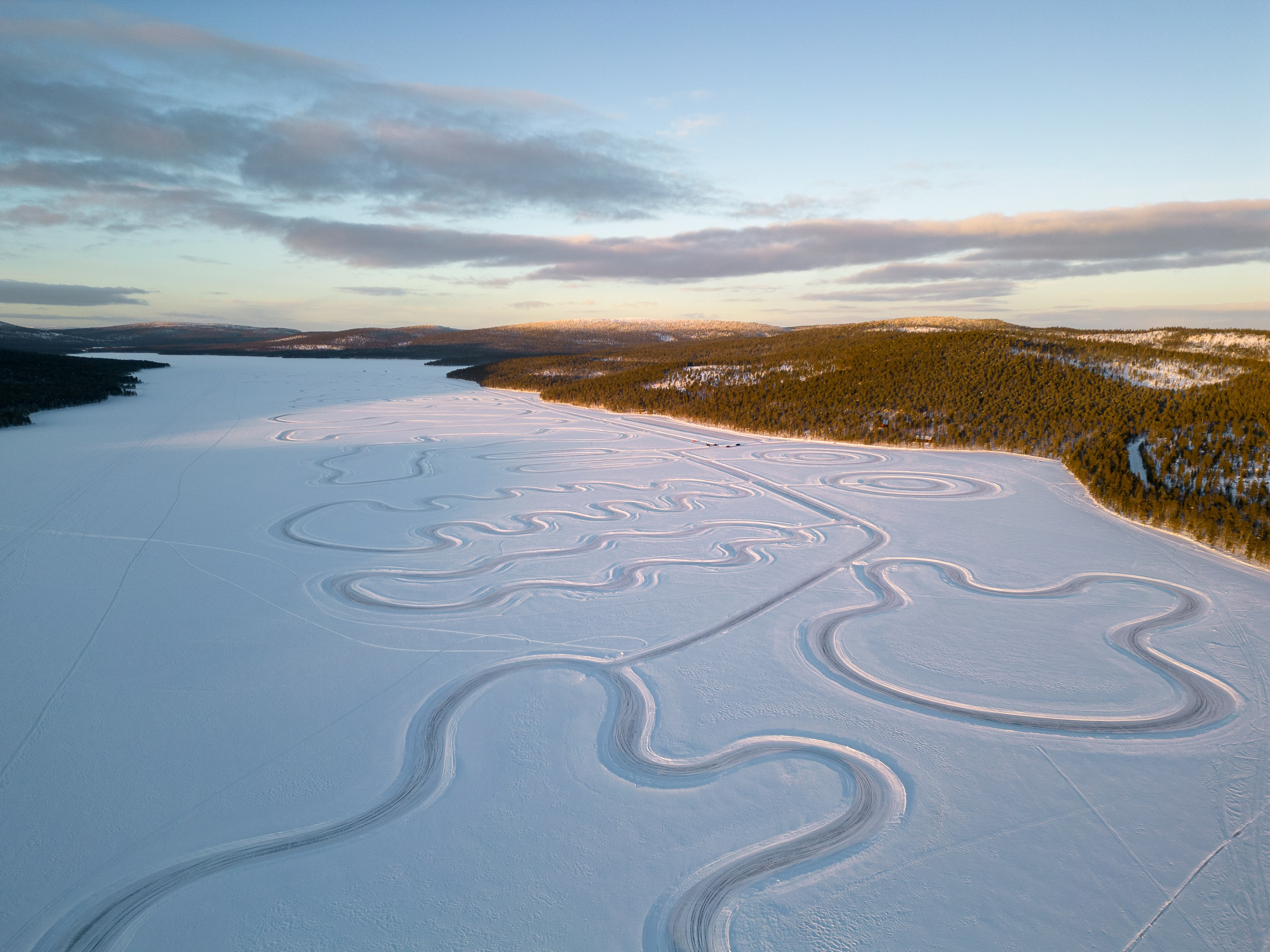
And if you just want the most seat time, look for programs like Lapland Ice Driving or Ice Drive Sweden. The northern wilds of Sweden and Finland are full of frozen lakes where clubs plow out full race courses, sometimes repeating Formula One circuits. If you have the funds, you can rent any manner of sports car and run it sideways all day long on proper studded tires.
Whatever it costs and whatever you have to do to make it happen, ice racing is well worth the effort. I’ve been lucky to drive a long list of amazing cars in amazing places, but nothing comes close to the joy of wheeling my 20-year-old Subaru around a frozen lake.
Zero grip, maximum fun: A practical guide to getting into amateur ice racing Read More »